Small informational popups that appear on hover or focus, providing additional context, help text, or descriptions for UI elements.
On this page
This documentation is a work in progress and may contain incomplete or outdated information. If you have any feedback or suggestions, please open an issue on GitHub.
Different configurations and states available for tooltip components to accommodate various informational requirements, content complexity levels, and contextual presentation needs. These variants provide flexibility in appearance, content structure, and semantic meaning while maintaining design consistency across the system.
Tooltips
Contextual overlay elements that display helpful information, guidance, and supplementary details triggered by user interaction. These components serve as the primary informational interface for providing just-in-time assistance, adapting their appearance and content structure based on information complexity, context, and visual integration to deliver clear guidance and maintain consistent user experience across all tooltip scenarios.
Type Variants
Content structure configurations that determine the layout and information hierarchy of tooltip components. These variants control the amount of detail and visual complexity to match different informational requirements.
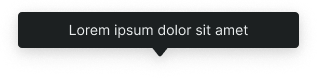
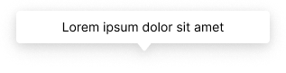
Basic
Simplified tooltip structure with essential messaging and minimal visual elements. Use for brief explanations, simple definitions, quick help text, or when space constraints require compact information delivery without detailed context.
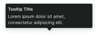
Rich
Comprehensive tooltip structure with enhanced content areas and additional information elements. Use for detailed explanations, multi-part guidance, complex help content, or when providing rich context and supporting information with structured presentation.
Context Variants
Visual styles and semantic meanings that communicate tooltip purpose, importance, and contextual relationship within the interface hierarchy. These variants determine the tooltip's color treatment, visual prominence, and thematic messaging to guide user attention and convey information significance.
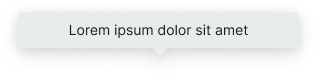
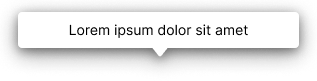
Default
Standard tooltip styling for general-purpose informational content that doesn't require special emphasis. Use for routine help text, neutral explanations, or standard contextual information that provides helpful guidance without specific urgency or importance levels.
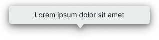
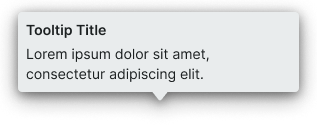
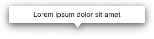
Alternate
Alternative styling variant optimized for different backgrounds or emphasized contexts. Use as a visual alternative to default styling in sections with alternate backgrounds or special interface contexts requiring distinct visual treatment.
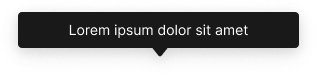
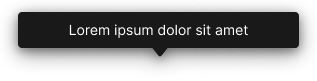
Black
High-contrast styling variant that maintains black appearance regardless of theme. Use for maximum visual impact in special contexts or when consistent dark styling is required across theme variations for critical informational content.
White
Clean contrast styling variant that maintains white appearance regardless of theme. Use for prominent information requiring neutral treatment in special contexts or when consistent light styling is needed across theme variations for clear informational delivery.