Temporary messages that inform users about system events, updates, or changes, typically appearing as toast messages or banner alerts.
On this page
This documentation is a work in progress and may contain incomplete or outdated information. If you have any feedback or suggestions, please open an issue on GitHub.
Different configurations and states available for notification components to accommodate various messaging requirements, visual prominence levels, and contextual communication needs. These variants provide flexibility in appearance, content structure, and semantic meaning while maintaining design consistency across the system.
Notifications
Communication elements that display important information, status updates, and system feedback to users. These components serve as the primary messaging interface within applications, adapting their appearance and content structure based on urgency, context, and information density to provide clear communication and maintain consistent user experience across all notification scenarios.
Type Variants
Content structure configurations that determine the layout and information hierarchy of notification components. These variants control the amount of detail and visual complexity to match different communication requirements.
Type variants are implemented as separate Figma components within this file to optimize performance. Each component has the same style and context variants.
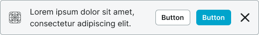
Notification
Simplified notification structure with essential messaging and minimal visual elements. Use for quick status updates, simple confirmations, or when space constraints require compact communication without detailed context.
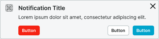
Rich Notification
Comprehensive notification structure with enhanced content areas and additional information elements. Use for complex messages requiring detailed explanations, multiple action options, or when providing rich context and supporting information.
Style Variants
Visual presentation modes that affect the notification's background treatment and overall appearance within the interface. These variants determine the visual weight and integration approach for different design contexts.
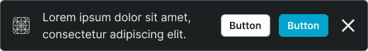
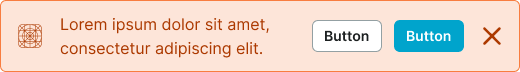
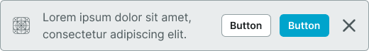
Basic
Standard notification styling with subtle background treatment and integrated appearance. Use for notifications that should blend naturally with interface content while maintaining clear visibility and readability.
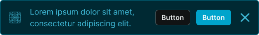
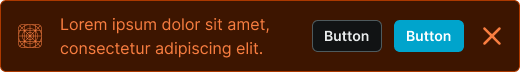
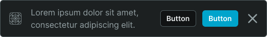
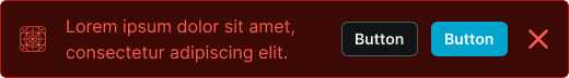
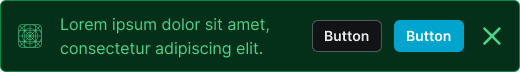
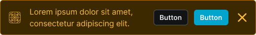
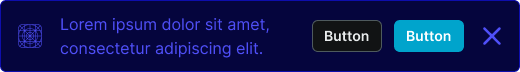
Solid
Enhanced notification styling with prominent background treatment and distinct visual separation. Use for high-priority notifications requiring strong visual presence or when notifications need to stand out prominently from surrounding content.
Context Variants
Visual styles and semantic meanings that communicate notification purpose, urgency, and message type within the interface hierarchy. These variants determine the notification's color treatment, visual prominence, and contextual messaging to guide user attention and convey information significance.
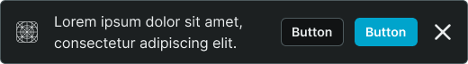
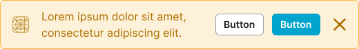
Default
Standard notification styling for general-purpose messages that don't require special emphasis. Use for routine system updates, neutral information, or non-critical communications that provide helpful context.
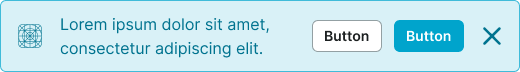
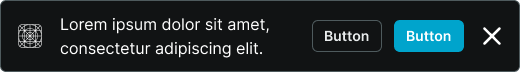
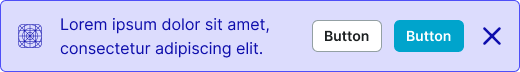
Alternate
Alternative styling variant optimized for different backgrounds or emphasized contexts. Use as a visual alternative to default styling in sections with alternate backgrounds or special interface contexts.
Primary
Represents important information that users should prioritize. Use for significant system updates, feature announcements, or high-priority communications that drive core user awareness and engagement.
Secondary
Secondary importance styling for notable but less critical information than primary notifications. Use for supplementary updates, feature tips, or when providing additional context alongside primary communications.
Neutral
Neutral styling variant for informational messages with minimal urgency or priority. Use when maintaining visual hierarchy while providing functional information access without demanding immediate attention.
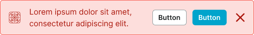
Danger
Critical alert styling that signals errors, failures, or potentially harmful situations. Use for system errors, failed operations, security warnings, or any communication that requires immediate user attention and corrective action.
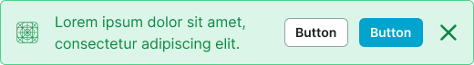
Success
Positive confirmation styling for completion and success states. Use for successful operations, completed transactions, positive system feedback, or any communication that confirms successful user actions.
Warning
Cautionary styling variant that signals attention-required situations or potential issues. Use for system warnings, validation alerts, approaching limits, or communications that require user awareness and possible action.
Info
Informational styling variant for knowledge-based content and feature guidance. Use for helpful tips, feature explanations, educational content, or communications that provide valuable context and learning opportunities.
Black
High-contrast styling variant that maintains black appearance regardless of theme. Use for maximum visual impact in special contexts or when consistent dark styling is required across theme variations for critical communications.
White
Clean contrast styling variant that maintains white appearance regardless of theme. Use for prominent communications requiring neutral treatment in special contexts or when consistent light styling is needed across theme variations.