Skip to main content Skip to docs navigation

Dialog components that overlay the main content, focusing user attention on critical information or tasks that require interaction before returning to the main interface.

This documentation is a work in progress and may contain incomplete or outdated information. If you have any feedback or suggestions, please open an issue on GitHub.

Variants

Different configurations and states available for modal components to accommodate various content presentation requirements, screen sizes, and interactive scenarios. These variants provide flexibility in appearance, content structure, and display behavior while maintaining design consistency across different devices and modal use cases.
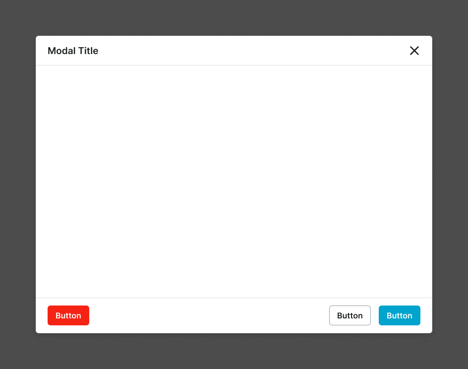
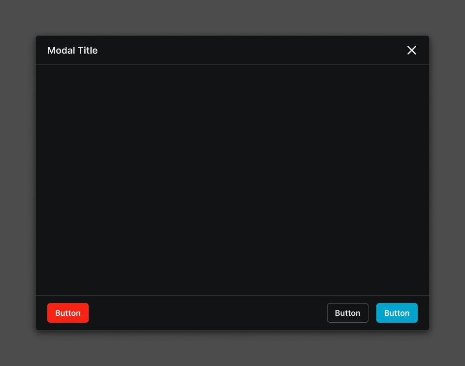
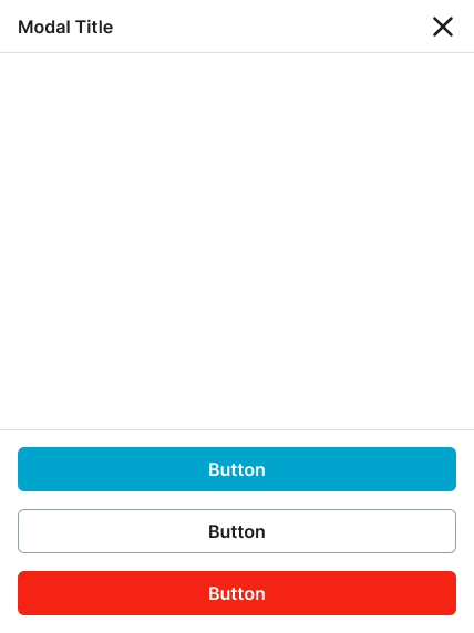
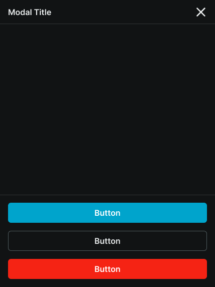
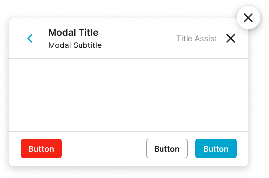
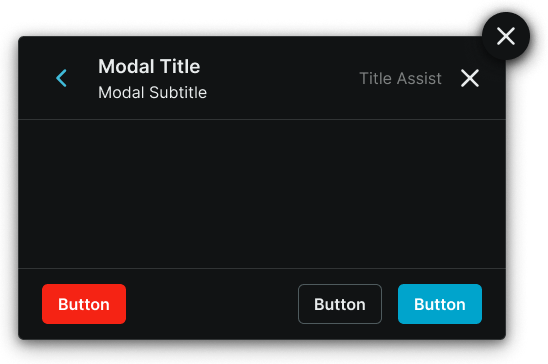
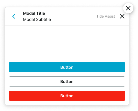
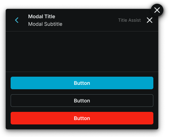
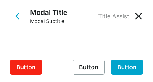
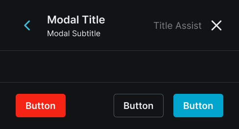
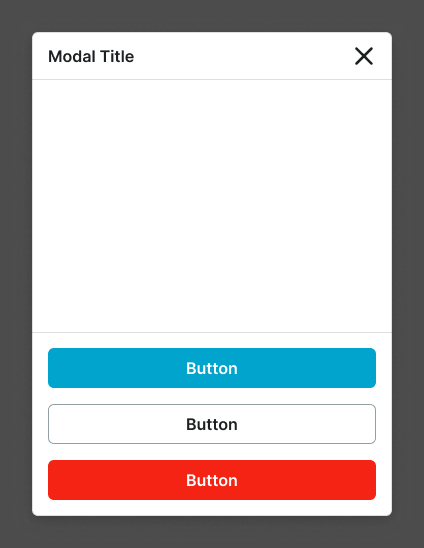
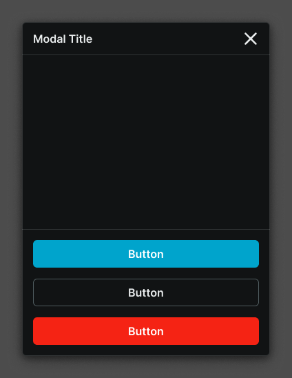
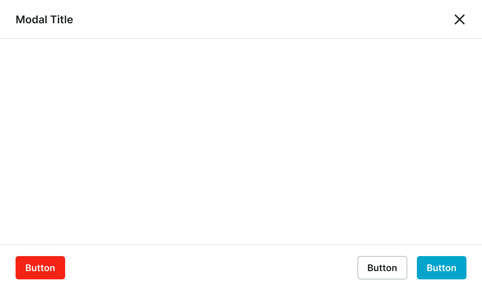
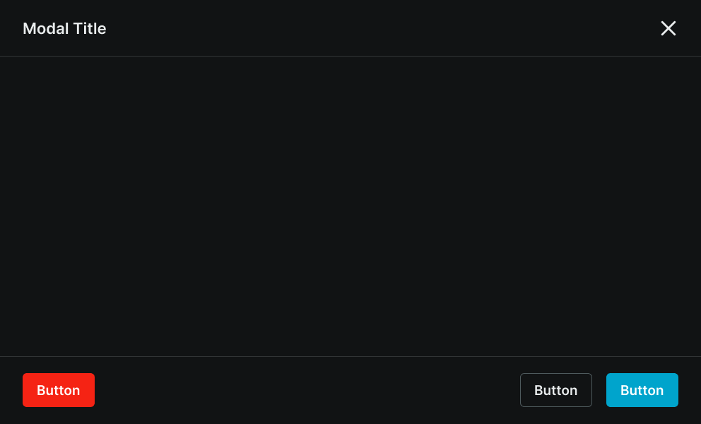
Modal dialog elements that display focused content, detailed information, and interactive workflows requiring user attention within structured interface layouts. These components serve as the primary content presentation windows that house headers, content areas, and footers, organizing interface elements and interactive functionality while maintaining consistent layout patterns and content hierarchy across different modal scenarios.

Size Variants

Layout configurations that control the modal window dimensions and content presentation to optimize usability across different screen sizes and device capabilities. These variants determine the spatial organization and content hierarchy characteristics for various display contexts.
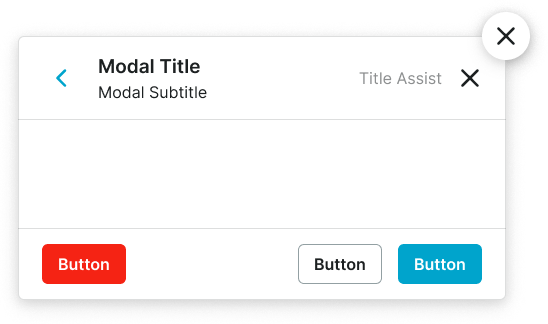
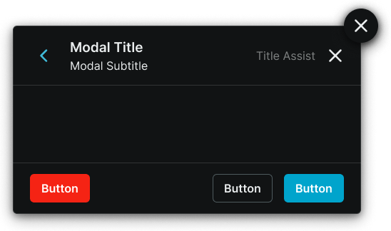
Modal variant example image Modal variant example image

Large

Expanded modal window dimensions optimized for tablet and desktop environments with generous screen real estate. Use for complex content presentations, detailed forms, comprehensive workflows, or when providing extensive information and interaction options on larger displays.

Modal variant example image Modal variant example image

Small

Compact modal window dimensions optimized for mobile devices and space-constrained environments. Use for focused content, simple forms, essential interactions, or when screen space requires efficient use while maintaining clear content presentation and interaction capabilities.

Display Variants

Presentation configurations that determine the modal window's display approach and spatial relationship with the underlying interface. These variants control how the modal window appears and interacts with the main application content.
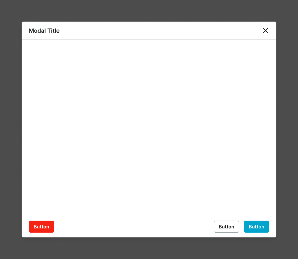
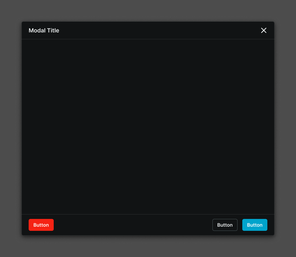
Modal variant example image Modal variant example image

Standard

Centered modal presentation that overlays the main interface while maintaining background context visibility. Use for content that benefits from maintaining visual connection to the underlying interface or when users need contextual awareness during modal interaction.

Modal variant example image Modal variant example image

Fullscreen

Maximized modal presentation that utilizes the complete available space within the modal screen. Use for immersive content experiences, complex workflows requiring full attention, or when content complexity demands maximum available space without distractions.

Fullscreen overlay elements that provide the foundational backdrop and positioning framework for modal presentations with dimmed backgrounds and screen coverage controls. These components serve as the containing environment that manages modal window placement, backdrop behavior, and screen interaction, adapting their size and display characteristics based on screen capabilities and modal complexity to ensure optimal presentation and user focus across all device contexts.

Size Variants

Layout configurations that control the modal screen dimensions and content organization to optimize presentation across different screen sizes, device orientations, and content complexity levels. These variants determine the content hierarchy and spatial relationships for comprehensive modal scenarios.

Modal variant example image Modal variant example image

XLarge

Maximum modal screen layout optimized for large desktop environments with extensive content presentation capabilities. Use for complex applications, comprehensive dashboards, detailed content management, or when providing maximum information density and interaction options on large displays.

Modal variant example image Modal variant example image

Large

Expanded modal screen layout optimized for standard desktop and tablet environments with substantial content presentation needs. Use for detailed workflows, multi-section content, comprehensive forms, or when providing extensive functionality and information on medium to large displays.

Modal variant example image Modal variant example image

Medium

Balanced modal screen layout optimized for standard tablet environments with moderate content presentation requirements. Use for focused workflows, structured content, standard forms, or when providing substantial functionality while maintaining content clarity on medium displays.

Modal variant example image Modal variant example image

Small

Compact modal screen layout optimized for mobile devices with focused content presentation and streamlined interaction patterns. Use for essential workflows, simplified content, mobile-optimized forms, or when screen constraints require efficient content organization while maintaining clear functionality.

Modal variant example image Modal variant example image

Fullscreen Large

Maximum screen coverage layout optimized for large displays with immersive content experiences. Use for comprehensive applications, detailed content creation, complex data visualization, or when content requires complete screen utilization without interface distractions on large displays.

Modal variant example image Modal variant example image

Fullscreen Small

Complete screen coverage layout optimized for mobile devices with focused immersive experiences. Use for mobile applications, simplified content creation, focused data entry, or when mobile content requires full screen attention without interface elements or distractions.