pagination
Navigation controls that divide content across multiple pages, allowing users to browse through large datasets or content collections sequentially.
Different configurations and states available for pagination components to accommodate various navigation requirements, content density, and user interaction patterns. These variants provide flexibility in appearance, behavior, and functionality while maintaining design consistency across different pagination contexts and data presentation scenarios.
Page Number
Individual clickable numeric elements that represent specific page positions within pagination interfaces. These components serve as the core interactive building blocks for numbered pagination systems, adapting their visual state based on user interaction and current page status to provide clear navigation feedback and maintain consistent user experience across all page selection scenarios.
State Variants
Interactive states that affect user interaction capabilities and visual feedback based on current user activity and page status. These variants communicate the page number's availability and current selection state while guiding users through successful navigation.


Page Arrow
Directional navigation elements that provide previous and next page functionality within pagination interfaces. These components serve as essential navigation controls for sequential page browsing, adapting their visual state based on user interaction and navigation availability to provide clear directional feedback and maintain consistent user experience across all pagination scenarios.
State Variants
Interactive states that affect user interaction capabilities and visual feedback based on current user activity and navigation availability. These variants communicate the arrow's functionality and current interaction state while guiding users through successful page navigation.
Simple Pagination
Navigation elements that provide numbered page selection through clickable page buttons. These components serve as the standard pagination interface for content navigation, adapting their appearance and button states based on current page position and total page count to provide clear navigation feedback and maintain consistent user experience across all paginated content.
State Variants
Position-based configurations that determine the visual state and navigation capabilities of pagination elements based on their location within the overall page sequence. These variants control the active state and contextual styling to provide clear positional feedback.


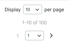
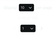
Advanced Pagination
Enhanced navigation elements that provide comprehensive pagination controls including page selection, item count configuration, and status information. These components serve as feature-rich pagination interfaces for complex data presentation, adapting their size and functionality based on content complexity and user control requirements.
Size Variants
Dimensional configurations that control the pagination scale and content presentation to optimize usability across different screen sizes and interface contexts. These variants determine the spatial organization and control accessibility for various display environments.


Dot Pagination
Minimal navigation elements that provide position indication through visual dot indicators. These components serve as subtle pagination interfaces for image galleries, carousels, and slideshow content, adapting their dot states based on current position to provide clear positional awareness with minimal visual impact.
State Variants
Position-based configurations that determine the visual state and navigation feedback of dot pagination elements based on their location within the content sequence. These variants control the active dot styling and positional indication across all possible positions.


Active Position
Dynamic state that highlights the current position within the dot sequence while maintaining visibility of all available positions. Use for any position within sequential content navigation, slideshow browsing, gallery viewing, or when users navigate through content items requiring clear positional awareness and sequence context.