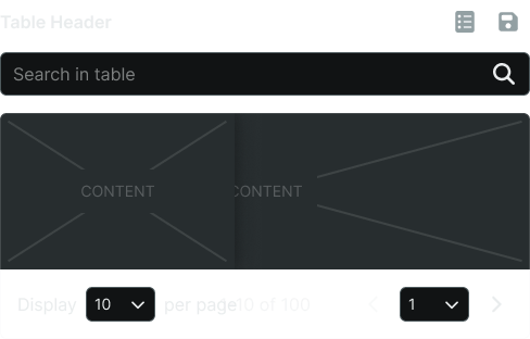
Structured data displays that organize information into rows and columns, enabling users to scan, sort, and analyze tabular data.
On this page
This documentation is a work in progress and may contain incomplete or outdated information. If you have any feedback or suggestions, please open an issue on GitHub.
Different configurations and states available for table components to accommodate various data presentation requirements, interaction patterns, and organizational structures. These variants provide flexibility in content display, user interaction, and visual hierarchy while maintaining consistent tabular organization across the system.
Table Data Cell
Individual data elements within table structures that display content through various formats and interactive capabilities. These components serve as the fundamental content containers within tabular layouts, adapting their presentation and functionality based on data type, user interaction requirements, and contextual needs.
Type Variants
Different content presentation methods for displaying various types of data within table cells. These variants determine the fundamental format and interactive capabilities of the data cell element, optimized for specific content types and user interaction patterns.
Basic
Standard data cell with text content and minimal interactive elements. Use for displaying simple textual data, numerical values, basic information, or when content requires straightforward presentation without additional functionality.
Form
Interactive data cell with form input elements for direct data entry and editing. Use for editable tables, configuration interfaces, data collection forms, or when users need to modify cell content directly within the table structure.
Button
Interactive data cell with button element for triggering actions and operations. Use for action tables, workflow interfaces, command execution, or when cells contain actionable elements that perform specific functions.
Icon
Data cell enhanced with icon element for visual representation and quick identification. Use for status indicators, categorical data, symbolic information, or when icons effectively communicate data meaning without extensive text.
Badge
Data cell featuring badge element for status, counts, or categorical labeling. Use for notification tables, status tracking, numerical indicators, or when visual labels enhance data understanding and categorization.
Check
Data cell with checkbox element for selection and bulk operations. Use for selectable data tables, multi-selection interfaces, batch operations, or when users need to choose multiple table entries for actions.
Custom
Flexible data cell supporting specialized content and unique presentation requirements. Use for complex data types by swapping the text asset when standard cell types cannot accommodate specific data representation needs.
Table Head Cell
Header elements that provide column identification, organization, and interactive capabilities for table structures. These components establish column context, enable data operations, and provide essential navigation and sorting functionality within tabular interfaces.
Type Variants
Different functional capabilities for table header elements that determine their interactive behavior and operational features. These variants control the level of functionality and user interaction available within column headers.
Basic
Standard header cell with column identification and minimal interactive features. Use for simple data tables, display-only interfaces, basic column labeling, or when headers require straightforward content identification without advanced functionality.
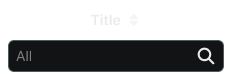
Filtering
Enhanced header cell with filtering capabilities for data subset selection and content refinement. Use for large datasets, searchable tables, data analysis interfaces, or when users need to narrow down visible content based on specific criteria.
Content Variants
Content structure configurations that determine the information hierarchy and interactive elements within table headers. These variants control the type of content and selection capabilities available in header cells.
Text
Text-based header content with column labels and descriptive information. Use for standard column identification, data categorization, clear content labeling, or when textual headers provide sufficient context for data understanding.
Checkbox
Header content with checkbox element for column-wide selection and bulk operations. Use for selectable data tables, master selection controls, batch operation interfaces, or when users need to select entire columns or all visible rows.
Table Row
Horizontal container elements that organize related data across columns and provide visual structure for tabular content. These components establish data relationships, maintain visual hierarchy, and support various interactive states for data manipulation and navigation.
Type Variants
Different presentation states and functional capabilities that affect row appearance and user interaction. These variants determine the visual emphasis, interaction feedback, and operational context for different table scenarios.
Header
Special header row containing column titles and organizational information. Use for table structure definition, column identification, data categorization, or when establishing the foundational organization for tabular content presentation.
Odd
Standard row styling for odd-numbered entries in alternating row patterns. Use for zebra-striped tables, improved readability, visual separation, or when alternating patterns enhance data scanning and content differentiation.
Even
Standard row styling for even-numbered entries in alternating row patterns. Use for zebra-striped tables, consistent visual rhythm, content organization, or when alternating patterns support user navigation through large datasets.
Hover
Interactive state indicating mouse interaction and potential row selection. Use for interactive tables, selectable content, navigation feedback, or when providing visual confirmation of user interaction with specific data entries.
Active
Visual state indicating currently selected or focused row for operations. Use for active selection, current context indication, focused data display, or when highlighting the primary data entry for user attention.
Edit
Interactive state indicating row modification capabilities and edit mode activation. Use for editable tables, data modification workflows, content management interfaces, or when providing clear feedback for data editing operations.
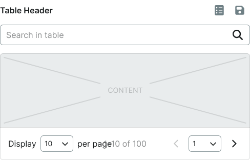
Table Container
Structural wrapper elements that provide overall table organization, scrolling behavior, and layout constraints. These components establish the foundational structure for tabular content and manage the presentation of complex data within various interface contexts.
Type Variants
Different structural configurations that affect table layout behavior and content presentation constraints. These variants determine the scrolling characteristics and spatial organization for various table implementation requirements.
Basic
Standard table container with default scrolling and layout behavior. Use for simple data tables, standard interfaces, basic tabular content, or when tables fit comfortably within available interface space without specialized constraints.
Sticky
Enhanced table container with fixed header positioning during content scrolling. Use for large datasets, lengthy tables, continuous header visibility, or when users need persistent column identification while navigating through extensive tabular content.


