table
Structured data displays that organize information into rows and columns, enabling users to scan, sort, and analyze tabular data.
Technical specifications and design system values that define the visual and structural properties of table components. These specifications ensure consistent implementation across design tools and development environments for tabular data presentation and interaction.
Legend:
- Brackets (
[]) denote a component variant placeholder. - Full emphasis indicates a value specific to that variant.
- Dimmed indicates a value unchanged from the default variant.
Table Data Cell
Specifications for individual data cell elements including measurements, colors, and typography attributes that define the core appearance and content presentation properties for each cell.


1
Table Data Cell
- verticalPadding:
- space.table.cell-padding-y
- horizontalPadding:
- space.table.cell-padding-x
- itemSpacing:
- space.table.cell-gap
2
Text
- fill:
- color.table.fg-data
- typography:
- font.table.data-text
Table Head Cell
Specifications for table header cell elements including measurements, colors, typography, and interactive indicator attributes that define the structural properties for column organization and sorting controls.
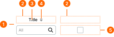
1
Table Head Cell
- verticalPadding:
- space.table.cell-padding-y
- horizontalPadding:
- space.table.cell-padding-x
- itemSpacing:
- space.table.cell-gap
2
Title Frame
- itemSpacing:
- space.context.2xsmall
3
Title Text
- fill:
- color.table.fg-head
- typography:
- font.table.head-text
4
Sort Icon
- height:
- size.icon.glyph.xsmall
- width:
- size.icon.glyph.xsmall
- fill:
- color.table.icon-sort
5
Check Frame
- verticalPadding:
- space.unit.6
Table Row
Specifications for horizontal container elements including fill, border color, and border width attributes that define the visual separation and state styling for data organization within the table structure.


1
Table Row
- fill:
- color.table.bg-[type]
- borderColor:
- color.table.border-main
- borderWidthBottom:
- borderWidth.table.main
Table Container
Specifications for table wrapper elements including layout, border, shadow, and header styling attributes that define the overall structural framework and navigation capabilities for comprehensive table presentation.
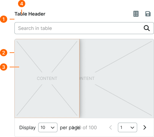
1
Table Container
- itemSpacing:
- space.context.medium
2
Table Frame
- borderColor:
- color.table.border-main
- borderRadius:
- borderRadius.table.main
- borderWidth:
- borderWidth.table.main
3
Sticky Frame
- boxShadow:
- shadow.common.nav-left
4
Table Header
- fill:
- color.section.fg-medium
- typography:
- font.section.header-medium