Persistent action buttons that remain visible and accessible, typically positioned in a fixed location as users scroll through content.
On this page
This documentation is a work in progress and may contain incomplete or outdated information. If you have any feedback or suggestions, please open an issue on GitHub.
Different configurations and states available for floating button components to accommodate various use cases, user interactions, and visual requirements. These variants provide flexibility in appearance, behavior, and hierarchy while maintaining design consistency across the system.
Floating Buttons
Elevated interactive elements that provide prominent access to primary actions within interfaces. These components serve as Material Design Floating Action Button (FAB) equivalents, featuring elevated appearance with shadow styling that floats above interface content to provide persistent action access and visual prominence across all interface contexts.
Type Variants
Content structure configurations that determine the layout and visual presentation format of floating button components. These variants control the content display and interaction approach to match different functional requirements while maintaining elevated appearance.
Basic
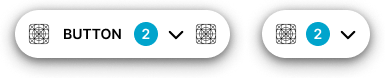
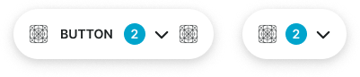
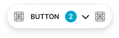
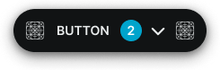
Standard floating button structure with text label and elevated shadow styling. Use for prominent actions requiring clear labeling and maximum visibility, primary task completion, or when providing comprehensive action context with descriptive text.
Icon-Only
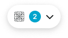
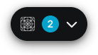
Minimal floating button structure optimized for displaying only icon elements with elevated appearance. Use for essential actions requiring persistent access, quick operations, toolbar shortcuts, or when space constraints require simplified visual presentation while maintaining maximum prominence.
Context Variants
Visual styles and semantic meanings that communicate floating button purpose and importance within the interface hierarchy. These variants determine the button's elevated appearance, color treatment, and contextual messaging while maintaining consistent shadow elevation and prominence.
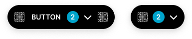
Default
Standard elevated styling for general-purpose floating actions that require persistent access. Use for common operations like creating new content, initiating primary workflows, or actions that benefit from persistent visibility.
Solid Badge
context:
primary
Alternate
Alternative elevated styling variant optimized for different backgrounds or emphasized contexts. Use as a visual alternative to default styling in sections with alternate backgrounds while maintaining elevation prominence.
Solid Badge
context:
primary
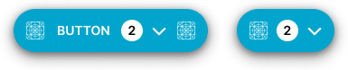
Primary
Represents the most important floating action a user should take. Use for critical workflow initiation, primary content creation, essential task completion, or call-to-action elements that drive core user engagement with maximum prominence.
Solid Badge
context:
white
Secondary
Secondary elevated styling for important but less critical floating actions. Use for alternative pathways, supplementary workflows, or when offering multiple floating options alongside a primary elevated action.
Solid Badge
context:
white
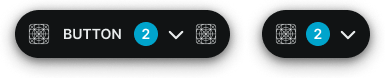
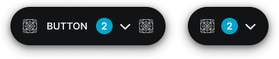
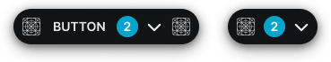
Black
High-contrast elevated styling variant that maintains black appearance with consistent shadow elevation. Use for maximum visual impact in special contexts requiring persistent dark styling across theme variations.
Solid Badge
context:
primary
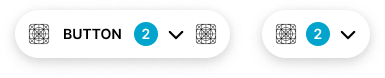
White
Clean contrast elevated styling variant that maintains white appearance with consistent shadow elevation. Use for prominent actions requiring neutral treatment with persistent light styling across theme variations.
Solid Badge
context:
primary
Size Variants
Different dimensional scales for floating button components to accommodate various layout requirements and visual hierarchies. These variants maintain proportional relationships and consistent elevation while adapting to different design contexts and space constraints.
Large
Expanded floating button size designed for maximum prominence and high-visibility actions. Use for primary floating actions in spacious layouts, hero sections, or when enhanced prominence and touch accessibility are required with elevated appearance.
Solid Badge
size:
large
Medium
Standard floating button size providing balanced proportions for most floating button implementations. Use as the default size for primary floating actions across general interface contexts where optimal visibility and elevation prominence are required.
Solid Badge
size:
medium
Small
Compact floating button size optimized for dense layouts while maintaining elevation prominence. Use in constrained spaces, mobile interfaces, or when multiple floating elements need accommodation within limited screen real estate.
Solid Badge
size:
small
State Variants
Interactive states that affect user interaction capabilities and visual feedback based on current user activity and system conditions. These variants communicate the floating button's availability while maintaining consistent elevation and prominence.
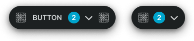
Idle
Represents the standard elevated appearance of a floating button when not being interacted with. Elevated styling with shadow indicates persistent availability for interaction and maintains visual prominence.
Badge Frame
opacity:
opacity.level.solid
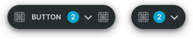
Hover
Provides enhanced visual feedback when a user hovers over a floating button with increased elevation. Enhanced shadow and styling signals available interaction and guides user attention with elevated prominence.
Badge Frame
opacity:
opacity.level.solid
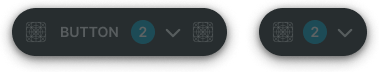
Press
Indicates that a floating button is currently being pressed with reduced elevation feedback. Active press state provides immediate tactile feedback during user interaction while maintaining floating appearance.
Badge Frame
opacity:
opacity.level.solid
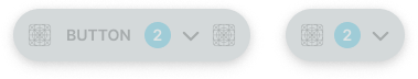
Disabled
Shows that a floating button is not currently interactive with reduced elevation and visual prominence. Diminished shadow and styling indicates unavailability while maintaining elevated interface structure.