floating-button
Persistent action buttons that remain visible and accessible, typically positioned in a fixed location as users scroll through content.
Configurable properties that control the appearance, behavior, and functionality of floating button components for elevated action presentation and persistent user access.
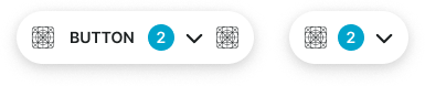
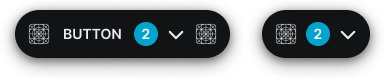
Floating Buttons
Properties that define the visual state and interactive behavior of elevated button elements.
context variant
Controls the visual style and semantic meaning of the floating button based on its intended purpose and importance within elevated interface hierarchy.
- default
- alternate
- primary
- secondary
- neutral
- danger
- success
- warning
- info
- black
- white
size variant
Controls the dimensional scale and proportional relationships of the floating button component.
- large
- medium
- small
state variant
Controls the interactive state and visual feedback of the floating button based on user interaction.
- idle
- hover
- press
- disabled
has-icon-start boolean
Controls the visibility of an icon element positioned before the button label.
- true
- false
icon-start-instance instance-swap
- has-icon-start:
- true
Specifies which icon component to display when icon-start property is enabled.
- Icon Placeholder
badge boolean
Controls the visibility of a badge element for displaying counts or notifications.
- true
- false
is-dropdown boolean
Controls the visibility of a dropdown indicator that signals additional actions or options.
- true
- false
has-icon-end boolean
Controls the visibility of an icon element positioned after the button label.
- true
- false
icon-end-instance instance-swap
- has-icon-end:
- true
Specifies which icon component to display when has-icon-end property is enabled.
- Icon Placeholder