floating-button
Persistent action buttons that remain visible and accessible, typically positioned in a fixed location as users scroll through content.
On this page
This documentation is a work in progress and may contain incomplete or outdated information. If you have any feedback or suggestions, please open an issue on GitHub.
Technical specifications and design system values that define the visual and structural properties of floating button components. These specifications ensure consistent implementation across design tools and development environments for elevated and persistent action interfaces.
Legend:
- Brackets (
[]) denote a component variant placeholder. - Full emphasis indicates a value specific to that variant.
- Dimmed indicates a value unchanged from the default variant.
Floating Buttons
Specifications for elevated button elements including measurements, colors, typography, shadow properties, and elevation styling attributes. These values define the core appearance, elevation behavior, and Material Design FAB-equivalent properties for each floating button variant.
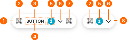
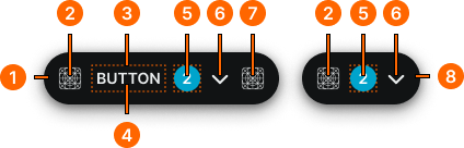
1
Floating Button
- size:
- medium
- padding-y:
- space.context.small
- padding-x:
- space.context.small
- gap:
- space.context.xsmall
- color.background:
- color.button.[context].bg-[state]
- borderRadius:
- borderRadius.context.round
- boxShadow:
- shadow.elevation.default.30
- size:
- large
- padding-y:
- space.context.medium
- padding-x:
- space.context.medium
- gap:
- space.context.xsmall
- color.background:
- color.button.[context].bg-[state]
- borderRadius:
- borderRadius.context.round
- boxShadow:
- shadow.elevation.default.30
- size:
- small
- padding-y:
- space.context.xsmall
- padding-x:
- space.context.xsmall
- gap:
- space.context.xsmall
- color.background:
- color.button.[context].bg-[state]
- borderRadius:
- borderRadius.context.round
- boxShadow:
- shadow.elevation.default.30
2
Icon Start
- height:
- size.icon.glyph.medium
- width:
- size.icon.glyph.medium
- fill:
- color.button.[context].fg-[state]
3
Label Frame
- padding-x:
- space.context.2xsmall
4
Label Text
- fill:
- color.button.[context].fg-[state]
- typography:
- font.text.small.strong
5
Badge Frame
- state:
- idle, hover, press
- opacity:
- opacity.level.solid
- state:
- disabled
- opacity:
- opacity.context.fg-slight
6
Caret Icon
- height:
- size.icon.glyph.small
- width:
- size.icon.glyph.small
- fill:
- color.button.[context].fg-[state]
7
Icon End
- height:
- size.icon.glyph.medium
- width:
- size.icon.glyph.medium
- fill:
- color.button.[context].fg-[state]
8
Floating Icon-Button
- size:
- medium
- padding-y:
- space.context.small
- padding-x:
- space.context.small
- gap:
- space.context.xsmall
- color.background:
- color.button.[context].bg-[state]
- borderRadius:
- borderRadius.context.round
- boxShadow:
- shadow.elevation.default.30
- size:
- large
- padding-y:
- space.context.medium
- padding-x:
- space.context.medium
- gap:
- space.context.xsmall
- color.background:
- color.button.[context].bg-[state]
- borderRadius:
- borderRadius.context.round
- boxShadow:
- shadow.elevation.default.30
- size:
- small
- padding-y:
- space.context.xsmall
- padding-x:
- space.context.xsmall
- gap:
- space.context.xsmall
- color.background:
- color.button.[context].bg-[state]
- borderRadius:
- borderRadius.context.round
- boxShadow:
- shadow.elevation.default.30