Skip to main content Skip to docs navigation

Button Group

Collections of related buttons organized into cohesive sets, providing users with multiple related action options in a single component.

This documentation is a work in progress and may contain incomplete or outdated information. If you have any feedback or suggestions, please open an issue on GitHub.

Variants

Different configurations and states available for button group components to accommodate various action organization requirements, layout patterns, and interaction contexts. These variants provide flexibility in appearance, behavior, and functionality while maintaining design consistency across different button grouping scenarios and user interface implementations.

Button Group Item

Individual interactive elements that function as building blocks within button group structures. These components serve as the core button units within grouped interfaces, adapting their appearance and behavior based on type, context, size, and interaction state to provide clear action identification and maintain consistent user experience across all button group scenarios.

Type Variants

Content structure configurations that determine the layout and visual presentation format of button group item components. These variants control the content display and interaction approach to match different functional requirements within group contexts.

Type variants are implemented as separate Figma components within this file.
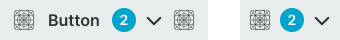
Button Group variant example image Button Group variant example image

Basic

Standard button group item structure with text label and optional supporting elements. Use for most button group implementations requiring clear labeling, standard group interactions, or when providing comprehensive action context with descriptive text within grouped interfaces.

Button Group variant example image Button Group variant example image

Icon-Only

Minimal button group item structure optimized for displaying only icon elements without text labels. Use for compact button groups, toolbar implementations, secondary group controls, or when space constraints require simplified visual presentation while maintaining clear action recognition.

Context Variants

Visual styles and semantic meanings that communicate button group item purpose and importance within the interface hierarchy. These variants determine the item's prominence, color treatment, and contextual messaging to guide user attention and convey action significance within group structures.

Button Group variant example image Button Group variant example image

Default

Standard button group item styling for general-purpose actions that don't require special emphasis within the group. Use for non-critical group interactions, balanced action priorities, or when maintaining equal visual weight across group elements.

Solid Badge

context:
primary
Button Group variant example image Button Group variant example image

Primary

Represents the main action a user should take within the button group. Use for high-priority group actions, primary group functionality, or when one action needs emphasis over other group elements.

Solid Badge

context:
white

Size Variants

Dimensional configurations that control the button group item scale and content presentation to optimize usability across different screen sizes and interface contexts. These variants determine the spatial organization and interaction accessibility for various display environments.

Button Group variant example image Button Group variant example image

Large

Expanded button group item dimensions optimized for desktop and tablet environments with generous screen real estate. Use for detailed group interfaces, comprehensive action areas, or when providing extensive interaction targets within button groups.

Solid Badge

size:
large
Button Group variant example image Button Group variant example image

Medium

Balanced button group item dimensions suitable for standard interface layouts and moderate content density. Use for most button group implementations, responsive group interfaces, or when maintaining optimal balance between action space and group efficiency.

Solid Badge

size:
medium
Button Group variant example image Button Group variant example image

Small

Compact button group item dimensions optimized for mobile devices and space-constrained environments. Use for mobile button groups, dense group systems, or when screen space requires efficient use while maintaining clear action presentation and interaction capabilities.

Solid Badge

size:
small

State Variants

Interactive states that affect user interaction capabilities and visual feedback based on current user activity and button availability. These variants communicate the button group item's functionality and current interaction state while guiding users through successful group navigation.
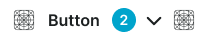
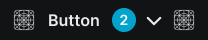
Button Group variant example image Button Group variant example image

Idle

Standard appearance of a button group item when not being interacted with and action is available. Neutral styling indicates the action is accessible and provides clear interactive target within the group structure.

Badge Frame

opacity:
opacity.level.solid
Button Group variant example image Button Group variant example image

Hover

Enhanced visual feedback when a user hovers over a button group item, indicating interactive availability. Elevated styling signals potential action activation and guides user attention to available group functionality.

Badge Frame

opacity:
opacity.level.solid
Button Group variant example image Button Group variant example image

Press

Active feedback state indicating a button group item is currently being activated or pressed. Immediate tactile response provides user confirmation during group interaction and maintains responsive interface behavior.

Badge Frame

opacity:
opacity.level.solid
Button Group variant example image Button Group variant example image

Disabled

Non-interactive state for button group items when actions are not currently accessible due to system conditions or restrictions. Reduced visual prominence indicates unavailability while maintaining group structure and layout consistency.

Badge Frame

opacity:
opacity.context.fg-slight

Button Group

Container elements that organize and present collections of related buttons through unified visual treatment and coordinated functionality. These components serve as the primary action grouping interface, adapting their appearance and layout organization based on context emphasis and spatial arrangement to provide clear action relationships and maintain consistent user experience across all button group scenarios.
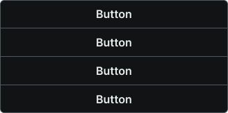
Context Variants

Visual styles and semantic meanings that communicate button group purpose and importance within the interface hierarchy. These variants determine the group's prominence, color treatment, and contextual messaging to guide user attention and convey grouped action significance.
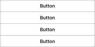
Button Group variant example image Button Group variant example image

Default

Standard button group styling for general-purpose action collections that don't require special emphasis. Use for non-critical group interactions, balanced action priorities, or when maintaining neutral visual weight within the interface.

Button Group variant example image Button Group variant example image

Primary

Represents important action collections that users should prioritize. Use for high-priority group functionality, primary action sets, or when button groups need emphasis within the interface hierarchy.

Layout Variants

Spatial organization configurations that determine the arrangement and orientation of button elements within group structures. These variants control the visual flow and interaction patterns to match different interface contexts and space utilization requirements.
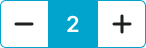
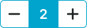
Button Group variant example image Button Group variant example image

Horizontal

Standard button group layout with side-by-side button arrangement for efficient horizontal space utilization. Use for most button group implementations, toolbar interfaces, or when maintaining linear action flow within interface layouts.

Button Group variant example image Button Group variant example image

Vertical

Alternative button group layout with stacked button arrangement for efficient vertical space utilization. Use for sidebar interfaces, mobile button groups, or when vertical space optimization is required while maintaining clear action organization.

Cart Button Group

Specialized interactive elements designed specifically for e-commerce quantity control that provide increment and decrement functionality for product management. These components serve as the primary quantity adjustment interface within shopping experiences, adapting their appearance and functionality based on product context and user interaction requirements to provide clear quantity control and maintain consistent user experience across all cart management scenarios.

Layout Variants

Spatial organization configurations that determine the arrangement and orientation of quantity control elements within cart button group structures. These variants control the visual flow and interaction patterns to match different e-commerce interface contexts and space utilization requirements.

Button Group variant example image Button Group variant example image

Horizontal

Standard cart button group layout with side-by-side increment/decrement button arrangement for efficient horizontal space utilization. Use for most cart implementations, product detail pages, or when maintaining linear quantity control flow within e-commerce interfaces.

Button Group variant example image Button Group variant example image

Vertical

Alternative cart button group layout with stacked increment/decrement button arrangement for efficient vertical space utilization. Use for mobile cart interfaces, compact product displays, or when vertical space optimization is required while maintaining clear quantity control organization.

Size Variants

Dimensional configurations that control the cart button group scale and interaction area to optimize usability across different screen sizes and e-commerce contexts. These variants determine the spatial organization and touch accessibility for various shopping environments.

Button Group variant example image Button Group variant example image

Large

Expanded cart button group dimensions optimized for desktop and tablet shopping environments with generous screen real estate. Use for detailed product pages, comprehensive cart interfaces, or when providing extensive interaction areas for quantity control.

Button Group variant example image Button Group variant example image

Medium

Balanced cart button group dimensions suitable for standard e-commerce layouts and moderate content density. Use for most cart implementations, responsive shopping interfaces, or when maintaining optimal balance between quantity control space and product information.

Button Group variant example image Button Group variant example image

Small

Compact cart button group dimensions optimized for mobile devices and space-constrained shopping environments. Use for mobile cart interfaces, dense product grids, or when screen space requires efficient use while maintaining clear quantity control and touch interaction capabilities.