button-group
Collections of related buttons organized into cohesive sets, providing users with multiple related action options in a single component.
Technical specifications and design system values that define the visual and structural properties of button group components. These specifications ensure consistent implementation across design tools and development environments.
Legend:
- Brackets (
[]) denote a component variant placeholder. - Full emphasis indicates a value specific to that variant.
- Dimmed indicates a value unchanged from the default variant.
Button Group Item
Specifications for individual button group item elements within grouped button structures.
1
Button Group Item
- verticalPadding:
- space.button.[size]-padding-y
- horizontalPadding:
- space.button.[size]-padding-x
- itemSpacing:
- space.button.[size]-gap
- fill:
- color.button.[context].bg-[state]
2
Icon Start
- height:
- size.button.[size]-icon
- width:
- size.button.[size]-icon
- fill:
- color.button.[context].fg-[state]
3
Label Frame
Text only buttons require additional spacing.
- horizontalPadding:
- space.button.[size]-nudge
4
Label Text
- fill:
- color.button.[context].fg-[state]
- typography:
- font.button.[size]
5
Badge Frame
- state:
- idle, hover, press
- opacity:
- opacity.base.solid
- state:
- disabled
- opacity:
- opacity.context.fg-slight
6
Caret Icon
- height:
- size.button.[size]-caret
- width:
- size.button.[size]-caret
- fill:
- color.button.[context].fg-[state]
7
Icon End
- height:
- size.button.[size]-icon
- width:
- size.button.[size]-icon
- fill:
- color.button.[context].fg-[state]
8
Solid Icon-Button
- verticalPadding:
- space.button.[size]-padding-y
- horizontalPadding:
- space.button.[size]-padding-y
- itemSpacing:
- space.button.[size]-gap
- fill:
- color.button.[context].bg-[state]
Button Group
Specifications for the container element that groups collections of related buttons into a unified visual structure.
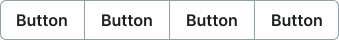
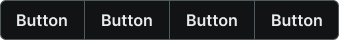
1
Button Group
- itemSpacing:
- space.base.1
- fill:
- color.button.default.border-idle
- borderColor:
- color.button.default.border-idle
- borderRadius:
- borderRadius.button.medium
- borderWidth:
- borderWidth.button.main
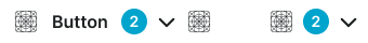
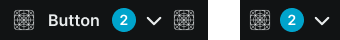
Cart Button Group
Specifications for the specialized quantity control grouping with increment and decrement buttons and a numeric count display for e-commerce contexts.
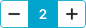

1
Component
- itemSpacing:
- space.base.1
- fill:
- color.button.primary.bg-idle
- borderColor:
- color.button.primary.bg-idle
- borderRadius:
- borderRadius.button.[size]
- borderWidth:
- borderWidth.button.main
2
Count Frame
- height:
- size.button.medium-main
- width:
- size.button.medium-main
- fill:
- color.button.primary.bg-idle
3
Count Text
- size:
- medium
- fill:
- color.button.primary.fg-idle
- typography:
- font.text.large.strong
- size:
- large
- fill:
- color.button.primary.fg-idle
- typography:
- font.text.xlarge.strong
- size:
- small
- fill:
- color.button.primary.fg-idle
- typography:
- font.text.medium.strong