Skip to main content Skip to docs navigation

Collapsible content sections that organize and display information in a space-efficient vertical layout, allowing users to expand and collapse panels to reveal or hide content.

This documentation is a work in progress and may contain incomplete or outdated information. If you have any feedback or suggestions, please open an issue on GitHub.

Variants

Different configurations and states available for accordion components to accommodate various content organization patterns, user interactions, and interface requirements. These variants provide flexibility in appearance, behavior, and spacing while maintaining design consistency across expandable content implementations.

Accordion Item

Individual collapsible content sections that display headers with expandable detail areas. These components serve as building blocks for organizing related information into digestible, space-efficient sections that users can explore on demand based on their specific information needs.
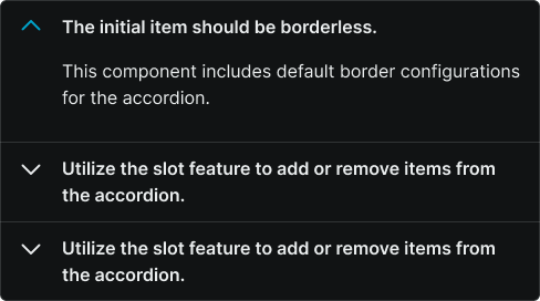
State Variants

Interactive states that control content visibility and visual feedback based on user interaction and current expansion status. These variants communicate the accordion's current state and guide users through content exploration workflows.
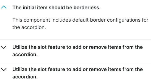
Accordion variant example image Accordion variant example image

Collapsed

Content area is hidden with only the header visible, showing collapsed indicator. Default state that conserves screen space while providing access to section titles and expansion controls.

Accordion variant example image Accordion variant example image

Expanded

Content area is visible with header showing expanded indicator. Active state that reveals detailed information while maintaining context of the section's relationship to other content areas.

Spacing Variants

Different spatial relationships between accordion items and their surrounding elements to accommodate various layout requirements and visual densities. These variants control the visual separation and grouping of expandable content sections.

Accordion variant example image Accordion variant example image

Basic

Standard spacing with visible borders and margins between accordion items. Provides clear visual separation and defined boundaries that help users distinguish between different content sections and interaction areas.

Accordion variant example image Accordion variant example image

Flush

Minimal spacing with connected borders creating seamless visual flow between items. Use when content sections are closely related or when maximizing content density within constrained interface areas.

Size Variants

Different dimensional scales for accordion components to accommodate various content hierarchies and interface contexts. These variants maintain proportional relationships between headers, content areas, and interaction elements while adapting to different design requirements.
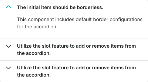
Accordion variant example image Accordion variant example image

Small

Compact accordion size optimized for dense information layouts and secondary content sections. Use in sidebars, detail panels, or when multiple accordions need to coexist within limited vertical space.

Accordion variant example image Accordion variant example image

Medium

Standard accordion size providing balanced proportions for most content organization implementations. Use as the default size for primary content sections and general information hierarchy management.

Accordion variant example image Accordion variant example image

Large

Expanded accordion size designed for prominent content sections and enhanced readability. Use for primary information areas, featured content, or when improved visual prominence and touch accessibility are required.

Accordion

Complete accordion system that manages multiple collapsible sections with coordinated behavior and consistent visual treatment. This composite component handles the orchestration of individual accordion items while providing group-level functionality and interaction patterns.

Spacing Variants

Different spatial configurations for accordion groups that control the visual relationship between multiple collapsible sections and their overall presentation within the interface layout.

Accordion variant example image Accordion variant example image

Basic

Standard spacing with clear separation between accordion items and defined boundaries. Provides structured visual hierarchy that helps users understand content organization and section relationships.

Accordion variant example image Accordion variant example image

Flush

Connected accordion items with shared borders creating unified content blocks. Use when presenting closely related information sections or when creating seamless content experiences within constrained interface areas.

Accordion Item

spacing:
flush
size:
medium