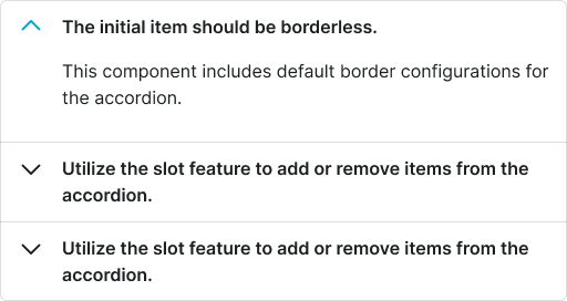
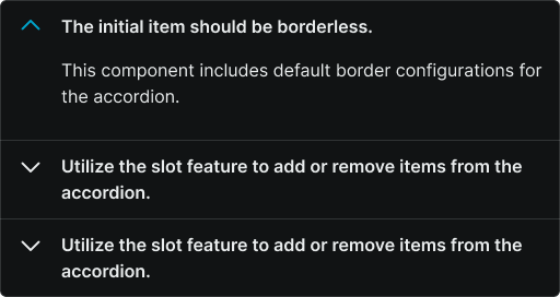
accordion
Collapsible content sections that organize and display information in a space-efficient vertical layout, allowing users to expand and collapse panels to reveal or hide content.
Component properties and controls available for accordion components in Figma, enabling designers to customize appearance, behavior, and interaction states. These properties provide comprehensive control over accordion functionality while maintaining design system consistency.
Accordion Item
Individual collapsible content section properties that control the visual appearance, spacing, and interactive behavior of single accordion elements within the design system.


flush variant
Controls the spacing relationship and visual separation between accordion items and surrounding elements. This property determines whether items display with standard spacing and borders or connect seamlessly for unified content presentation.
- false
- true
is-expanded variant
Controls the expansion state and visual feedback of the accordion item's content visibility. This property manages the collapsed/expanded appearance and determines which interaction indicators and content areas are visible to users.
- true
- false
size variant
Controls the dimensional scale and proportional relationships of the accordion item header, content area, and interactive elements. This property affects the overall visual prominence and touch accessibility of the collapsible section.
- small
- medium
- large
Accordion
Complete accordion system properties that manage multiple collapsible sections and control group-level appearance and spacing behaviors for coordinated accordion implementations.
flush variant
Controls the spacing configuration and visual treatment for the entire accordion group, determining whether multiple items display with standard separation or connect as unified content blocks for seamless user experience.
- false
- true
items slot
Contains the individual accordion items that make up the complete accordion component. This slot allows designers to organize and manage multiple collapsible sections within a single accordion structure, ensuring consistent behavior and appearance across all items.
- Accordion Item