chart
Data visualization components that represent information graphically through various chart types like bar, line, pie, and donut charts.
Different configurations and states available for chart components to accommodate various data visualization requirements, presentation formats, and analytical needs. These variants provide flexibility in appearance, data structure, and visual emphasis while maintaining design consistency across different charting scenarios and data interpretation contexts.
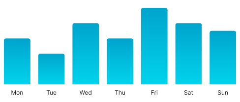
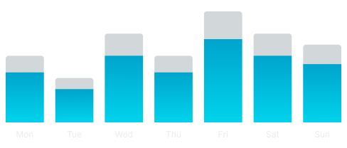
Bar Chart
Visual elements that represent quantitative data through rectangular bars with proportional heights or lengths. These components serve as the primary comparative data visualization interface, adapting their appearance and data organization based on value relationships, categorical groupings, and analytical presentation to provide clear data comparison and maintain consistent user experience across all bar chart scenarios.
Bar Variants
Data presentation configurations that determine the structural organization and comparison approach of bar chart elements. These variants control the data grouping and visual hierarchy to match different analytical requirements and comparative contexts.
Bar variants are not direct variants of the Bar Chart component. To achieve these configurations, you need to dive into the component and change the type variant of the nested "_ Bar - Vertical" components.

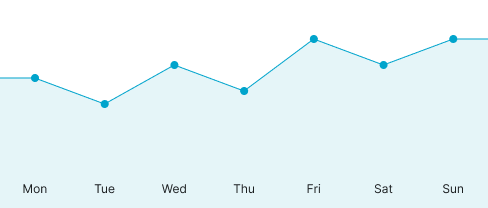
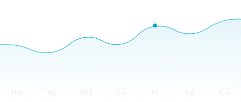
Area Chart
Visual elements that represent quantitative data through filled areas beneath trend lines for continuous data visualization. These components serve as the primary temporal and progressive data interface, adapting their appearance and trend visualization based on data patterns, temporal relationships, and analytical presentation to provide clear progression analysis and maintain consistent user experience across all area chart scenarios.
Graph Variants
Visual presentation configurations that determine the line styling and area treatment of area chart elements. These variants control the aesthetic approach and data emphasis to match different analytical contexts and visual clarity requirements.
Graph variants are not direct variants of the Area Chart component. To achieve these configurations, you need to dive into the component and change the type variant of the nested "_ Area Graph" component.
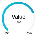
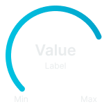
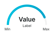
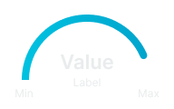
Gauge Chart
Visual elements that represent single metric values through circular or arc-based indicators for performance and status visualization. These components serve as the primary single-value monitoring interface, adapting their appearance and indicator presentation based on value ranges, performance thresholds, and analytical presentation to provide clear metric status and maintain consistent user experience across all gauge chart scenarios.
Graph Variants
Structural configurations that determine the shape and coverage of gauge chart elements. These variants control the visual format and space utilization to match different interface contexts and monitoring requirements.


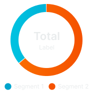
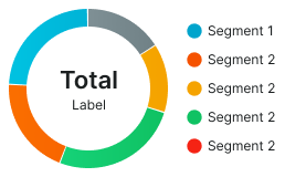
Donut Chart
Visual elements that represent proportional data through segmented circular rings for part-to-whole relationship visualization. These components serve as the primary compositional data interface, adapting their appearance and segment organization based on data proportions, categorical relationships, and analytical presentation to provide clear distribution analysis and maintain consistent user experience across all donut chart scenarios.
Layout Variants
Spatial organization configurations that determine the arrangement and positioning of legend elements relative to donut chart structures. These variants control the information hierarchy and space utilization to match different interface contexts and data presentation requirements.
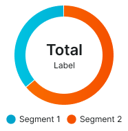
Bottom Legend
Standard donut chart layout with legend positioned at the bottom for traditional information hierarchy and vertical space utilization. Use for most donut chart implementations, desktop interfaces, or when maintaining conventional data presentation patterns with clear categorical identification.
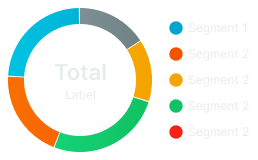
Right Legend
Alternative donut chart layout with legend positioned at the right side for horizontal space optimization and side-by-side information arrangement. Use for wide interface layouts, dashboard implementations, or when horizontal space utilization is preferred while maintaining clear categorical reference.