chart
Data visualization components that represent information graphically through various chart types like bar, line, pie, and donut charts.
Technical specifications and design system values that define the visual and structural properties of chart components. These specifications ensure consistent implementation across design tools and development environments.
Legend:
- Brackets (
[]) denote a component variant placeholder. - Full emphasis indicates a value specific to that variant.
- Dimmed indicates a value unchanged from the default variant.
Bar Value
Specifications for comparative data visualization elements with vertical bar orientation including measurements, colors, typography, and categorical styling attributes. These values define the visual presentation and comparison properties for vertical bar chart implementations.
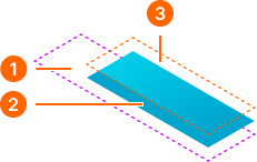
1
Bar Value - Vertical
This container adjusts the heights of "_ Bar Item" components from 10% to 100% for flexible display.
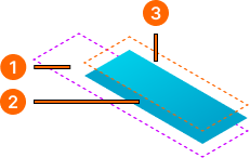
2
Bar Item - Vertical
The nested component's height varies from 10% to 100% of the "_ Bar Value" component.
- fill:
- color.context.primary.base-color
- borderRadiusTopRight:
- borderRadius.context.small
- borderRadiusTopLeft:
- borderRadius.context.small
3
Gradient
Rectangle shape within the Bar Item component.
- blend:
- soft light
- fill:
- gradient.palette.white.l-180
Gauge Graph
Specifications for single metric visualization elements including measurements, colors, typography, and indicator styling attributes. These values define the visual presentation and performance monitoring properties for gauge chart implementations.
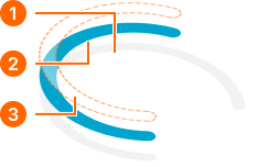
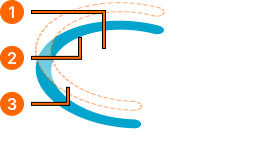
1
Background
Intersect selection boolean operation to visualize the graph base.
- fill:
- color.context.default.dim-slight
2
Value
Intersect selection boolean operation to visualize the graph value.
- fill:
- color.context.primary.base-color
3
Overlay
Intersect selection boolean operation to add gradient overlay to the value.
- blend:
- soft light
- fill:
- gradient.palette.white.l-270