Navigation components that organize content into multiple panels, with only one panel visible at a time, allowing users to switch between related content sections.
On this page
This documentation is a work in progress and may contain incomplete or outdated information. If you have any feedback or suggestions, please open an issue on GitHub.
Different configurations and states available for tab components to accommodate various navigation requirements, user interactions, and visual presentations. These variants provide flexibility in appearance, behavior, and organizational hierarchy while maintaining design consistency across the system.
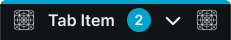
Tab Item
Interactive navigation elements that allow users to switch between different content views or sections within an interface. These components serve as the primary navigation triggers within tabbed interfaces, adapting their appearance and behavior based on activation state, visual treatment, and user interaction to provide clear feedback and maintain consistent navigation experience across all interface contexts.
Activity Variants
Selection state configurations that determine the tab item's current activation status and visual prominence. These variants control the selection feedback and active state presentation to clearly communicate the current content view.
Active
Selected tab item state indicating the currently displayed content section. Use for highlighting the active content view, emphasizing current navigation context, or when providing clear visual confirmation of the selected interface section.
Inactive
Standard tab item state indicating unselected content sections. Use for available navigation options, secondary content areas, or when indicating accessible but currently inactive interface sections.
Style Variants
Visual presentation modes that affect the tab item's appearance and design treatment within the interface. These variants determine the visual approach and aesthetic integration for different design contexts and interface styles.
Regular
Standard tab item styling with balanced visual treatment and integrated appearance. Use for most tab implementations requiring clear navigation, standard interfaces, or when maintaining consistent visual hierarchy without special emphasis.
Fancy
Enhanced tab item styling with distinctive visual treatment and elevated design elements. Use for premium interfaces, featured navigation sections, or when providing enhanced visual appeal and sophisticated interaction design.
Size Variants
Dimensional configurations that control the tab item scale and proportional relationships to accommodate different interface densities and content requirements. These variants determine the spatial characteristics and visual weight for various layout contexts.
Large
Expanded tab item dimensions optimized for spacious interfaces and prominent navigation. Use for primary navigation systems, desktop environments, or when providing generous interaction areas with enhanced visibility.
Medium
Balanced tab item dimensions suitable for standard interface layouts and moderate content density. Use for most tab implementations, responsive interfaces, or when maintaining optimal balance between space efficiency and usability.
Small
Compact tab item dimensions optimized for dense layouts and space-constrained environments. Use for secondary navigation, mobile interfaces, or when maximizing content space while maintaining functional navigation capabilities.
State Variants
Interactive feedback configurations that communicate user interaction and tab item responsiveness. These variants provide visual feedback for different interaction states to enhance user experience and interface clarity.
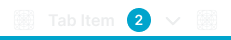
Idle
Default tab item state with standard appearance and no active interaction. Use for normal display conditions, resting states, or when indicating available but not currently engaged navigation elements.
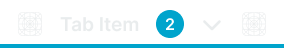
Hover
Interactive feedback state indicating mouse interaction or potential selection. Use for desktop interfaces, rollover effects, or when providing visual confirmation of user interaction with navigation elements.
Press
Active interaction state indicating user activation or touch engagement. Use for touch interfaces, click feedback, or when providing immediate visual response to user interaction with navigation elements.
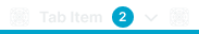
Disabled
Inactive state indicating unavailable or restricted navigation options. Use for conditional content, restricted access scenarios, or when temporarily preventing navigation to specific interface sections.
Tab Bar
Container elements that organize and present multiple tab items within a cohesive navigation structure. These components serve as the foundational framework for tabbed navigation systems, managing tab item layout, visual grouping, and overall navigation presentation while maintaining consistent organizational patterns across different interface contexts.
Type Variants
Layout configurations that determine the tab bar's positioning and structural arrangement within the interface. These variants control the navigation placement and organizational approach for different layout requirements and interface contexts.
Top
Standard tab bar positioning located at the top of content areas for primary navigation access. Use for main navigation systems, content section switching, or when providing traditional tabbed interface patterns with top-aligned navigation.
Bottom
Alternative tab bar positioning located at the bottom of content areas for accessible navigation access. Use for mobile interfaces, secondary navigation systems, or when optimizing navigation accessibility and thumb-friendly interaction patterns.
Fancy
Enhanced tab bar configuration with distinctive visual treatment and elevated design elements. Use for premium interfaces, featured navigation systems, or when providing enhanced visual appeal and sophisticated navigation design regardless of positioning.