Container components that group related content and actions about a single subject, presenting information in scannable, visually distinct blocks.
On this page
This documentation is a work in progress and may contain incomplete or outdated information. If you have any feedback or suggestions, please open an issue on GitHub.
Different configurations and states available for card components to accommodate various content presentation requirements, layout patterns, and visual organization needs. These variants provide flexibility in appearance, content structure, and positioning while maintaining design consistency across the system.
Card
Container elements that organize and present related content within structured visual boundaries. These components serve as the primary content grouping interface within layouts, adapting their appearance and content organization based on information hierarchy, media integration, and contextual presentation to provide clear content separation and maintain consistent user experience across all card scenarios.
Image Spacing Variants
Content presentation configurations that determine the visual relationship between images and card boundaries. These variants control the spatial integration and visual impact of image elements within card layouts.
Contained
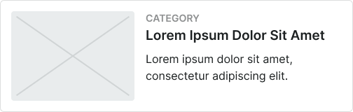
Standard card presentation with padded image spacing for balanced visual integration. Use for content cards requiring clear separation between image and text elements, standard layouts, or when maintaining consistent visual rhythm with surrounding interface elements.
Full-bleed
Enhanced card presentation with image extending to card edges for maximum visual impact. Use for media-focused content, promotional cards, gallery layouts, or when emphasizing visual content over textual information.
Size Variants
Dimensional configurations that control the card scale and content presentation to optimize usability across different screen sizes and device capabilities. These variants determine the spatial organization and readability characteristics for various display contexts.
Large
Expanded card dimensions optimized for tablet and desktop environments with generous screen real estate. Use for detailed content presentations, comprehensive information cards, featured content, or when providing extensive interaction areas and enhanced readability on larger displays.
Medium
Balanced card dimensions suitable for standard interface layouts and moderate content density. Use for most card implementations, responsive interfaces, or when maintaining optimal balance between content space and layout efficiency.
Small
Compact card dimensions optimized for mobile devices and space-constrained environments. Use for mobile layouts, dense grid systems, summary cards, or when screen space requires efficient use while maintaining clear content presentation and interaction capabilities.
Positioning Variants
Layout configurations that determine the placement and orientation of image elements within card structures. These variants control the visual hierarchy and content flow to match different design contexts and information priorities.
Top
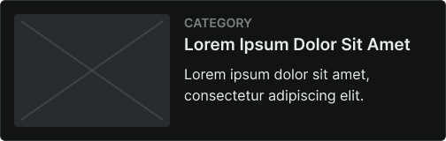
Standard image positioning at the top of card content for traditional visual hierarchy. Use for most card implementations, article previews, product displays, or when following conventional content organization patterns.
Bottom
Alternative image positioning at the bottom of card content for inverted visual emphasis. Use for text-first content, summary cards, or when prioritizing textual information over visual elements.
Left
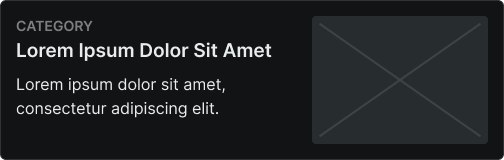
Horizontal image positioning on the left side for compact layout efficiency. Use for list-style cards, mobile layouts, content summaries, or when optimizing horizontal space utilization.
Right
Horizontal image positioning on the right side for alternative layout arrangement. Use for varied visual rhythm, content differentiation, or when providing layout diversity within card collections.
Card Header
Structural elements that provide identification, navigation, and contextual information for card content. These components establish card purpose and hierarchy while offering supplementary functionality and visual organization within card layouts.
Type Variants
Content structure configurations that determine the layout and functionality of card header elements. These variants control the information hierarchy and interactive capabilities to match different card contexts and user requirements.
Standard
Standard header configuration with balanced content organization and integrated functionality. Use for most card implementations requiring clear identification, consistent header structure, or when maintaining standard card organization patterns.
Card Footer
Action and navigation elements that provide interactive functionality and supplementary controls for card content. These components complete card structures while offering user interaction options and additional functionality within card layouts.
Type Variants
Content structure configurations that determine the layout and interaction patterns of card footer elements. These variants control the action organization and functional capabilities to match different user interaction requirements.
Basic Actions
Standard footer configuration with essential action elements and simple interaction patterns. Use for cards requiring basic user actions, minimal interaction complexity, or when providing straightforward functional access.
Horizontal Buttons
Footer configuration with horizontally arranged button elements for multiple action options. Use for cards requiring multiple user choices, action variety, or when optimizing horizontal space for action presentation.
Vertical Buttons
Footer configuration with vertically stacked button elements for space-efficient action organization. Use for mobile layouts, space-constrained cards, or when prioritizing button accessibility over horizontal space efficiency.