story
Full-screen, immersive components that present sequential narrative content, typically featuring images or videos with interactive navigation.
Different configurations and states available for story components to accommodate various content presentation requirements, interaction patterns, and visual engagement needs. These variants provide flexibility in appearance, content structure, and state management while maintaining design consistency across the system.
Story Button
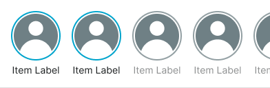
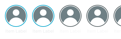
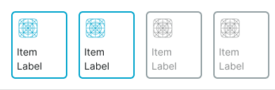
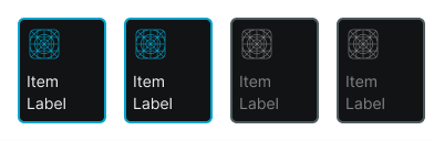
Interactive elements that provide access to story content through compact, circular presentation formats. These components serve as the primary entry point for story experiences, adapting their appearance and behavior based on content type, viewing state, and visual presentation requirements to provide clear access patterns and maintain consistent user experience across all story scenarios.
Type Variants
Content structure configurations that determine the visual presentation format and content display approach of story button components. These variants control the content organization and interaction emphasis to match different story identification requirements.
State Variants
Visual presentation modes that communicate the story's viewing status and user interaction history. These variants determine the visual emphasis and user awareness approach for different story engagement states.


Story Card
Container elements that organize and present story content within structured visual boundaries through expanded presentation formats. These components serve as the primary content display interface for story experiences, adapting their appearance and content organization based on viewing state, content density, and contextual presentation to provide clear story access and maintain consistent user experience across all story scenarios.
State Variants
Visual presentation modes that communicate the story's viewing status and user interaction history within card-based layouts. These variants determine the visual emphasis and user awareness approach for different story engagement states in expanded format presentations.


Story Carousel
Sequential presentation elements that organize and display collections of story content through horizontal navigation patterns. These components serve as the primary story collection interface, adapting their appearance and content organization based on story type, presentation format, and contextual requirements to provide clear story browsing and maintain consistent user experience across all story carousel scenarios.
Type Variants
Content structure configurations that determine the story presentation format and layout approach within carousel contexts. These variants control the story organization and interaction emphasis to match different story collection requirements.
Card
Story carousel presentation using rectangular story card components with icon and label for enhanced content identification. Use for story collections requiring clearer content labeling, desktop story experiences, or when providing comprehensive story identification through framed card elements.