story
Full-screen, immersive components that present sequential narrative content, typically featuring images or videos with interactive navigation.
Configurable properties that control the appearance, behavior, and functionality of story components for sequential content browsing interfaces.
Story Button
Properties that define the visual type, state, and icon of individual story indicator buttons.


type variant
Controls the visual presentation format of the story button, determining whether an avatar or icon is displayed as the primary visual element.
- avatar
- icon
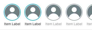
is-unread variant
Controls the read status and visual treatment of the story button based on content consumption state.
- true
- false
icon instance-swap
- type:
- icon
Specifies which icon component to display within the story button visual element.
- Icon Placeholder
Story Card
Properties that define the read state and visual icon of story card elements.


is-unread variant
Controls the read status and visual treatment of the story card based on content consumption state.
- true
- false
icon instance-swap
Specifies which icon component to display within the story card visual element.
- Icon Placeholder
Story Carousel
Properties that define the layout type of story carousel container elements.
type variant
Controls the display format and content presentation approach of the story carousel, determining whether button or card style story indicators are used.
- button
- card