story
Full-screen, immersive components that present sequential narrative content, typically featuring images or videos with interactive navigation.
Technical specifications and design system values that define the visual and structural properties of story components. These specifications ensure consistent implementation across design tools and development environments for full-screen narrative and content browsing interfaces.
Legend:
- Brackets (
[]) denote a component variant placeholder. - Full emphasis indicates a value specific to that variant.
- Dimmed indicates a value unchanged from the default variant.
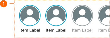
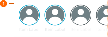
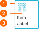
Story Button
Specifications for compact story entry points including measurements, colors, typography, and circular framing styling attributes. These values define the presentation and read-state properties for each story button variant with interactive access behaviors.
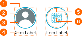
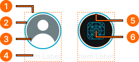
1
Story Button
- height:
- size.unit.96
- width:
- size.unit.72
- itemSpacing:
- space.unit.4
2
Avatar Frame
- is-unread:
- true
- verticalPadding:
- space.unit.4
- horizontalPadding:
- space.unit.4
- borderColor:
- color.context.primary.base-color
- borderRadius:
- borderRadius.context.round-72
- borderWidth:
- borderWidth.context.xlarge
- is-unread:
- false
- verticalPadding:
- space.unit.4
- horizontalPadding:
- space.unit.4
- borderColor:
- color.context.default.border-main
- borderRadius:
- borderRadius.context.round-72
- borderWidth:
- borderWidth.context.xlarge
3
Avatar
- height:
- size.unit.64
- width:
- size.unit.64
4
Story Text
- is-unread:
- true
- fill:
- color.context.default.fg-main
- typography:
- font.text.small.normal
- is-unread:
- false
- fill:
- color.context.default.fg-subtle
- typography:
- font.text.small.normal
5
Icon Frame
- height:
- size.unit.64
- width:
- size.unit.64
- fill:
- color.context.default.bg-main
6
Icon
- is-unread:
- true
- height:
- size.unit.40
- width:
- size.unit.40
- fill:
- color.context.primary.base-color
- is-unread:
- false
- height:
- size.unit.40
- width:
- size.unit.40
- fill:
- color.context.default.fg-subtle
Story Card
Specifications for expanded story card entries including measurements, colors, typography, and content framing styling attributes. These values define the visual presentation and read-state properties for each story card variant with content preview behaviors.
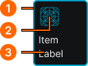
1
Story Card
- is-unread:
- true
- height:
- size.unit.96
- width:
- size.unit.80
- verticalPadding:
- space.unit.8
- horizontalPadding:
- space.unit.8
- itemSpacing:
- space.unit.8
- fill:
- color.context.default.bg-main
- borderColor:
- color.context.primary.base-color
- borderRadius:
- borderRadius.context.medium
- borderWidth:
- borderWidth.context.xlarge
- is-unread:
- false
- height:
- size.unit.96
- width:
- size.unit.80
- verticalPadding:
- space.unit.8
- horizontalPadding:
- space.unit.8
- itemSpacing:
- space.unit.8
- fill:
- color.context.default.bg-main
- borderColor:
- color.context.default.border-main
- borderRadius:
- borderRadius.context.medium
- borderWidth:
- borderWidth.context.xlarge
2
Icon
- is-unread:
- true
- height:
- size.unit.32
- width:
- size.unit.32
- fill:
- color.context.primary.base-color
- is-unread:
- false
- height:
- size.unit.32
- width:
- size.unit.32
- fill:
- color.context.default.fg-subtle
3
Story Text
- is-unread:
- true
- fill:
- color.context.default.fg-main
- typography:
- font.text.small.normal
- is-unread:
- false
- fill:
- color.context.default.fg-subtle
- typography:
- font.text.small.normal
Story Carousel
Specifications for horizontal story collection layouts including measurements, spacing, and content organization styling attributes. These values define the sequential presentation and container properties for story browsing implementations.