Components that display collections of related items in a structured, scannable format with consistent styling and spacing.
On this page
This documentation is a work in progress and may contain incomplete or outdated information. If you have any feedback or suggestions, please open an issue on GitHub.
Different configurations and states available for list components to accommodate various content presentation requirements, interaction patterns, and visual organization needs. These variants provide flexibility in appearance, behavior, and functionality while maintaining design consistency across the system.
List Item
Individual list elements that display content through different layout patterns and interactive states. These components serve as the core building blocks within list structures, adapting their appearance and behavior based on content type, user interaction, and contextual requirements.
Type Variants
Different content presentation methods for displaying various types of information, each optimized for specific content types and visual hierarchy. These variants determine the fundamental layout and visual structure of the list item element.
Basic
Standard list item with text content and minimal visual elements. Use for simple lists, menu items, navigation elements, or when displaying straightforward textual information without additional media.
With Icon
List item enhanced with icon element for visual identification and categorization. Use for navigation menus, feature lists, action items, or when icons help users quickly identify content type or function.
With Image
List item featuring image element for rich media representation and visual context. Use for galleries, product lists, user profiles, or when visual content is essential for content identification and engagement.
Spacing Variants
Layout configurations that control the internal padding and visual separation of list items. These variants determine the visual density and spacing relationships to match different design contexts and content requirements.
Basic
Standard spacing with balanced padding for optimal readability and touch accessibility. Use for most list implementations requiring comfortable content separation and clear visual hierarchy.
Flush
Minimal spacing with reduced padding for dense layouts and space-efficient designs. Use when maximizing content density, compact interfaces, or when visual elements need minimal separation.
Text Variants
Content structure configurations that determine the text layout and information hierarchy within list items. These variants control the amount of textual detail and visual organization to match different informational requirements.
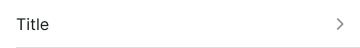
Basic
Simple text layout with primary content only. Use for straightforward lists, basic navigation, or when content requires minimal textual complexity and clear focus.
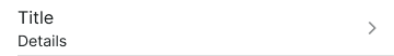
Details
Enhanced text layout with additional descriptive information and context. Use for detailed lists, product descriptions, or when supplementary information supports primary content understanding.
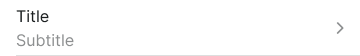
Subtitle
Text layout with primary and secondary text hierarchy for categorized information. Use for organized content presentation, grouped items, or when content benefits from clear informational structure.
Input Inactive
Text layout optimized for placeholder content in editable list items. Use for empty input states, form templates, or when indicating available input areas with placeholder guidance.
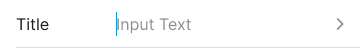
Input Active
Text layout optimized for active editable content and user-entered data. Use for active input states, live editing scenarios, or when displaying user-entered text within list items.
Disclosure Variants
Directional indicators that communicate expandable content and navigation hierarchy within list structures. These variants determine the visual cues for collapsible sections and nested content organization.
Right
Rightward-pointing indicator suggesting forward navigation or expandable content. Use for navigation lists, hierarchical menus, or when indicating progression to detailed views.
Down
Downward-pointing indicator suggesting expanded or collapsible content below. Use for accordion interfaces, expandable sections, or when indicating visible nested content.
Up
Upward-pointing indicator suggesting collapsible content or upward navigation. Use for collapsing expanded sections, return navigation, or when indicating content closure.
Assist Variants
Supplementary elements that provide additional functionality and contextual information within list items. These variants enhance list items with interactive elements and status indicators for improved user experience.
Basic
Standard list item without additional assistance elements. Use for simple content presentation requiring minimal interactive or informational enhancements.
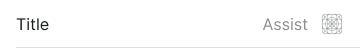
Icon
List item enhanced with functional icon for actions or status indication. Use for actionable lists, status displays, or when icons provide essential functional context.
Info
List item with informational element providing additional context or details. Use for explanatory content, help systems, or when users benefit from contextual information access.
Check
List item with checkbox element for selection and bulk operations. Use for selectable lists, multi-selection interfaces, or when users need to choose multiple items.
Popup
List item with popup trigger for additional options or detailed information. Use for contextual menus, detailed views, or when space constraints require hidden content access.
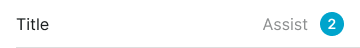
Badge
List item with badge element for status, counts, or categorical information. Use for notification lists, status indicators, or when visual labeling enhances content understanding.
Switch
List item with toggle switch for binary setting control. Use for preference lists, configuration interfaces, or when users need to enable/disable specific options.
Edit Variants
Interactive states that communicate list item modification capabilities and selection status. These variants provide visual feedback for editing operations and content management workflows.
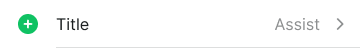
Add
Visual state indicating new item addition or creation capability. Use for expandable lists, content creation workflows, or when emphasizing addition functionality.
Remove
Visual state indicating item deletion or removal capability. Use for content management, destructive operations, or when providing clear removal feedback.
Selected
Visual state indicating item selection for operations or navigation. Use for selectable lists, active states, or when highlighting user choices.
Unselected
Visual state indicating available but unselected items. Use for multi-selection interfaces, choice scenarios, or when maintaining clear selection status.
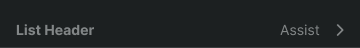
List Header
Structural elements that provide context and organization for list content through titles and organizational information. These components establish visual hierarchy and content categorization within list structures.
Spacing Variants
Layout configurations that control the header spacing and visual separation within list structures. These variants determine the visual prominence and spacing relationships for different organizational contexts.
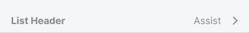
Basic
Standard header spacing with balanced padding for clear content organization. Use for most list implementations requiring clear section separation and readable organizational structure.
Flush
Minimal header spacing with reduced padding for compact layouts and space efficiency. Use when maximizing content density, compact interfaces, or when headers need minimal visual separation.
List Footer
Structural elements that provide closure and additional actions for list content through summary information and supplementary controls. These components complete list sections and offer additional functionality.
Spacing Variants
Layout configurations that control the footer spacing and visual separation within list structures. These variants determine the visual closure and spacing relationships for different content contexts.
Basic
Standard footer spacing with balanced padding for clear content closure. Use for most list implementations requiring clear section completion and readable supplementary information.
Flush
Minimal footer spacing with reduced padding for compact layouts and space efficiency. Use when maximizing content density, compact interfaces, or when footers need minimal visual separation.
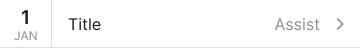
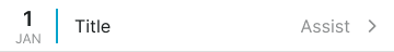
List Event
Specialized list elements designed for event and temporal content presentation with enhanced visual indicators. These components adapt standard list structures for time-based information and calendar integration.
Style Variants
Visual presentation modes that affect the event's appearance and temporal significance within list contexts. These variants determine the visual emphasis and categorical identification for different event types.
Basic
Standard event styling with minimal visual enhancement for simple temporal content. Use for basic event lists, simple scheduling, or when events require straightforward presentation without additional emphasis.
Fancy
Enhanced event styling with colored indicator elements for categorization and visual identification. Use for calendar integration, categorized events, or when color coding improves content organization and user recognition.
List Swipe
Interactive list elements that reveal additional actions and options through swipe gestures on touch devices. These components provide space-efficient access to secondary functionality while maintaining clean list appearance.
Direction Variants
Swipe gesture orientations that determine the direction of gesture interaction and content revelation. These variants establish the interaction pattern for accessing hidden functionality.
Swipe Left
Left-directional swipe gesture revealing actions positioned on the right side. Use for destructive actions, secondary options, or when following platform conventions for action revelation.
Swipe Right
Right-directional swipe gesture revealing actions positioned on the left side. Use for positive actions, primary options, or when providing alternative interaction patterns for action access.
Action Variants
Content configurations that determine the type of actions revealed through swipe interactions. These variants control the presentation format and visual approach for accessing hidden functionality.
Text
Text-based actions revealed through swipe gesture for clear labeling and action identification. Use for descriptive operations, complex actions, or when text labels provide necessary context for user understanding.
Icon
Icon-based actions revealed through swipe gesture for compact visual representation and quick recognition. Use for common operations, space-constrained interfaces, or when icons effectively communicate action purpose without text labels.


