list
Components that display collections of related items in a structured, scannable format with consistent styling and spacing.
Configurable properties that control the appearance, behavior, and functionality of list components for content organization and interactive displays.
List Item
Properties that define the visual state and interactive behavior of individual list item elements.


flush boolean
Controls the spacing variant of the list item, determining whether standard or minimal padding is applied.
- true
- false
type variant
Controls the content presentation method and visual structure of the list item.
- basic
- icon
- image
has-disclosure boolean
Controls the visibility of directional indicators for expandable content and navigation hierarchy.
- true
- false
has-assist boolean
Controls the visibility of supplementary elements that provide additional functionality and contextual information.
- true
- false
has-edit boolean
Controls the visibility of interactive states for modification capabilities and selection status.
- true
- false
text-type variant
Controls the text layout and information hierarchy within the list item content structure.
- basic
- details
- subtitle
- input-placeholder
- input-text
title text
Specifies the primary text content displayed as the main heading or label within the list item.
details text
Specifies the secondary descriptive text content that provides additional context and information.
subtitle text
Specifies the hierarchical secondary text content that creates categorized information structure.
value text
Specifies the text content displayed in editable list items, covering both placeholder and active user-entered data states.
icon-instance instance-swap
Specifies which icon component to display when the list item includes icon elements.
edit-state variant
Specifies which edit state component to display when has-edit property is enabled.
disclosure-direction variant
Controls the directional orientation of disclosure indicators for expandable content.
- right
- down
- up
assist-type variant
Controls the type of supplementary element displayed when has-assist property is enabled.
- basic
- icon
- info
- check
assist-text text
Specifies the text content displayed within assistance elements for contextual information.
assist-icon instance-swap
Specifies which icon component to display within assistance elements when assist-type requires icon presentation.
List Header
Properties that control the layout and content structure of list header elements for organizational context.


flush boolean
Controls the spacing variant of the list header, determining whether standard or minimal padding is applied.
- true
- false
has-disclosure boolean
Controls the visibility of directional indicators for expandable sections and content organization.
- true
- false
has-assist boolean
Controls the visibility of supplementary elements that provide additional functionality within header context.
- true
- false
List Footer
Properties that control the layout and content structure of list footer elements for section closure and supplementary actions.
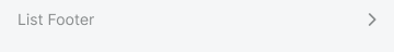

flush boolean
Controls the spacing variant of the list footer, determining whether standard or minimal padding is applied.
- true
- false
has-disclosure boolean
Controls the visibility of directional indicators for expandable content within footer context.
- true
- false
List Event
Properties that define the visual state and interactive behavior of specialized list elements for event and temporal content presentation.


colored variant
Controls the visual styling and colored indicator elements for event categorization and identification.
- true
- false
has-disclosure boolean
Controls the visibility of directional indicators for expandable event content and detailed information.
- true
- false
has-assist boolean
Controls the visibility of supplementary elements that provide additional functionality and contextual information.
- true
- false
has-edit boolean
Controls the visibility of interactive states for modification capabilities and selection status.
- true
- false
List Swipe
Properties that define the interactive behavior and action configuration of swipe-enabled list elements for gesture-based functionality.


swipe variant
Controls the directional orientation of swipe gestures for revealing hidden actions and functionality.
- left
- right
type variant
Controls the presentation format of actions revealed through swipe interactions, determining whether text or icon-based display is used.
- text
- icon
has-2nd-action boolean
Controls the visibility of a secondary action element within the swipe-revealed action set.
- true
- false
has-3rd-action boolean
Controls the visibility of a tertiary action element within the swipe-revealed action set.
- true
- false