list
Components that display collections of related items in a structured, scannable format with consistent styling and spacing.
Technical specifications and design system values that define the visual and structural properties of list components. These specifications ensure consistent implementation across design tools and development environments.
Legend:
- Brackets (
[]) denote a component variant placeholder. - Full emphasis indicates a value specific to that variant.
- Dimmed indicates a value unchanged from the default variant.
List Item
Specifications for individual list item elements including measurements, colors, typography, and styling attributes. These values define the core appearance and content presentation properties for each list item variant.
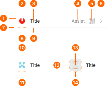
1
List Item
- flush:
- false
- verticalPadding:
- space.list.padding-y
- horizontalPadding:
- space.list.padding-x
- itemSpacing:
- space.list.gap
- fill:
- color.context.default.bg-main
- flush:
- true
- verticalPadding:
- space.list.padding-y
- horizontalPadding:
- none
- itemSpacing:
- space.list.gap
- fill:
- color.context.default.transparent-color
2
Edit Icon
- state:
- remove
- height:
- size.list.icon
- width:
- size.list.icon
- fill:
- color.context.danger.base-color
- state:
- add
- height:
- size.list.icon
- width:
- size.list.icon
- fill:
- color.context.success.base-color
- state:
- selected
- height:
- size.list.icon
- width:
- size.list.icon
- fill:
- color.context.primary.base-color
- state:
- unselected
- height:
- size.list.icon
- width:
- size.list.icon
- fill:
- color.context.neutral.base-color
3
Title
- fill:
- color.context.default.fg-main
- typography:
- font.text.medium.normal
4
Assist Text
- fill:
- color.context.default.fg-subtle
- typography:
- font.text.medium.normal
5
Assist Icon
- height:
- size.list.icon
- width:
- size.list.icon
- fill:
- color.context.default.fg-subtle
5
Disclosure Icon
- height:
- size.list.icon
- width:
- size.list.disclosure
- fill:
- color.context.default.fg-subtle
7
Separator
- flush:
- false
- paddingLeft:
- space.list.padding-x
- gap:
- space.list.gap
- flush:
- true
- paddingLeft:
- none
- gap:
- space.list.gap
8
Edit Indent
A transparent line whose visibility is tied to the edit property.
- height:
- size.asset.separator
- width:
- size.list.icon
- fill:
- color.context.default.transparent-color
9
Separator Line
A separator line with a width set to fill.
- height:
- size.asset.separator
- fill:
- color.context.default.border-subtle
10
List Icon
- height:
- size.list.icon
- width:
- size.list.icon
- fill:
- color.context.default.icon-main
11
Icon Indent
- height:
- size.asset.separator
- width:
- size.list.icon
- fill:
- color.context.default.transparent-color
12
Image Frame
A container frame used to create negative margins in Figma.
- height:
- size.list.icon
13
List Image
- height:
- size.list.image
- width:
- size.list.image
- verticalMargin:
- -1 * space.list.nudge
14
Image Indent
- height:
- size.asset.separator
- width:
- size.list.icon
- fill:
- color.context.default.transparent-color
List Header
Specifications for list header elements including measurements, colors, typography, and organizational styling attributes. These values define the structural properties and visual hierarchy for section organization within list contexts.
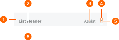
1
List Header
- flush:
- false
- horizontalPadding:
- space.list.padding-x
- paddingTop:
- space.context.large
- paddingBottom:
- space.context.xsmall
- fill:
- color.context.default.bg-even
- flush:
- true
- horizontalPadding:
- space.base.0
- paddingTop:
- space.context.large
- paddingBottom:
- space.context.xsmall
- fill:
- color.context.default.transparent-color
2
Header Text
- fill:
- color.context.default.fg-subtle
- typography:
- font.text.small.mass
3
Assist Text
- fill:
- color.context.default.fg-subtle
- typography:
- font.text.small.normal
4
Disclosure Frame
- height:
- size.icon.glyph.small
5
Disclosure Icon
- height:
- size.list.icon
- width:
- size.list.disclosure
- fill:
- color.context.default.fg-subtle
6
Separator Line
- height:
- size.asset.separator
- fill:
- color.context.default.border-subtle
List Footer
Specifications for list footer elements including measurements, colors, typography, and closure styling attributes. These values define the structural properties and visual completion for section endings within list contexts.
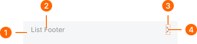
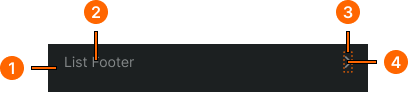
1
List Footer
- flush:
- false
- horizontalPadding:
- space.list.padding-x
- paddingTop:
- space.context.xsmall
- paddingBottom:
- space.context.large
- fill:
- color.context.default.bg-even
- flush:
- true
- horizontalPadding:
- space.base.0
- paddingTop:
- space.context.xsmall
- paddingBottom:
- space.context.large
- fill:
- color.context.default.transparent-color
2
Footer Text
- fill:
- color.context.default.fg-subtle
- typography:
- font.text.small.normal
3
Disclosure Frame
- height:
- size.icon.glyph.small
4
Disclosure Icon
- height:
- size.list.icon
- width:
- size.list.disclosure
- fill:
- color.context.default.fg-subtle