Input components that provide a calendar interface for users to select dates, date ranges, or specific time periods.
On this page
This documentation is a work in progress and may contain incomplete or outdated information. If you have any feedback or suggestions, please open an issue on GitHub.
Different configurations and states available for date picker components to accommodate various date selection requirements, interaction patterns, and temporal navigation needs. These variants provide flexibility in appearance, behavior, and functionality while maintaining design consistency across different date selection contexts and calendar presentation scenarios.
Day Item
Individual date elements that display specific days within calendar structures. These components serve as the core interactive building blocks within date picker interfaces, adapting their appearance and behavior based on date status, user interaction, and contextual requirements to provide clear date selection and maintain consistent user experience across all calendar scenarios.
State Variants
Date-based configurations that determine the visual state and interactive capabilities of day elements based on their temporal context and user interaction status. These variants control the date appearance and selection feedback to provide clear temporal navigation.
Default
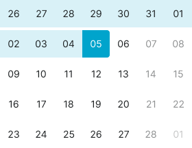
Standard appearance of a day element representing a regular date within the current month view. Neutral styling indicates the date is available for selection and provides clear interactive target for date choosing.
Today
Emphasized styling for the current date to provide temporal reference and orientation. Use for highlighting the present day, providing calendar context, or when users need clear indication of today's date within the selection interface.
Weekend
Alternative styling for weekend dates to provide visual distinction from weekdays. Use for Saturday and Sunday dates, non-working days, or when providing visual differentiation based on day-of-week context.
Outside
Subdued styling for dates from previous or next months that appear in the current month view. Use for overflow dates, month transition context, or when providing complete week row display while maintaining month focus.
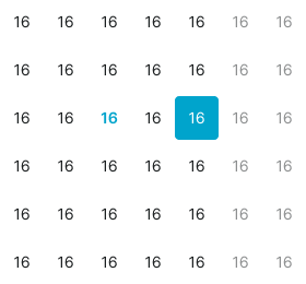
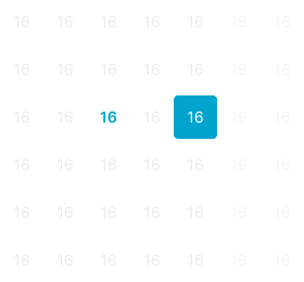
Selected
Highlighted state indicating the currently chosen date within the date picker interface. Distinct styling provides clear feedback about current selection and maintains positional awareness within date navigation.
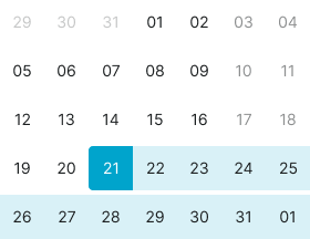
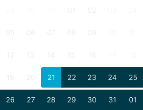
Range Start
Starting point styling for date range selections indicating the first selected date. Use for range picker interfaces, booking systems, period selection, or when marking the beginning of a date span.
Range End
Ending point styling for date range selections indicating the last selected date. Use for range picker interfaces, booking systems, period selection, or when marking the conclusion of a date span.
Range Middle
Intermediate styling for dates within selected range boundaries. Use for date spans, booking periods, multi-day selections, or when providing visual indication of dates between range start and end points.
Range Today
Combined styling for today's date when it falls within a selected range. Use for range selections that include the current date, providing both temporal reference and selection context.
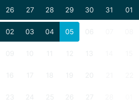
Hover
Enhanced visual feedback when hovering over regular dates. Provides interaction preview and guides user attention to available date selection options.
Hover Today
Enhanced visual feedback when hovering over today's date. Combines current date emphasis with interaction availability to provide clear selection preview.
Nav Item
Navigation elements that provide temporal movement and month selection within date picker interfaces. These components serve as essential navigation controls for calendar browsing, adapting their appearance and functionality based on navigation type and interaction requirements.
Type Variants
Navigation structure configurations that determine the functionality and presentation format of navigation elements. These variants control the navigation approach and interaction method to match different temporal movement requirements.
Prev
Backward navigation element for moving to previous months or time periods. Use for month navigation, temporal browsing, historical date access, or when providing backward movement through calendar views.
Next
Forward navigation element for moving to next months or time periods. Use for month navigation, temporal browsing, future date access, or when providing forward movement through calendar views.
Dropdown
Interactive selection element for direct month or year access through dropdown interface. Use for quick navigation, direct period selection, or when providing efficient access to distant dates without sequential navigation.
State Variants
Interactive states that affect user interaction capabilities and visual feedback based on current user activity and navigation element status. These variants communicate the navigation element's availability and current interaction state.
Idle
Standard appearance of a navigation element when not being interacted with and available for use. Neutral styling indicates the navigation control is accessible for interaction and provides clear interactive target.
Hover
Enhanced visual feedback when hovering over a navigation element. Provides interaction preview and guides user attention to available navigation options within the date picker interface.
Press
Active state indicating the navigation element is being pressed or activated. Distinct styling provides immediate tactile feedback during user interaction and confirms navigation action initiation.
Label Item
Individual label elements that display specific text content within date picker interfaces. These components serve as informational and navigational options for efficient date picker interaction, adapting their appearance based on user interaction and selection status.
State Variants
Interactive states that affect user interaction capabilities and visual feedback based on current user activity and month selection status. These variants communicate the month's availability and current selection state.
Idle
Standard appearance of a month element when not being interacted with and available for selection. Neutral styling indicates the month is accessible for navigation and provides clear interactive target.
Hover
Enhanced visual feedback when hovering over a month element. Provides interaction preview and guides user attention to available month selection options.
Active
Highlighted state indicating the currently selected month within the picker interface. Distinct styling provides clear feedback about current temporal position and navigation context.
Title Row
Navigation header elements that display current temporal context and provide access to navigation controls. These components serve as the primary orientation interface within date pickers, containing navigation buttons and month dropdown functionality for efficient calendar navigation.
Type Variants
Navigation structure configurations that determine the functionality and presentation format of title elements. These variants control the navigation interface and temporal context display to match different date picker requirements.
Basic
Standard title structure with essential navigation controls and current period display. Use for simple date pickers, basic calendar interfaces, or when providing minimal navigation complexity with clear temporal orientation.
Separate
Enhanced title structure with individual dropdown controls for month and year selection. Use for precise date navigation, quick period access, or when providing granular control over temporal positioning.
Today
Comprehensive title structure combining dropdown navigation with direct today access. Use for efficient date selection, current date shortcuts, or when providing both navigation flexibility and quick present-day access.
Weekdays Row
Header elements that display day-of-week labels for calendar orientation and column identification. These components serve as the structural foundation for date picker layouts, adapting their presentation format based on space constraints and readability requirements.
Type Variants
Content structure configurations that determine the presentation format of weekday labels. These variants control the text display and space utilization to match different calendar layout requirements.
Letters
Minimal weekday presentation using single-letter abbreviations for space-efficient display. Use for compact calendars, mobile interfaces, or when maximizing date display area while maintaining day-of-week orientation.
Short
Standard weekday presentation using short abbreviations for balanced readability and space usage. Use for most calendar implementations, desktop interfaces, or when providing clear day identification without excessive space consumption.
Time Row
Temporal input elements that provide hour and minute selection for datetime picking functionality. These components serve as the time specification interface within date pickers, adapting their input structure based on time entry preferences and interface complexity.
Type Variants
Input structure configurations that determine the time entry method and interface organization. These variants control the time input approach to match different user preferences and interaction patterns.
Text
Text-based time input structure with combined hour and minute entry in single field. Use for streamlined time selection, simple datetime interfaces, or when providing consolidated time input without field separation.
Select
Dropdown-based time input structure with individual select controls for hour and minute entry. Use for precise time control, clear input validation, or when providing granular time specification with separate field focus.
Dates Block
Preset calendar template elements that provide optimized month layouts for different temporal contexts. These components serve as the structural foundation for date display, adapting their week configuration based on specific month requirements and calendar efficiency.
Type Variants
Layout structure configurations that determine the calendar template organization and week arrangement. These variants control the date display optimization to match different month patterns and space utilization requirements.
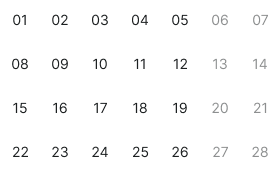
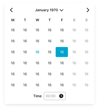
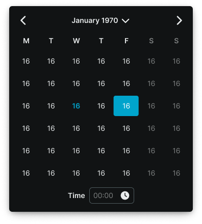
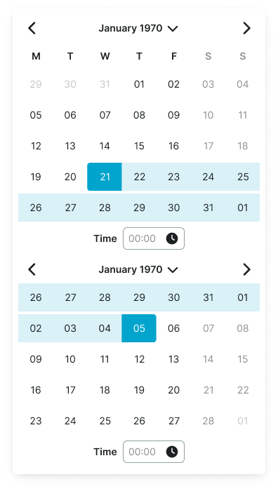
Basic
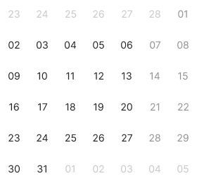
Standard six-week calendar template providing comprehensive month display with buffer dates. Use for consistent calendar sizing, complete week display, or when maintaining uniform calendar dimensions across all months.
Jan 70
Optimized five-week calendar template specifically configured for January 1970 layout patterns. Use for specific month configurations, historical date contexts, or when providing tailored calendar layouts for particular temporal periods.
Feb 70
Optimized five-week calendar template specifically configured for February 1970 layout patterns. Use for specific month configurations, historical date contexts, or when providing tailored calendar layouts for particular temporal periods.
March 70
Optimized six-week calendar template specifically configured for March 1970 layout patterns. Use for specific month configurations, historical date contexts, or when providing tailored calendar layouts for particular temporal periods.
Feb 71
Optimized four-week calendar template specifically configured for February 1971 layout patterns. Use for specific month configurations, historical date contexts, or when providing tailored calendar layouts for particular temporal periods.
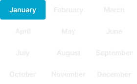
Months
Month selection template providing organized month display for annual navigation and year-based selection. Use for year view interfaces, annual planning, month selection modes, or when providing comprehensive month access within yearly context.
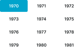
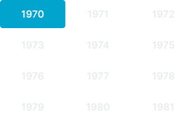
Years
Year selection template providing organized year display with preset 12-year using same organizational structure as months. Use for decade view interfaces, historical date navigation, year selection modes, or when providing comprehensive year access within temporal context.
Date Picker
Complete date selection interfaces that combine calendar navigation, date display, and selection functionality. These components serve as the comprehensive date picking solution, adapting their layout and feature set based on selection requirements and interface complexity.
Type Variants
Interface structure configurations that determine the date picker layout and selection capabilities. These variants control the overall organization and feature scope to match different date selection requirements.
Single
Standard single-month date picker interface for individual date selection. Use for simple date choosing, form inputs, appointment scheduling, or when providing straightforward date selection without range functionality.
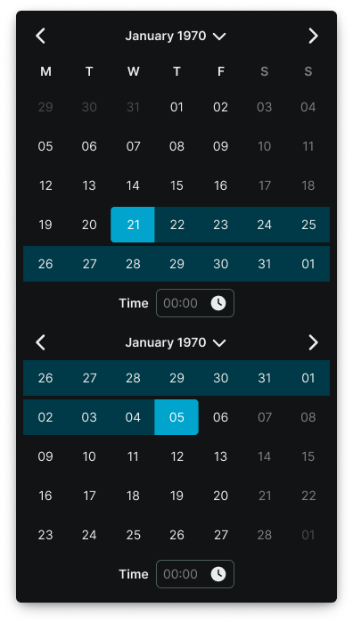
Vertical
Dual-month date picker interface arranged vertically for range selection functionality. Use for date ranges, booking systems, period selection, or when providing span selection with clear month relationship and vertical layout optimization.
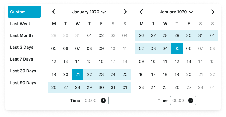
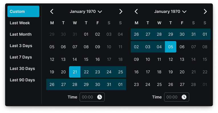
Horizontal
Dual-month date picker interface arranged horizontally with preset shortcuts for enhanced range selection. Use for date ranges with quick selection options, booking systems with common periods, or when providing span selection with preset convenience and horizontal layout optimization.