date-picker
Input components that provide a calendar interface for users to select dates, date ranges, or specific time periods.
Technical specifications and design system values that define the visual and structural properties of date picker components. These specifications ensure consistent implementation across design tools and development environments.
Legend:
- Brackets (
[]) denote a component variant placeholder. - Full emphasis indicates a value specific to that variant.
- Dimmed indicates a value unchanged from the default variant.
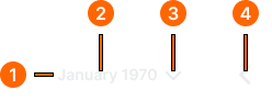
Day Item
Specifications for individual date elements including measurements, colors, typography, and interactive styling attributes. These values define the core appearance and state-dependent properties for calendar date implementations.


1
Day Item
- state:
- idle, hover, active, today, weekend, outside
- height:
- size.date-picker.day-height
- width:
- size.date-picker.day-width
- fill:
- color.date-picker.bg-[state]
- borderRadius:
- borderRadius.date-picker.day
- state:
- range-start
- height:
- size.date-picker.day-height
- width:
- size.date-picker.day-width
- fill:
- color.date-picker.bg-active
- borderRadiusTopLeft:
- borderRadius.date-picker.day
- borderRadiusTopRight:
- borderRadius.context.zero
- borderRadiusBottomLeft:
- borderRadius.date-picker.day
- borderRadiusBottomRight:
- borderRadius.context.zero
- state:
- range-end
- height:
- size.date-picker.day-height
- width:
- size.date-picker.day-width
- fill:
- color.date-picker.bg-active
- borderRadiusTopLeft:
- borderRadius.context.zero
- borderRadiusTopRight:
- borderRadius.date-picker.day
- borderRadiusBottomLeft:
- borderRadius.context.zero
- borderRadiusBottomRight:
- borderRadius.date-picker.day
- state:
- range-middle, range-today
- height:
- size.date-picker.day-height
- width:
- size.date-picker.day-width
- fill:
- color.date-picker.bg-range
- borderRadius:
- borderRadius.context.zero
2
Element
- state:
- idle, hover, active, weekend, outside
- fill:
- color.date-picker.fg-[state]
- typography:
- font.date-picker.day
- state:
- today, hover-today
- fill:
- color.date-picker.fg-today
- typography:
- font.date-picker.today
- state:
- selected, range-start, range-end
- fill:
- color.date-picker.fg-active
- typography:
- font.date-picker.day
- state:
- range-middle
- fill:
- color.date-picker.fg-idle
- typography:
- font.date-picker.day
- state:
- range-today
- fill:
- color.date-picker.fg-today
- typography:
- font.date-picker.today
Nav Item
Specifications for calendar navigation elements including measurements, colors, typography, and interactive styling attributes. These values define the core appearance and selection properties for temporal navigation implementations.

1
Nav Item
- minHeight:
- size.date-picker.day-height
- minWidth:
- size.date-picker.day-width
- verticalPadding:
- space.context.2xsmall
- horizontalPadding:
- space.context.2xsmall
- itemSpacing:
- space.context.2xsmall
- fill:
- color.date-picker.bg-[state]
- borderRadius:
- borderRadius.date-picker.day
2
Text
- fill:
- color.date-picker.fg-[state]
- typography:
- font.date-picker.label
3
Caret
- width:
- size.icon.glyph.small
- height:
- size.icon.glyph.small
- fill:
- color.date-picker.fg-[state]
4
Nav Icon
- width:
- size.icon.glyph.medium
- height:
- size.icon.glyph.medium
- fill:
- color.date-picker.fg-[state]
Label Item
Specifications for interactive text and month selection elements including measurements, colors, typography, and interactive styling attributes. These values define the core appearance and selection properties for temporal navigation implementations.
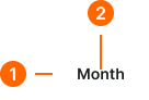
1
Label Item
- height:
- size.date-picker.day-height
- verticalPadding:
- space.context.2xsmall
- horizontalPadding:
- space.context.xsmall
- fill:
- color.date-picker.bg-[state]
- borderRadius:
- borderRadius.date-picker.menu
2
Label Text
- fill:
- color.date-picker.fg-[state]
- typography:
- font.date-picker.label
Date Picker
Specifications for complete date selection interfaces including measurements, colors, layout properties, and comprehensive styling attributes. These values define the overall appearance and functionality properties for date picker implementations.
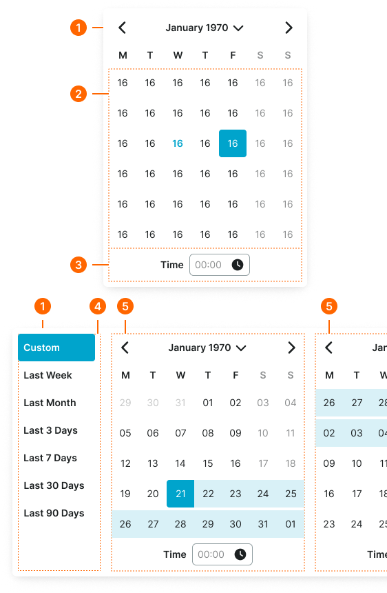
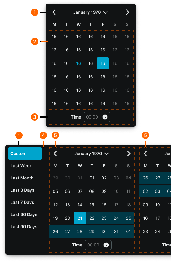
1
Date Picker
- type:
- basic, dual-vertical
- verticalPadding:
- space.date-picker.padding-y
- horizontalPadding:
- space.date-picker.padding-x
- itemSpacing:
- space.context.zero
- fill:
- color.date-picker.bg-main
- borderColor:
- color.date-picker.border-main
- borderRadius:
- borderRadius.date-picker.main
- borderWidth:
- color.date-picker.main
- boxShadow:
- shadow.date-picker.main
- type:
- dual-horizontal
- verticalPadding:
- space.date-picker.padding-y
- horizontalPadding:
- space.date-picker.padding-x
- itemSpacing:
- space.context.medium
- fill:
- color.date-picker.bg-main
- borderColor:
- color.date-picker.border-main
- borderRadius:
- borderRadius.date-picker.main
- borderWidth:
- color.date-picker.main
- boxShadow:
- shadow.date-picker.main
2
Dates Block
- itemSpacing:
- space.date-picker.gap
3
Time Row
- verticalPadding:
- space.context.xsmall
- horizontalPadding:
- space.context.xsmall
- itemSpacing:
- space.context.xsmall
4
Menu Frame
- paddingRight:
- space.context.xsmall
- borderColor:
- color.date-picker.border-subtle
- borderWidthRight:
- borderWidth.context.medium
5
Calendar Frame
Simple container.