Top navigation bars for mobile interfaces, typically containing branding, page titles, and essential navigation or action controls.
On this page
This documentation is a work in progress and may contain incomplete or outdated information. If you have any feedback or suggestions, please open an issue on GitHub.
Different configurations and states available for mobile navigation top components to accommodate various navigation requirements, platform conventions, and interaction patterns. These variants provide flexibility in appearance, content structure, and functionality while maintaining design consistency across mobile interface implementations.
Mobile Top Navigation
Container elements that provide primary navigation structure and interface organization for mobile applications. These components serve as the foundational navigation interface for mobile experiences, adapting their appearance and behavioral patterns based on presentation context, modal states, and platform-specific design requirements to provide clear navigation hierarchy and maintain consistent user experience across all mobile navigation scenarios.
Type Variants
Structural configurations that determine the presentation context and visual hierarchy of mobile navigation components. These variants control the interface integration and interaction emphasis to match different mobile application contexts and navigation requirements.
Basic
Standard mobile navigation presentation with integrated interface styling for primary application navigation. Use for main application screens, standard mobile interfaces, or when maintaining conventional iOS-style navigation patterns with clear hierarchical structure.
Modal
Enhanced mobile navigation presentation with modal context styling for overlay interface navigation. Use for fullscreen modal presentations, temporary interface states, or when providing focused navigation experiences that require clear separation from underlying content.
Stack
Layered mobile navigation presentation with stacked modal styling for nested interface navigation. Use for multi-level modal flows, progressive interface states, or when maintaining navigation context through multiple overlay levels with clear hierarchical relationships.
Nav Control Bar
Interactive elements that provide title display and action organization within mobile navigation structures. These components serve as the primary content and control interface for mobile navigation, adapting their appearance and layout organization based on platform conventions, title positioning, and content hierarchy to provide clear navigation context and maintain consistent user experience across all mobile control scenarios.
Type Variants
Layout configurations that determine the title positioning and content organization of mobile navigation control elements. These variants control the visual hierarchy and platform alignment to match different mobile design conventions and content requirements.
Center
Standard navigation control with centered title positioning for balanced visual hierarchy and iOS-style navigation patterns. Use for most mobile navigation implementations, iOS-aligned interfaces, or when maintaining symmetrical content organization with clear focal emphasis.
Left
Alternative navigation control with left-aligned title positioning for compact visual hierarchy and Android-style navigation patterns. Use for Android-aligned interfaces, space-efficient navigation, or when prioritizing left-to-right reading patterns with content optimization.
Large Title
Enhanced navigation control with prominent title presentation for emphasized content hierarchy and iOS-style large title patterns. Use for primary screens, content-focused interfaces, or when providing enhanced title visibility with clear typographic emphasis and improved content accessibility.
Nav Title Item
Individual title elements that provide content identification and contextual information within mobile navigation headers. These components serve as the primary title display interface for mobile navigation, adapting their appearance and content organization based on title positioning, content complexity, and platform conventions to provide clear page identification and maintain consistent user experience across all mobile title scenarios.
Type Variants
Content structure configurations that determine the title presentation format and information hierarchy of mobile navigation title elements. These variants control the content display and positioning approach to match different informational requirements and platform conventions.
Basic
Standard title presentation with centered positioning for balanced visual hierarchy and straightforward content identification. Use for most mobile navigation implementations, simple page titles, or when maintaining clear focal emphasis with minimal content complexity.
Dropdown
Interactive title presentation with centered positioning and dropdown indicator for expandable content selection. Use for category selection, content filtering interfaces, or when providing title-based navigation options with clear expansion affordance.
Left
Alternative title presentation with left-aligned positioning for compact visual hierarchy and Android-style navigation patterns. Use for Android-aligned interfaces, content-heavy layouts, or when optimizing horizontal space utilization with left-to-right reading patterns.
Subtitle
Enhanced title presentation with secondary text support for additional contextual information and content hierarchy. Use for detailed page identification, content categorization, or when providing supplementary information alongside primary title content.
Large
Prominent title presentation with enlarged typography for emphasized content hierarchy and enhanced visual prominence. Use for primary screens, content-focused interfaces, or when providing maximum title visibility with clear typographic emphasis and improved accessibility.
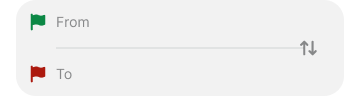
Trip
Specialized title presentation with departure and arrival location display for travel-focused navigation and location-based content identification. Use for travel applications, booking interfaces, or when providing location-specific context with clear origin-destination relationships.
Chat
Conversational title presentation with left-aligned positioning, subtitle support, and avatar integration for messaging-focused navigation. Use for chat applications, messaging interfaces, or when providing user-focused navigation with clear participant identification and conversation context.
Logo
Brand-focused title presentation with logo integration for company identification and brand emphasis within navigation context. Use for branded applications, marketing interfaces, or when maintaining brand visibility with clear corporate identity and visual recognition.
Nav Action
Individual interactive elements that provide action functionality and navigation controls within mobile navigation headers. These components serve as the primary action interface for mobile navigation, adapting their appearance and interaction behavior based on action type, visual emphasis, and platform conventions to provide clear functional access and maintain consistent user experience across all mobile action scenarios.
State Variants
Interactive states that affect user interaction capabilities and visual feedback based on current availability and action status. These variants communicate the action item's functionality and current interaction state while guiding users through successful navigation actions.
Active
Standard appearance of an action item when available for interaction and ready for user activation. Use for enabled actions, available functionality, or when providing clear interactive affordance with standard visual treatment.
Passive
Non-interactive state for action items when functionality is not currently accessible due to system conditions or contextual restrictions. Use for unavailable actions, conditional functionality, or when maintaining interface structure while indicating temporary unavailability.
Type Variants
Functional configurations that determine the action type and interaction approach of mobile navigation action elements. These variants control the functionality organization and visual presentation to match different action requirements and interaction contexts.
Back
Standard navigation action with preset back icon for return functionality and hierarchical navigation. Use for standard back navigation, parent screen access, or when providing conventional return patterns with clear directional indication.
Parent
Enhanced navigation action with iOS-style back icon and parent title display for contextual return functionality. Use for iOS-aligned interfaces, hierarchical navigation, or when providing clear parent context with return destination identification.
Text Basic
Basic text-based action with label presentation for straightforward functional access and clear action identification. Use for simple actions, text-based commands, or when providing direct functional access with clear textual communication.
Text Emphasized
Emphasized text-based action with prominent styling for primary functionality and high-priority actions. Use for critical actions, primary commands, or when requiring enhanced visual emphasis with clear action priority and user attention.
Menu
Standard utility action with preset menu icon for additional options and extended functionality access. Use for option menus, settings access, or when providing additional functionality with clear utility indication and expandable options.
Close
Dismissal action with preset close icon for modal closure and interface dismissal functionality. Use for modal interfaces, overlay dismissal, or when providing clear exit patterns with conventional close indication.
Icons
Flexible action configuration with dual icon placeholders for customizable functionality and versatile action presentation. Use for custom actions, specialized functionality, or when requiring flexible icon-based actions with adaptable visual presentation.
Leading Icon
Enhanced action presentation with text label and left-positioned icon for comprehensive action identification and visual clarity. Use for detailed actions, labeled functionality, or when providing clear action context with icon support and textual identification.
Trailing Icon
Alternative action presentation with text label and right-positioned icon for varied visual hierarchy and action emphasis. Use for secondary actions, alternative layouts, or when providing visual variety with icon support and textual clarity.
Avatar
User-focused action with avatar integration for profile access and user-specific functionality. Use for user menus, profile navigation, or when providing personalized action access with clear user identification and account-related functionality.
Pager
Sequential navigation action with directional arrows for content browsing and result navigation functionality. Use for search results, content lists, or when providing sequential navigation with clear directional movement and content browsing capabilities.
Nav Utility Bar
Specialized interface elements that provide extended functionality and interactive controls within mobile navigation structures. These components serve as the primary tool and utility interface for mobile navigation, adapting their appearance and functional organization based on tool type, interaction patterns, and user workflow requirements to provide enhanced navigation capabilities and maintain consistent user experience across all mobile tool scenarios.
Type Variants
Functional configurations that determine the tool type and interaction approach of mobile navigation utility elements. These variants control the functionality organization and user workflow integration to match different mobile application requirements and interaction contexts.
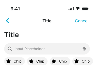
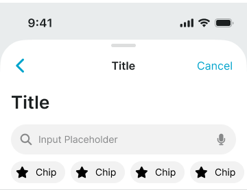
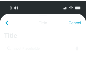
Search
Standard search interface with input field and query functionality for content discovery and navigation filtering. Use for content-heavy applications, search-driven interfaces, or when providing basic search capabilities with clear input focus and results navigation.
Trip Search
Specialized search interface with departure and arrival selection for travel-focused navigation and location-based functionality. Use for travel applications, booking interfaces, or when providing location-specific search capabilities with clear origin-destination relationships.
Segments
Organized control interface with segmented selection options for content categorization and iOS-style segmented control patterns. Use for content filtering, category navigation, or when providing clear selection options with iOS-aligned interaction patterns and visual organization.
Tabs
Horizontal navigation interface with tab-based content organization for section navigation and Android-style tab bar patterns. Use for content organization, section switching, or when providing Android-aligned tab navigation with clear content categorization and horizontal scrolling support.
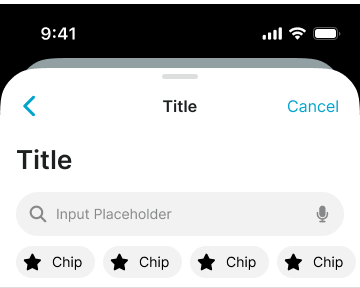
Chips
Compact selection interface with horizontal chip elements for search presets and shortcut functionality. Use for quick selections, preset options, or when providing efficient shortcut access with compact visual presentation and horizontal scrolling capabilities.
Calendar
Temporal navigation interface with week-based organization for calendar events and date-focused functionality. Use for calendar applications, event management interfaces, or when providing date-specific navigation with clear temporal organization and week-based browsing patterns.


