mobile-nav-top
Top navigation bars for mobile interfaces, typically containing branding, page titles, and essential navigation or action controls.
Configurable properties that control the appearance, behavior, and functionality of mobile navigation top components for mobile application interfaces and platform-specific navigation patterns.
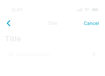
Mobile Top Navigation
Properties that define the visual state and structural organization of mobile navigation container elements that provide primary navigation for mobile applications.

type variant
Controls the presentation context and visual hierarchy of the mobile navigation component, determining whether basic, modal, or stacked styling is applied for different interface contexts.
- basic
- modal
- stack
status instance-swap
Specifies which status bar component to display within the mobile navigation container, providing system-level status information and platform-specific status bar styling.
has-control-bar boolean
Controls the visibility of the navigation control bar within the mobile navigation container, determining whether title and action elements are displayed for navigation context.
- true
- false
has-large-title boolean
Controls the visibility of large title presentation within the mobile navigation container, enabling iOS-style large title display for enhanced content hierarchy.
- true
- false
has-slot-1 boolean
Controls the visibility of the first utility slot within the mobile navigation container, enabling additional functional content or utility components.
- true
- false
has-slot-2 boolean
Controls the visibility of the second utility slot within the mobile navigation container, providing extended functionality and utility component integration.
- true
- false
has-separator boolean
Controls the visibility of visual separator elements that provide clear boundaries and separation between the navigation and page content.
- true
- false
Nav Control Bar
Properties that define the visual state and content organization of mobile navigation control elements that provide title display and action organization within navigation structures.


type variant
Controls the title positioning and content organization of the navigation control component, determining whether center, left, or large title styling is applied for different platform conventions.
- center
- left
- large
has-title boolean
Controls the visibility of the title content within the navigation control component, determining whether title text and positioning elements are displayed for page identification.
- true
- false
has-left-action boolean
Controls the visibility of left-side action elements within the navigation control component, enabling back navigation, menu access, or other leading-edge functionality.
- true
- false
has-right-action boolean
Controls the visibility of right-side action elements within the navigation control component, enabling additional actions, settings access, or other trailing-edge functionality.
- true
- false
Nav Title Item
Properties that define the visual state and content organization of mobile navigation title elements that provide content identification and contextual information within navigation headers.


type variant
Controls the title presentation format and content structure of the navigation title element, determining whether basic, dropdown, subtitle, or specialized styling is applied for different informational requirements.
Nav Action Item
Properties that define the visual state and interactive behavior of mobile navigation action elements that provide navigation controls and functional access within navigation headers.


type variant
Controls the action type and visual presentation of the navigation action element, determining whether back, menu, text, or icon-based styling is applied for different functional requirements.
state variant
Controls the interactive state and visual feedback of the navigation action element, determining whether active or disabled styling is applied based on current availability and interaction context.
- active
- passive
Nav Utility Bar
Properties that define the visual state and functional organization of mobile navigation utility elements that provide extended functionality and interactive controls within navigation structures.


has-left-action boolean
- type:
- search
Controls the visibility and type of left-side action elements within the navigation utility component, enabling leading-edge functionality and action organization for utility interfaces.
- true
- false
has-right-action boolean
- type:
- search
Controls the visibility and type of right-side action elements within the navigation utility component, enabling trailing-edge functionality and supplementary action access for utility interfaces.
- true
- false
state variant
- type:
- segments
Controls the current state of the utility component interface, determining the active selection, interaction mode, or functional context for segmented controls and utility navigation elements.