mobile-nav-top
Top navigation bars for mobile interfaces, typically containing branding, page titles, and essential navigation or action controls.
Technical specifications and design system values that define the visual and structural properties of mobile navigation top components. These specifications ensure consistent implementation across design tools and development environments.
Legend:
- Brackets (
[]) denote a component variant placeholder. - Full emphasis indicates a value specific to that variant.
- Dimmed indicates a value unchanged from the default variant.
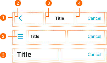
Control Bar
Specifications for mobile navigation control elements including measurements, colors, typography, and title positioning styling attributes. These values define the content organization and interaction properties for mobile navigation control implementations.
1
Control Bar
- style:
- basic
- hotizontalPadding:
- space.context.xsmall
- paddingBottom:
- space.base.10
- itemSpacing:
- space.context.xsmall
- style:
- glass
- hotizontalPadding:
- space.context.medium
- paddingBottom:
- space.base.10
- itemSpacing:
- space.context.medium
2
Left Frame
- style:
- basic
3
Title Frame
- style:
- basic
- hotizontalPadding:
- space.context.xsmall
- style:
- glass
- hotizontalPadding:
- none
4
Right Frame
Title Item
Specifications for mobile navigation title elements including measurements, colors, typography, and content positioning styling attributes. These values define the title presentation and content hierarchy properties for mobile navigation title implementations.


1
Title Text
- variant:
- any
- fill:
- color.context.default.fg-main
- typography:
- font.text.medium.strong
- variant:
- large
- fill:
- color.context.default.fg-main
- typography:
- font.text.2xlarge.strong
2
Subtitle Text
- fill:
- color.context.default.fg-main
- typography:
- font.text.medium.strong
Action Item
Specifications for mobile navigation action elements including measurements, colors, typography, and interaction state styling attributes. These values define the action presentation and interactive behavior properties for mobile navigation action implementations.


1
Action
- variant:
- default
- verticalPadding:
- space.base.8
- paddingRight:
- space.base.8
- paddingLeft:
- space.base.8
- itemSpacing:
- space.base.4
- variant:
- parent, icon-left
- verticalPadding:
- space.base.8
- paddingRight:
- space.base.12
- paddingLeft:
- space.base.8
- itemSpacing:
- space.base.4
- variant:
- icon-right
- verticalPadding:
- space.base.8
- paddingRight:
- space.base.8
- paddingLeft:
- space.base.12
- itemSpacing:
- space.base.4
- variant:
- text, emphasized
- verticalPadding:
- space.base.8
- paddingRight:
- space.base.12
- paddingLeft:
- space.base.12
- itemSpacing:
- space.base.4
2
Icon
- height:
- size.base.28
- width:
- size.base.28
- fill:
- color.context.default.fg-main
3
Text
- variant:
- parent, text, icon-left, icon-right
- fill:
- color.context.default.fg-main
- typography:
- font.text.medium.normal
- variant:
- emphasized
- fill:
- color.context.default.fg-main
- typography:
- font.text.medium.strong
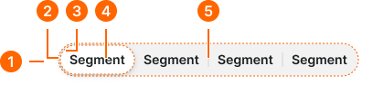
Segment Bar
Specifications for mobile navigation utility elements including measurements, colors, typography, and functional interface styling attributes. These values define the utility presentation and extended functionality properties for mobile navigation utility implementations.
1
Mobile Nav Segment Bar
- hotizontalPadding:
- space.context.medium
- paddingBottom:
- space.base.10
- itemSpacing:
- space.context.medium
2
Segment Bar Frame
- verticalPadding:
- space.base.2
- horizontalPadding:
- space.base.2
- fill:
- color.context.default.dim-slight
- borderRadius:
- borderRadius.context.round-36
3
Segment Item
- active:
- true
- verticalPadding:
- space.base.6
- horizontalPadding:
- space.base.12
- fill:
- color.context.default.bg-main
- borderRadius:
- borderRadius.context.round-32
- active:
- false
- verticalPadding:
- space.base.6
- horizontalPadding:
- space.base.12
- fill:
- color.context.default.transparent-color
- borderRadius:
- borderRadius.context.round-32
4
Text
- fill:
- color.context.default.fg-main
- typography:
- font.text.small.strong
5
Separator
- width:
- size.asset.separator
- fill:
- color.context.default.border-subtle