alert
Prominent notification components that draw user attention to important messages, warnings, or time-sensitive information requiring immediate awareness or action.
Different configurations and states available for alert components to accommodate various messaging requirements, screen sizes, and contextual communication needs. These variants provide flexibility in appearance, content structure, and semantic meaning while maintaining design consistency across different devices and alert scenarios.
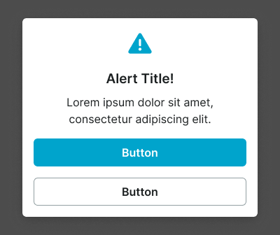
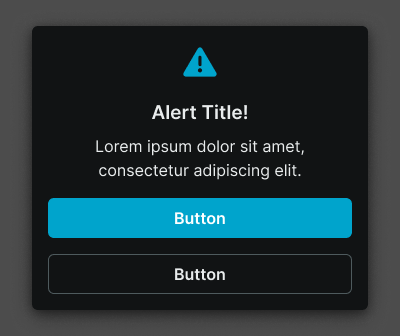
Alert Window
Modal dialog elements that display critical information, confirmations, and system alerts requiring immediate user attention. These components serve as interrupting communication interfaces that overlay the main application content, adapting their size and visual treatment based on screen constraints and message urgency to ensure clear visibility and user response across all device contexts.
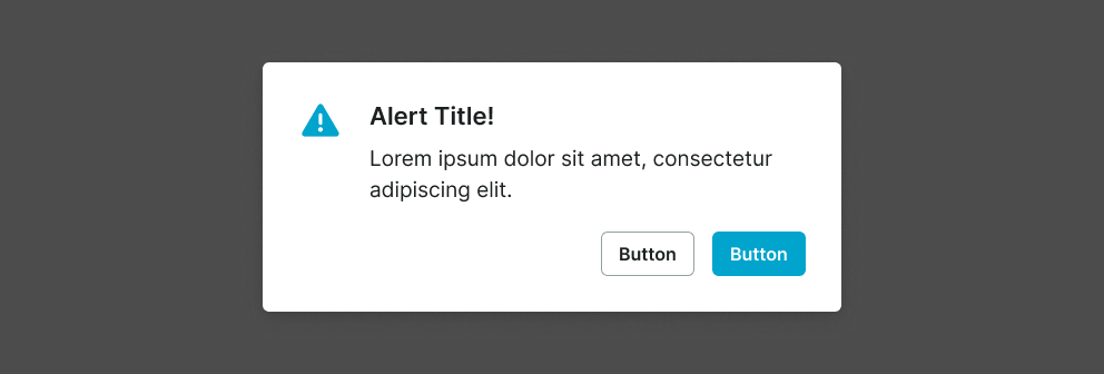
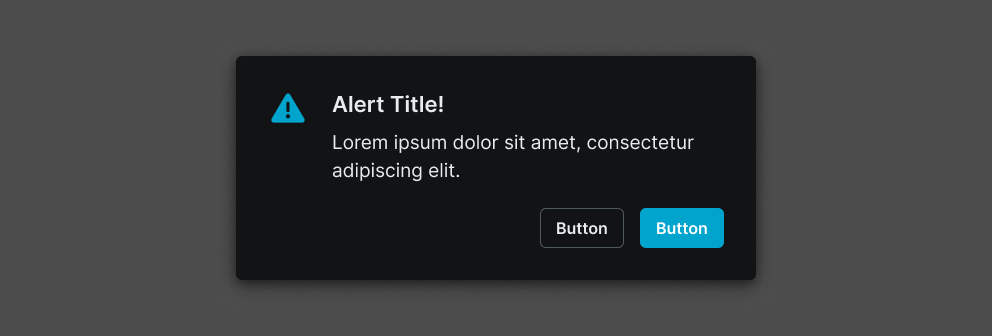
Size Variants
Layout configurations that control the alert window dimensions and content presentation to optimize visibility across different screen sizes and device capabilities. These variants determine the spatial organization and readability characteristics for various display contexts.


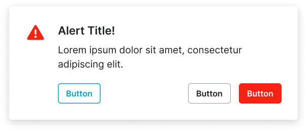
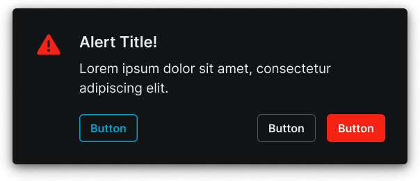
Context Variants
Visual styles and semantic meanings that communicate alert purpose, urgency, and message type within the interface hierarchy. These variants determine the alert's color treatment, visual prominence, and contextual messaging to guide user attention and convey information significance.
Alert Screen
Full-screen overlay elements that display comprehensive alert information and system states requiring complete user focus. These components serve as application-wide communication interfaces that replace the entire interface temporarily, adapting their size and content organization based on screen capabilities and information complexity to ensure optimal presentation and user engagement.
Size Variants
Layout configurations that control the alert screen dimensions and content organization to optimize presentation across different screen sizes and device orientations. These variants determine the content hierarchy and spatial relationships for comprehensive alert scenarios.
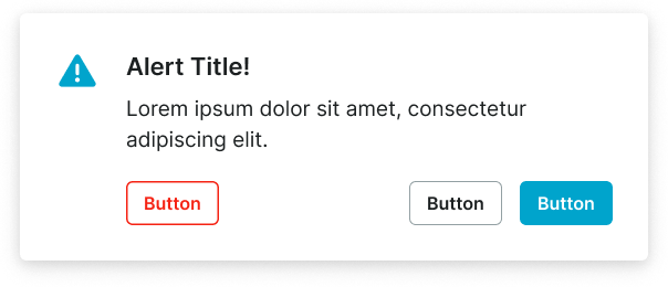
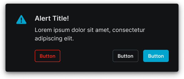
Large
Expanded alert screen layout optimized for tablet and desktop environments with extensive content presentation capabilities. Use for complex system states, detailed error explanations, comprehensive onboarding flows, or when providing extensive information and multiple interaction options on larger displays.
Alert Window
- size:
- large
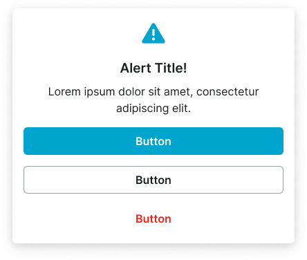
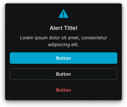
Small
Compact alert screen layout optimized for mobile devices with focused content presentation and streamlined interaction patterns. Use for essential system alerts, simplified error states, mobile-optimized flows, or when screen constraints require efficient content organization while maintaining clear communication and user guidance.
Alert Window
- size:
- small