alert
Prominent notification components that draw user attention to important messages, warnings, or time-sensitive information requiring immediate awareness or action.
Configurable properties that control the appearance, behavior, and functionality of alert components for critical messaging and user confirmation interfaces.
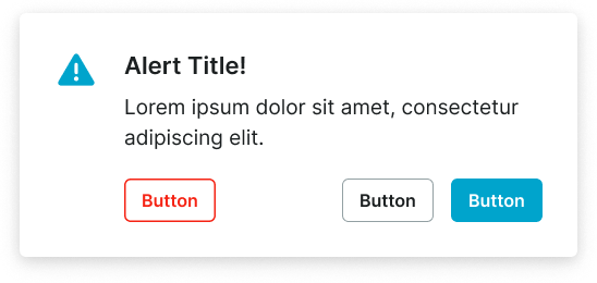
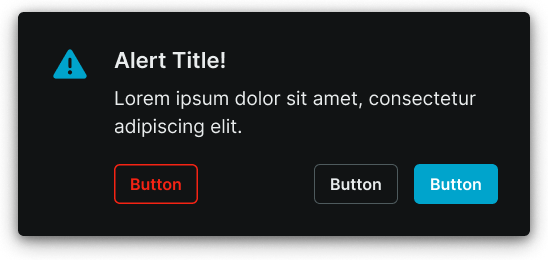
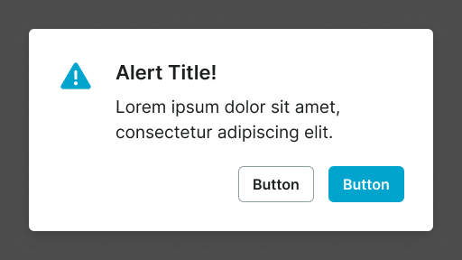
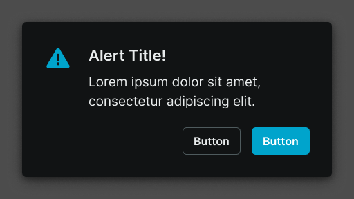
Alert Window
Properties that define the visual state and interactive behavior of modal dialog elements requiring immediate user attention and response.
size variant
Controls the layout dimensions and content presentation of the alert window based on screen size and device capabilities.
- large
- small
context variant
Controls the visual style and semantic meaning of the alert window based on message type, urgency, and intended purpose.
- default
- danger
has-icon boolean
Controls the visibility of an icon element positioned at the start of the alert window content area.
- true
- false
icon-instance instance-swap
Specifies which icon component to display when has-icon property is enabled.
- Icon Placeholder
has-slot boolean
Controls the visibility of a custom content slot for additional elements or media within the alert window.
- true
- false
slot slot
Specifies which component to display within the custom content slot when has-slot property is enabled.
has-2nd-action boolean
Controls the visibility of a secondary action element when multiple response options are needed.
- true
- false
has-3rd-action boolean
Controls the visibility of a tertiary action element for complex alert scenarios requiring multiple user options.
- true
- false
Alert Screen
Properties that control the layout and content structure of full-screen overlay elements with comprehensive alert capabilities and extensive interactive features.
size variant
Controls the layout dimensions and content organization of the alert screen based on screen size and device orientation capabilities.
- large
- small