alert
Prominent notification components that draw user attention to important messages, warnings, or time-sensitive information requiring immediate awareness or action.
Technical specifications and design system values that define the visual and structural properties of alert components. These specifications ensure consistent implementation across design tools and development environments for critical messaging and user confirmation interfaces.
Legend:
- Brackets (
[]) denote a component variant placeholder. - Full emphasis indicates a value specific to that variant.
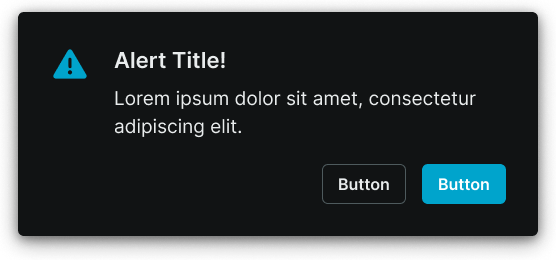
- Dimmed indicates a value unchanged from the default variant.
Alert Window
Specifications for modal dialog elements including measurements, colors, typography, and styling attributes. These values define the core appearance and behavior properties for each alert window variant requiring immediate user attention and response.
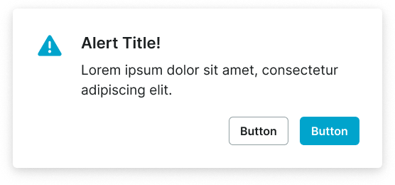
1
Alert Window
- verticalPadding:
- space.alert.[size]-padding-y
- horizontalPadding:
- space.alert.[size]-padding-x
- itemSpacing:
- space.alert.[size]-gap
- fill:
- color.context.default.bg-main
- borderColor:
- color.context.default.transparent-color
- borderRadius:
- borderRadius.alert.main
- borderWidth:
- borderWidth.alert.main
- boxShadow:
- shadow.common.modal
2
Alert Icon
- height:
- size.alert.[size]-icon
- width:
- size.alert.[size]-icon
- fill:
- color.context.default.icon-main
3
Text Frame
- itemSpacing:
- space.context.xsmall
4
Title Text
- fill:
- color.context.default.fg-main
- typography:
- font.alert.[size]-title
5
Body Text
- fill:
- color.context.default.fg-main
- typography:
- font.alert.[size]-body
6
Actions Frame
- itemSpacing:
- space.context.medium
Alert Screen
Specifications for full-screen overlay elements including measurements, colors, typography, and styling attributes. These values define the comprehensive appearance and behavior properties for each alert screen variant with extensive messaging and interactive capabilities.

