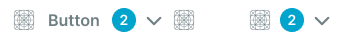
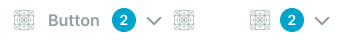
Link-styled interactive elements that combine button functionality with hyperlink visual presentation for consistent inline action and navigation triggers.
On this page
This documentation is a work in progress and may contain incomplete or outdated information. If you have any feedback or suggestions, please open an issue on GitHub.
Different configurations and states available for link button components to accommodate various interaction requirements, visual styles, and contextual needs. These variants provide flexibility in appearance, content structure, and semantic meaning while maintaining design consistency across the system.
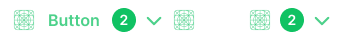
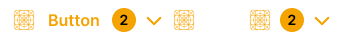
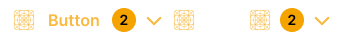
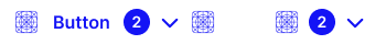
Link Buttons
Interactive elements that trigger actions or operations when activated by users. These components serve as the primary action triggers within interfaces, adapting their appearance and behavior based on context, importance, and current state to provide clear visual feedback and maintain consistent user experience across all interface contexts.
Type Variants
Content structure configurations that determine the layout and visual presentation format of button components. These variants control the content display and interaction approach to match different functional requirements.
Type variants are implemented as separate Figma components within this file to optimize performance. Each component has the same style and context variants.
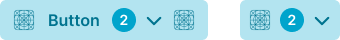
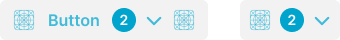
Basic
Standard button structure with text label and optional supporting elements. Use for most button implementations requiring clear labeling, standard interactions, or when providing comprehensive action context with descriptive text.
Icon Button
Minimal button structure optimized for displaying only icon elements without text labels. Use for compact interfaces, toolbar actions, secondary controls, or when space constraints require simplified visual presentation while maintaining clear action recognition.
Style Variants
Visual presentation modes that affect the button's background treatment and overall appearance within the interface. These variants determine the visual weight and interaction emphasis approach for different design contexts and hierarchy requirements.
Style variants are implemented as separate Figma components across multiple files to optimize performance. Each component has the same context and size variants.
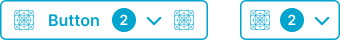
Solid
Bold button styling with full background fill and high contrast appearance. Use for primary actions requiring strong visual presence or when buttons need maximum visibility and emphasis within the interface.
Smooth
Subtle button styling with soft background treatment and integrated appearance. Use for secondary actions that should blend naturally with interface content while maintaining clear visibility and interaction affordance.
Outline
Bordered button styling with transparent background and defined edge treatment. Use for minimal actions requiring subtle emphasis or when maintaining visual hierarchy without adding visual weight to the interface.
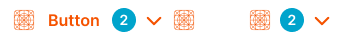
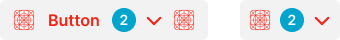
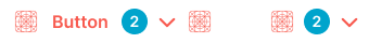
Link
Text-based button styling with minimal visual treatment and link-like appearance. Use for tertiary actions, inline navigation, or when providing functional access without visual prominence or interface disruption.
Context Variants
Visual styles and semantic meanings that communicate button purpose and importance within the interface hierarchy. These variants determine the button's prominence, color treatment, and contextual messaging to guide user attention and convey action significance.
default
Standard context following the interface's primary neutral color scheme. Use for general-purpose buttons that don't require specific semantic emphasis.
alternate
Alternate visual treatment for distinct button differentiation. Use when a button needs to stand out from the standard style within the same context area.
primary
Primary action emphasis with the interface's main brand color. Use for the most important call-to-action in each view.
secondary
Secondary action styling for supporting interactions. Use for less prominent actions alongside a primary action.
neutral
Neutral presentation without semantic color emphasis. Use for utility buttons or actions where color should not convey meaning.
danger
Warning emphasis for destructive or high-risk actions. Use for delete, remove, or other potentially harmful interactions requiring user attention.
success
Positive outcome emphasis for confirmations and completions. Use for actions that result in favorable states or completed operations.
warning
Cautionary emphasis for actions requiring careful consideration. Use for operations that may have unintended consequences.
info
Informational emphasis for guidance-related actions. Use when the action provides additional context or explains functionality.
black
High-contrast dark styling for maximum visual weight. Use on light backgrounds where strong visual anchoring is required.
white
Light styling for use on dark or colored backgrounds. Use when the interface background requires a light button treatment.
Size Variants
Different dimensional scales for button components to accommodate various layout requirements and visual hierarchies. These variants maintain proportional relationships while adapting to different design contexts and space constraints.
Large
Expanded button size designed for high-visibility actions requiring more emphasis, such as major calls to action or important decisions. Use for primary actions in hero sections, mobile interfaces, or when enhanced prominence is required.
Medium
Standard button size providing balanced proportions for most button implementations. Use as the default size for primary and secondary actions across general interface contexts where optimal visibility and usability are required.
Small
Compact button size optimized for dense layouts and secondary actions. Use in constrained spaces, inline forms, or when multiple buttons need to fit within limited screen real estate.
State Variants
Interactive states that affect user interaction capabilities and visual feedback based on current user activity and system conditions. These variants communicate the button's availability and guide users through successful task completion.
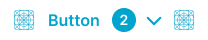
idle
Represents the standard appearance of a button when it is not being interacted with. Neutral appearance indicates button is available for interaction.
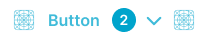
hover
Provides visual feedback when a user hovers over a button, indicating that it is interactive. Enhanced visual styling signals available interaction and guides user attention.
press
Indicates that a button is currently being pressed or activated. Active press state provides immediate tactile feedback during user interaction.
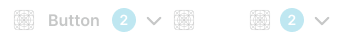
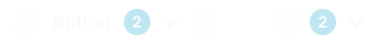
disabled
Indicates that the button is unavailable for interaction due to system constraints or user permissions. Reduced visual treatment communicates unavailability while maintaining layout and content structure.