Individual input elements that capture user data through different input methods and visual states with modern floating label styling.
On this page
This documentation is a work in progress and may contain incomplete or outdated information. If you have any feedback or suggestions, please open an issue on GitHub.
Different configurations and states available for form components to accommodate various use cases, user interactions, and visual requirements. These variants provide flexibility in appearance, behavior, and functionality while maintaining design consistency across the system.
Form Input
Individual input elements that capture user data through different input methods and visual states. These components serve as the core interactive elements within forms, adapting their appearance and behavior based on user interaction, content status, and validation requirements.
Style Variants
Visual presentation modes that affect the input field's label positioning and overall appearance within the form interface. These variants determine the visual design approach and space utilization for different design contexts and user experience requirements.
Style variants are implemented as separate Figma components across multiple files to optimize performance. Each component has the same type, activity, size, and state variants.
Regular
Traditional input field styling with label positioned above the input area. Use for most form implementations requiring clear labeling, conventional form patterns, or when maintaining standard form design conventions with separate label and input areas.
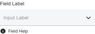
Floating
Modern input field styling with animated floating label that moves when the field becomes active. Use for contemporary form interfaces, space-efficient designs, or when providing elegant label transitions that combine label and placeholder functionality.
Outline
Outlined input field styling with border emphasis and integrated label positioning. Use for forms requiring strong visual definition, material design patterns, or when field boundaries need clear emphasis within the interface.
Type Variants
Different input methods for collecting various types of user data, each optimized for specific content types and interaction patterns. These variants determine the fundamental behavior and interface of the input element.
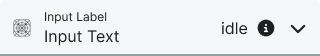
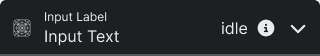
Text
Single-line input field for alphanumeric characters, passwords, and short text entries. Use for names, email addresses, phone numbers, and other concise data input.
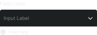
Select
Dropdown menu allowing users to choose from predefined options. Use when presenting 4 or more mutually exclusive choices to save space and guide user selection.
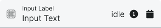
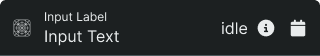
Date
Input field with date picker functionality for selecting dates. Provides calendar interface to ensure proper date format and reduce input errors.
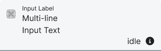
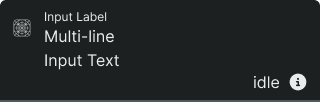
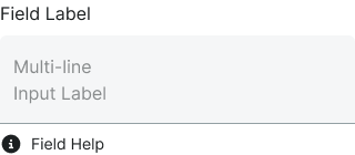
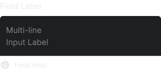
Textarea
Multi-line input field for longer text content and comments. Use for descriptions, feedback, messages, or any content requiring multiple lines.
Activity Variants
Visual states that indicate whether the input field contains user data or remains empty. These variants help users understand the current content status and provide appropriate visual feedback for populated versus unpopulated fields.
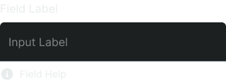
Active
Input field contains user-entered content or selected values. Visual styling indicates populated state to help users track completion progress.
Inactive
Input field is empty and displays placeholder text. Provides visual cues about expected input format and helps users understand field purpose.
State Variants
Interactive states that affect user interaction capabilities and visual feedback based on current user activity and system conditions. These variants communicate the input's availability, validation status, and guide users through successful form completion.
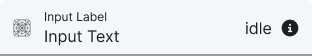
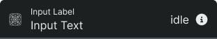
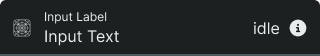
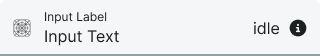
Idle
Default state when the input field is not being interacted with. Neutral appearance indicates field is available for interaction.
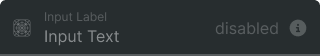
Disabled
Input field is non-interactive and cannot receive user input. Reduced visual prominence indicates unavailability while maintaining form structure.
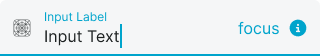
Focus
Input field is currently selected and ready for user input. Enhanced visual styling and cursor presence indicate active interaction state.
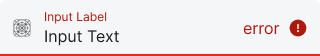
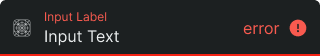
Error
Input field contains invalid data or failed validation. Error styling and messaging guide users toward correct input format.
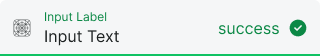
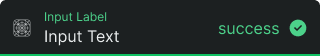
Success
Input field contains valid data that passed validation requirements. Success indicators provide positive feedback and reduce user anxiety.
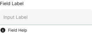
Form Field
Complete form elements that combine floating input components with labels, validation, and helper text for comprehensive user experience. These composite components provide proper accessibility, visual hierarchy, and contextual information necessary for effective form design and user guidance.
Type Variants
Different form field configurations based on the type of input component used, each maintaining consistent labeling, spacing, and helper text positioning while adapting to the specific requirements of the embedded input type.
Text
Complete form element including label, input field, and optional helper text. Provides full context for single-line data entry with proper accessibility markup and clear visual hierarchy.
Select
Complete form element with label, dropdown menu, and optional helper text. Combines selection interface with descriptive labeling and guidance for complex choice scenarios.
Textarea
Complete form element with label, multi-line input area, and optional helper text. Optimized layout for longer content input with appropriate spacing and text flow considerations.