form-floating
Individual input elements that capture user data through different input methods and visual states with modern floating label styling.
Configurable properties that control the appearance, behavior, and functionality of form input components. These properties enable customization of visual presentation, interaction patterns, and content structure to meet specific form design requirements.
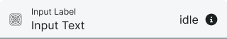
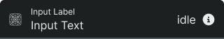
Form Input
Properties that define the visual state and interactive behavior of individual input elements.
type variant
Controls the input method and visual presentation of the form input.
- text
- select
- date
- textarea
state variant
Controls the interactive state and visual feedback of the component.
- idle
- focus
- error
- success
- disabled
active variant
Controls whether the input appears populated with content or empty.
- true
- false
icon boolean
Controls the visibility of an icon element positioned before the input text.
- true
- false
icon-instance instance-swap
- icon:
- true
Specifies which icon component to display when icon property is enabled.
- Placeholder Icon
help boolean
Controls the visibility of assistance text or elements positioned after the input.
- true
- false
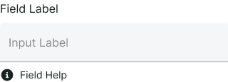
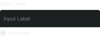
Form Field
Properties that control the layout and content structure of complete form field elements.
type variant
Controls the input component type used within the form field structure.
- text
- select
- textarea
label boolean
Controls the visibility of descriptive text positioned above the input component.
- true
- false
help boolean
Controls the visibility of instructional or validation text positioned below the input component.
- true
- false
dropdown boolean
- type:
- select
Controls the visibility of selection menu interface for select-type form fields.
- true
- false