navbar
Primary navigation components positioned at the top of pages, containing site branding and main navigation links.
Different configurations and states available for navbar components to accommodate various navigation requirements, screen sizes, and user interaction patterns. These variants provide flexibility in appearance, behavior, and functionality while maintaining design consistency across different navigation contexts and device environments.
Nav Link
Individual interactive elements that represent navigation options within navbar structures. These components serve as the core building blocks for horizontal navigation systems, adapting their visual state based on user interaction and current page status to provide clear navigation feedback and maintain consistent user experience across all navigation scenarios.
State Variants
Interactive states that affect user interaction capabilities and visual feedback based on current user activity and navigation status. These variants communicate the nav item's availability and current selection state while guiding users through successful navigation.


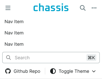
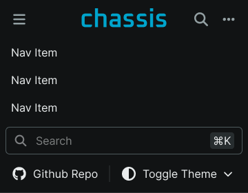
Navbar
Primary navigation containers that provide horizontal site navigation and main menu functionality across different screen sizes. These components serve as the foundational navigation interface for web applications, adapting their size and behavior based on device requirements and content organization to provide clear navigation access and maintain consistent user experience across all viewport scenarios.
Size Variants
Dimensional configurations that control the navbar scale and navigation presentation to optimize usability across different screen sizes and interface contexts. These variants determine the spatial organization and navigation accessibility for various display environments.