navbar
Primary navigation components positioned at the top of pages, containing site branding and main navigation links.
Technical specifications and design system values that define the visual and structural properties of navbar components. These specifications ensure consistent implementation across design tools and development environments.
Legend:
- Brackets (
[]) denote a component variant placeholder. - Full emphasis indicates a value specific to that variant.
- Dimmed indicates a value unchanged from the default variant.
Nav Link
Specifications for individual navigation item elements including measurements, colors, typography, and interactive styling attributes. These values define the core appearance and state-dependent properties for navigation menu implementations.
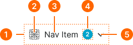
1
Nav Link
- verticalPadding:
- space.context.xsmall
- horizontalPadding:
- space.context.xsmall
- itemSpacing:
- space.context.xsmall
2
Icon
- state:
- idle, hover
- height:
- size.icon.glyph.medium
- width:
- size.icon.glyph.medium
- fill:
- color.context.default.fg-main
- state:
- active
- height:
- size.icon.glyph.medium
- width:
- size.icon.glyph.medium
- fill:
- color.context.default.fg-subtle
- state:
- disabled
- height:
- size.icon.glyph.medium
- width:
- size.icon.glyph.medium
- fill:
- color.context.default.fg-slight
3
Label
- state:
- idle, hover
- fill:
- color.context.default.fg-main
- typography:
- font.text.medium.normal
- state:
- active
- fill:
- color.context.default.fg-subtle
- typography:
- font.text.medium.normal
- state:
- disabled
- fill:
- color.context.default.fg-slight
- typography:
- font.text.medium.normal
4
Badge Frame
- state:
- idle, hover, active
- opacity:
- opacity.level.solid
- state:
- disabled
- opacity:
- opacity.context.fg-slight
5
Caret
- state:
- idle, hover
- height:
- size.icon.glyph.medium
- width:
- size.icon.glyph.medium
- fill:
- color.context.default.fg-main
- state:
- active
- height:
- size.icon.glyph.medium
- width:
- size.icon.glyph.medium
- fill:
- color.context.default.fg-subtle
- state:
- disabled
- height:
- size.icon.glyph.medium
- width:
- size.icon.glyph.medium
- fill:
- color.context.default.fg-slight
Navbar
Specifications for the top-level navigation bar layout including container dimensions, responsive sizing, logo placement, and internal frame structure properties across large and small breakpoints.
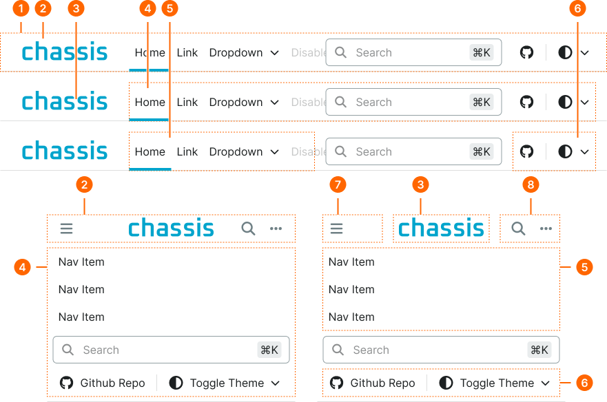
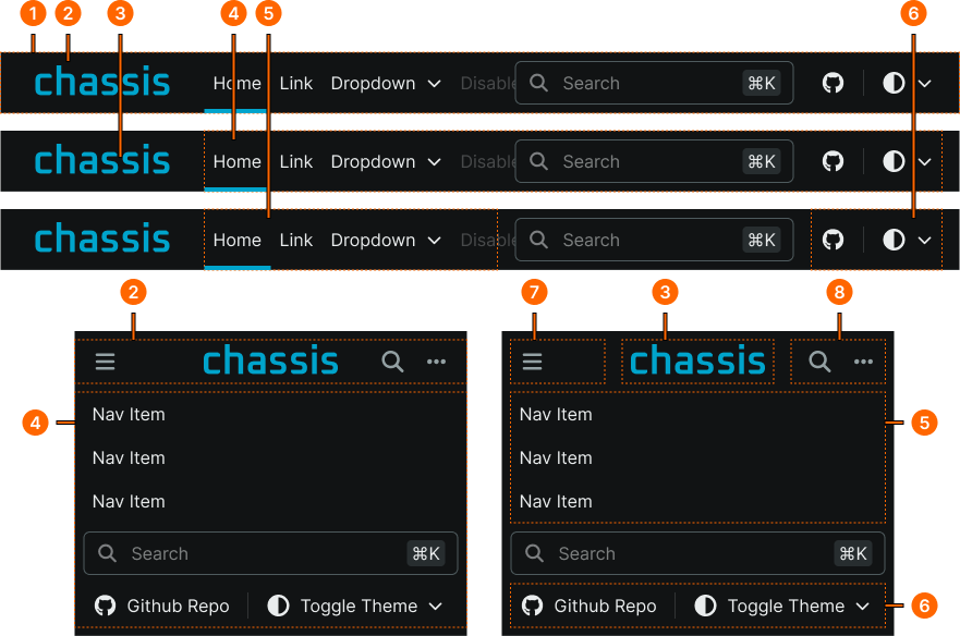
1
Navbar
- size:
- large
- verticalPadding:
- space.unit.0
- horizontalPadding:
- space.unit.0
- itemSpacing:
- space.unit.0
- size:
- small
- verticalPadding:
- space.unit.8
- horizontalPadding:
- space.unit.0
- itemSpacing:
- space.unit.8
2
Container Frame
- size:
- large
- minWidth:
- size.grid.breakpoint.medium
- maxWidth:
- size.grid.breakpoint.xlarge
- verticalPadding:
- none
- horizontalPadding:
- space.context.medium
- itemSpacing:
- space.context.medium
- size:
- small
- minWidth:
- none
- maxWidth:
- none
- verticalPadding:
- none
- horizontalPadding:
- space.context.xsmall
- itemSpacing:
- space.context.xsmall
3
Logo
- height:
- size.base.32
4
Collapse Frame
- size:
- large
- verticalPadding:
- none
- horizontalPadding:
- none
- itemSpacing:
- space.context.medium
- size:
- small
- verticalPadding:
- none
- horizontalPadding:
- space.context.xsmall
- itemSpacing:
- space.context.xsmall
5
Menu Frame
- size:
- large
- verticalPadding:
- none
- horizontalPadding:
- none
- itemSpacing:
- none
- size:
- small
- verticalPadding:
- none
- horizontalPadding:
- none
- itemSpacing:
- none
6
Tools Frame
- verticalPadding:
- none
- horizontalPadding:
- none
- itemSpacing:
- none