Menu components that reveal a list of options or actions when activated, allowing users to select from multiple choices in a compact space.
On this page
This documentation is a work in progress and may contain incomplete or outdated information. If you have any feedback or suggestions, please open an issue on GitHub.
Different configurations and states available for dropdown components to accommodate various selection requirements, content organization, and user interaction patterns. These variants provide flexibility in appearance, behavior, and functionality while maintaining design consistency across different dropdown contexts and menu presentation scenarios.
Dropdown Item
Individual interactive elements that display selectable options within dropdown menus. These components serve as the core building blocks within dropdown structures, adapting their appearance and behavior based on content type, user interaction, and contextual requirements to provide clear option selection and maintain consistent user experience across all dropdown scenarios.
Type Variants
Content structure configurations that determine the layout and functional purpose of dropdown item elements. These variants control the presentation format and interaction approach to match different content types and organizational requirements.
Action
Interactive item structure with selectable functionality for triggering actions or selections. Use for menu options, command selections, navigation choices, or when providing clickable actions within dropdown interfaces.
Header
Non-interactive item structure with emphasized styling for section organization and content grouping. Use for category labels, section dividers, organizational headers, or when providing visual hierarchy within dropdown content.
Separator
Non-interactive visual element that provides content separation and organizational structure within dropdown menus. Use for grouping related options, creating visual breaks, or when organizing dropdown content into logical sections.
State Variants
Interactive states that affect user interaction capabilities and visual feedback based on current user activity and item status. These variants communicate the dropdown item's availability and current selection state while guiding users through successful option selection.
Idle
Standard appearance of a dropdown item when not being interacted with and available for selection. Neutral styling indicates the option is accessible and provides clear interactive target for user selection.
Hover
Enhanced visual feedback when a user hovers over a dropdown item, indicating interactive availability. Elevated styling signals potential selection action and guides user attention to available option choices.
Active
Highlighted state indicating the currently selected or focused item within the dropdown menu. Distinct styling provides clear feedback about current selection and maintains positional awareness within option navigation.
Disabled
Non-interactive state for dropdown items that are not currently accessible due to conditions, restrictions, or system states. Reduced visual prominence indicates unavailability while maintaining interface structure and option context.
Dropdown Menu
Container elements that organize and present dropdown items within structured overlay interfaces. These components serve as the primary content presentation surface for dropdown functionality, adapting their appearance and organization based on content complexity and contextual requirements.
Type Variants
Layout configurations that determine the overall structure and presentation approach of dropdown menu elements. These variants control the organizational framework and visual treatment to match different content types and interaction patterns.
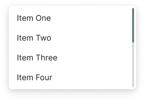
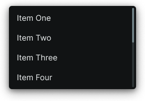
Basic
Default menu structure with standard layout organization and content presentation. Use for most dropdown implementations requiring conventional menu behavior, standard option display, or when providing consistent dropdown experience across interface contexts.
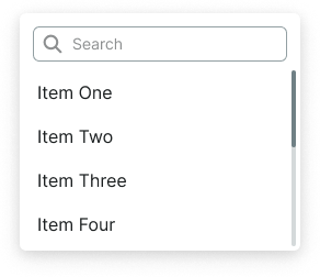
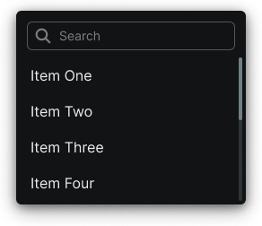
Searchable
Enhanced menu structure with integrated search input for filtering available options. Use for dropdown implementations with numerous options, complex option sets, or when users need quick access to specific choices through text-based filtering.
Dropdown Button
Trigger elements that initiate dropdown menu display and provide access to selectable options. These components serve as the interactive control for dropdown functionality, adapting their appearance and menu positioning based on interface layout and contextual requirements.
Orientation Variants
Positioning configurations that determine the dropdown menu placement relative to the trigger button element. These variants control the overlay positioning and alignment to optimize visibility and usability across different interface contexts.
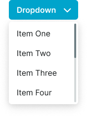
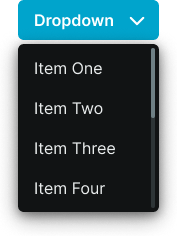
Down
Menu positioning with dropdown overlay expanding downward from the trigger button. Use for buttons positioned in upper interface areas, standard dropdown placements, or when sufficient space exists below the trigger for menu presentation.
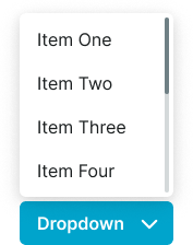
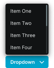
Up
Menu positioning with dropdown overlay expanding upward from the trigger button. Use for buttons positioned in lower interface areas, constrained vertical spaces, or when optimizing menu visibility by expanding toward available screen space above the trigger.