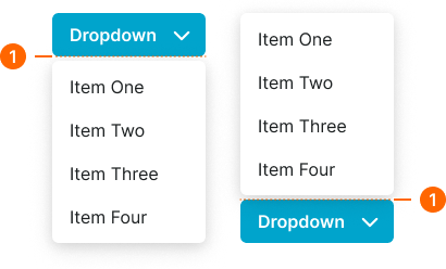
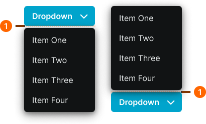
dropdown
Menu components that reveal a list of options or actions when activated, allowing users to select from multiple choices in a compact space.
Technical specifications and design system values that define the visual and structural properties of dropdown components. These specifications ensure consistent implementation across design tools and development environments.
Legend:
- Brackets (
[]) denote a component variant placeholder. - Full emphasis indicates a value specific to that variant.
- Dimmed indicates a value unchanged from the default variant.
Dropdown Item
Specifications for individual dropdown option elements including measurements, colors, typography, and interactive styling attributes. These values define the selectable item appearance.
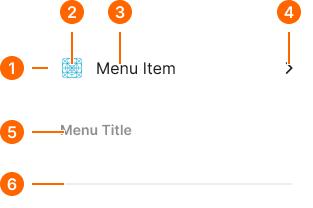
1
Dropdown Item
- type:
- action
- verticalPadding:
- space.context.xsmall
- horizontalPadding:
- space.context.small
- itemSpacing:
- space.context.small
- fill:
- color.dropdown.bg-[state]
- borderRadius:
- borderRadius.dropdown.item
- type:
- header
- verticalPadding:
- space.context.xsmall
- horizontalPadding:
- space.context.small
- itemSpacing:
- space.context.small
- fill:
- color.dropdown.bg-header
- borderRadius:
- borderRadius.dropdown.item
- type:
- separator
- verticalPadding:
- space.context.xsmall
- horizontalPadding:
- space.context.small
- itemSpacing:
- space.context.small
- fill:
- color.dropdown.bg-header
- borderRadius:
- borderRadius.dropdown.item
2
Icon
- height:
- size.icon.glyph.medium
- width:
- size.icon.glyph.medium
- fill:
- color.dropdown.icon-[state]
3
Action Text
- fill:
- color.dropdown.fg-[state]
- typography:
- font.dropdown.item
4
Disclosure Icon
- height:
- size.icon.glyph.xsmall
- width:
- size.icon.glyph.xsmall
- fill:
- color.dropdown.fg-[state]
5
Header Text
- fill:
- color.dropdown.fg-header
- typography:
- font.dropdown.header
6
Separator Line
- height:
- size.asset.separator
- fill:
- color.dropdown.separator
Dropdown Menu
Specifications for dropdown container elements including measurements, colors, layout properties, and organizational styling attributes. These values define the menu container appearance.
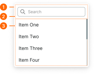
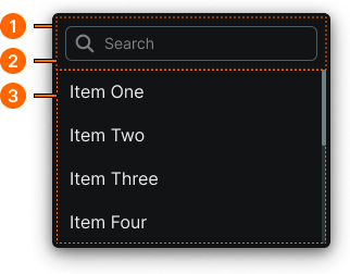
1
Dropdown Menu
- verticalPadding:
- space.context.2xsmall
- horizontalPadding:
- space.context.2xsmall
- fill:
- color.dropdown.bg-base
- borderColor:
- color.dropdown.border-base
- borderRadius:
- borderRadius.dropdown.main
- borderWidth:
- borderWidth.dropdown.main
- boxShadow:
- shadow.dropdown.main
2
Filter Frame
- type:
- searchable
- verticalPadding:
- space.context.xsmall
- horizontalPadding:
- space.context.xsmall
3
items
Scrollable container slot for dropdown items.
Dropdown Button
Specifications for dropdown trigger elements including measurements, colors, typography, and activation styling attributes. These values define the core appearance and interaction properties for dropdown button implementations.