dropdown
Menu components that reveal a list of options or actions when activated, allowing users to select from multiple choices in a compact space.
Configurable properties that control the appearance, behavior, and functionality of dropdown components for option selection and menu interaction management.
Dropdown Item
Properties that define the visual state and interactive behavior of individual selectable option elements within dropdown menu interfaces.


type variant
Controls the content structure and functional purpose of the dropdown item element based on its role within the menu organization.
- action
- header
- separator
state variant
- type:
- action
Controls the interactive state and visual feedback of the dropdown item based on user interaction and current selection status.
- idle
- hover
- active
- disabled
has-icon boolean
Controls the visibility of an icon element that provides visual identification and categorization within the dropdown item.
icon-instance instance-swap
- has-icon:
- true
Specifies which icon component to display when has-icon property is enabled.
- Icon Placeholder
has-disclosure boolean
Controls the visibility of a disclosure indicator that signals the dropdown item contains additional submenu options or nested content.
- true
- false
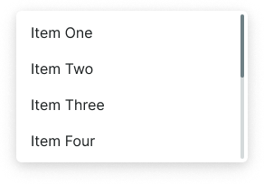
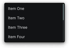
Dropdown Menu
Properties that define the visual state and organizational structure of container elements that present dropdown option collections.
variant variant
Controls the layout configuration and presentation approach of the dropdown menu container based on content organization requirements.
- basic
- searchable
has-scrollbar boolean
Controls the visibility of scrollbar elements when dropdown content exceeds the available menu height and requires vertical navigation.
- true
- false
items slot
Allows you to freely add and arrange dropdown item components directly inside the menu without detaching it.
Dropdown Button
Properties that define the visual state and positioning behavior of trigger elements that initiate dropdown menu display and interaction.
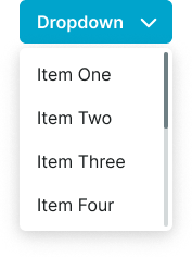
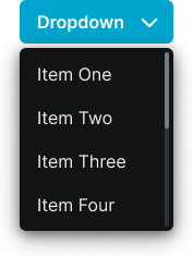
direction variant
Controls the expansion direction of the dropdown menu overlay relative to the trigger button element, optimizing menu visibility based on available screen space.
- down
- up
dropdown slot
Allows you to freely add a custom dropdown content directly inside the button without detaching it.