carousel
Slideshow components that cycle through multiple pieces of content such as images or cards in a rotating display format.
Different configurations and states available for carousel components to accommodate various content presentation requirements, scrolling patterns, and interactive display needs. These variants provide flexibility in appearance, content organization, and navigation behavior while maintaining design consistency across the system.
Hero Carousel
Prominent display elements that showcase featured content, promotional materials, and key information through sequential presentation. These components serve as the primary attention-grabbing interface within layouts, adapting their appearance and content organization based on screen real estate, visual prominence requirements, and contextual presentation to provide impactful content delivery and maintain consistent user experience across all hero carousel scenarios.
Size Variants
Dimensional configurations that control the carousel scale and content presentation to optimize visual impact across different screen sizes and device capabilities. These variants determine the spatial organization and content visibility characteristics for various display contexts.


Large
Expanded carousel dimensions optimized for desktop and tablet environments with generous screen real estate. Use for detailed hero presentations, comprehensive featured content, high-impact promotional displays, or when providing extensive visual areas and enhanced content visibility on larger displays.


Small
Compact carousel dimensions optimized for mobile devices and space-constrained environments. Use for mobile hero sections, simplified featured content, essential promotional displays, or when screen space requires efficient use while maintaining clear content presentation and touch interaction capabilities.
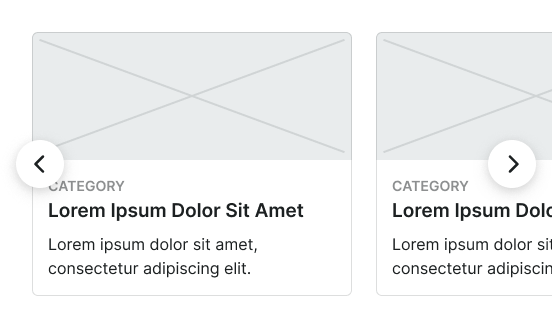
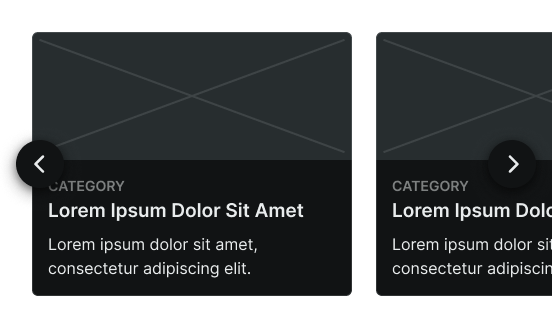
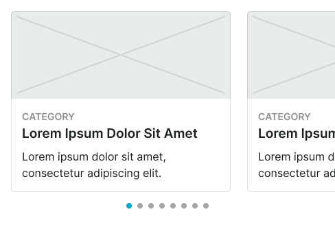
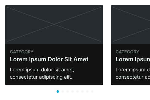
Card Carousel
Container elements that organize and present collections of related content through horizontal scrolling navigation. These components serve as the primary content grouping interface for sequential browsing, adapting their appearance and content organization based on card density, navigation patterns, and contextual presentation to provide clear content separation and maintain consistent user experience across all card carousel scenarios.
Size Variants
Dimensional configurations that control the card carousel scale and content presentation to optimize browsing usability across different screen sizes and device capabilities. These variants determine the spatial organization and card visibility characteristics for various display contexts.
Large
Expanded card carousel dimensions optimized for desktop and tablet environments with generous screen real estate. Use for detailed card presentations, comprehensive content collections, multi-column card displays, or when providing extensive browsing areas and enhanced card visibility on larger displays.
Small
Compact card carousel dimensions optimized for mobile devices and space-constrained environments. Use for mobile card browsing, simplified content collections, single-column card displays, or when screen space requires efficient use while maintaining clear card presentation and touch navigation capabilities.
Small Carousel
Touch-optimized display elements designed specifically for mobile environments that provide efficient content navigation through simplified interaction patterns. These components serve as the primary sequential browsing interface for mobile devices, adapting their appearance and functionality based on touch interaction requirements, screen limitations, and simplified navigation patterns to provide clear content flow while maintaining usability within mobile interface constraints.
Type Variants
Layout configurations that determine the content organization and image positioning within mobile carousel structures. These variants control the visual hierarchy and content flow to match different mobile design contexts and space utilization requirements.
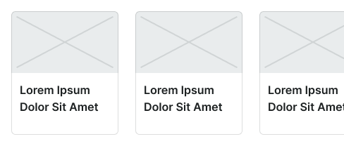
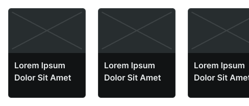


Image Left
Horizontal mobile carousel layout with image positioning on the left side for compact space efficiency. Use for mobile content lists, space-optimized displays, or when maximizing horizontal screen utilization while maintaining clear content organization and touch interaction capabilities.