carousel
Slideshow components that cycle through multiple pieces of content such as images or cards in a rotating display format.
Configurable properties that control the appearance, behavior, and functionality of carousel components for sequential content presentation and interactive browsing interfaces.
Hero Carousel
Properties that define the visual state and content presentation of prominent display elements that showcase featured content through sequential navigation.


size variant
Controls the dimensional scale and content presentation of the hero carousel to optimize visual impact across different screen sizes and device capabilities.
- large
- small
has-pagination boolean
Controls the visibility of pagination indicators that provide navigation feedback and position awareness within the carousel sequence.
- true
- false
Card Carousel
Properties that define the visual state and content organization of container elements that present collections of related content through horizontal scrolling navigation.
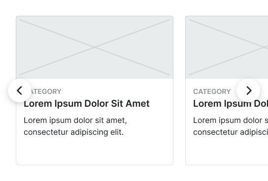
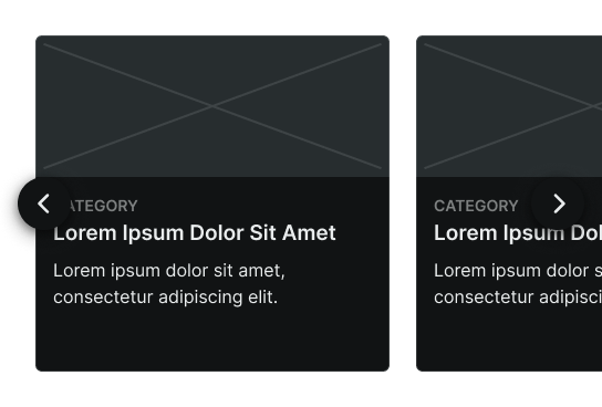
size variant
Controls the dimensional scale and content presentation of the card carousel to optimize browsing usability across different screen sizes and device capabilities.
- large
- small
has-pagination boolean
Controls the visibility of pagination indicators that provide navigation feedback and position awareness within the card collection sequence.
- true
- false
items slot
Allows you to freely add and arrange content directly inside a carousel without detaching it.
Small Carousel
Properties that define the visual state and content organization of touch-optimized display elements designed specifically for mobile environments with simplified interaction patterns.
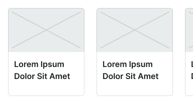
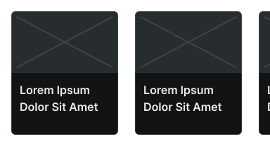
layout variant
Controls the layout configuration and image positioning within the mobile carousel structure, determining the visual hierarchy and content flow for touch-based navigation.
- image-top
- image-left
items slot
Allows you to freely add and arrange content directly inside a carousel without detaching it.