carousel
Slideshow components that cycle through multiple pieces of content such as images or cards in a rotating display format.
Technical specifications and design system values that define the visual and structural properties of carousel components. These specifications ensure consistent implementation across design tools and development environments.
Legend:
- Brackets (
[]) denote a component variant placeholder. - Full emphasis indicates a value specific to that variant.
- Dimmed indicates a value unchanged from the default variant.
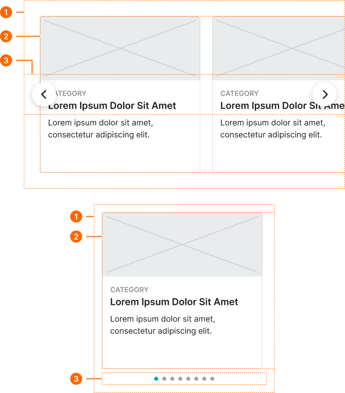
Hero Carousel
Specifications for prominent display carousel elements including measurements, colors, typography, and sequential presentation styling attributes. These values define the visual impact and navigation properties for featured content showcase implementations.
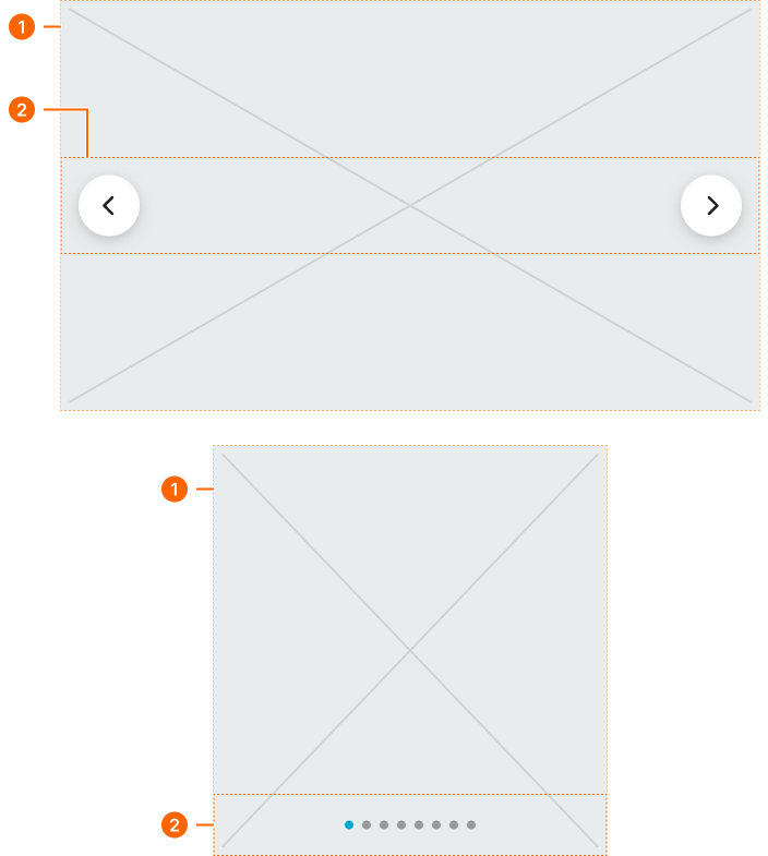
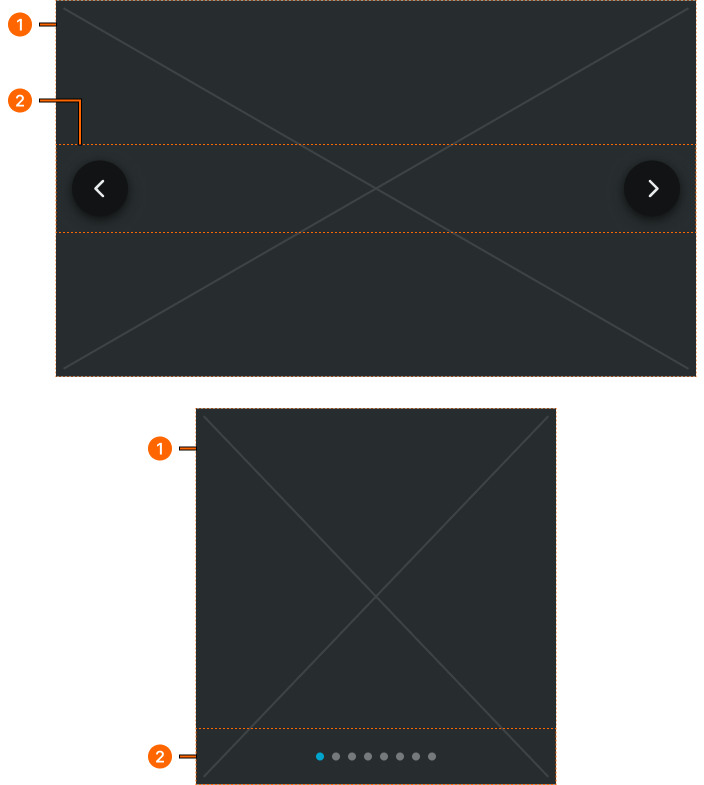
1
Hero Carousel
Basic container
2
Pager Frame
- verticalPadding:
- space.context.medium
- horizontalPadding:
- space.context.medium
- itemSpacing:
- auto
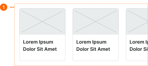
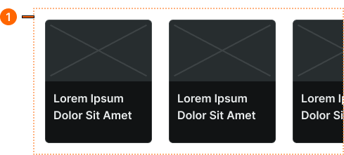
Card Carousel
Specifications for content collection carousel elements including measurements, colors, typography, and horizontal scrolling styling attributes. These values define the browsing experience and card organization properties for sequential content navigation implementations.
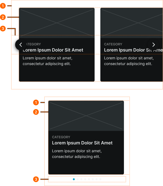
1
Card Carousel
- verticalPadding:
- space.page.[size]-padding-y
- horizontalPadding:
- space.page.[size]-padding-x
2
Cards Frame
- itemSpacing:
- space.page.[size]-gap
2
Pager Frame
- size:
- large
- verticalPadding:
- space.context.medium
- horizontalPadding:
- space.context.medium
- itemSpacing:
- auto
- size:
- small
- verticalPadding:
- none
- horizontalPadding:
- none
- itemSpacing:
- none
Small Carousel
Specifications for mobile-optimized carousel elements including measurements, colors, typography, and touch interaction styling attributes. These values define the simplified navigation and content presentation properties for mobile-specific carousel implementations.