Structural components that divide page content into thematically related areas, providing clear visual separation and content organization.
On this page
This documentation is a work in progress and may contain incomplete or outdated information. If you have any feedback or suggestions, please open an issue on GitHub.
Different configurations and states available for section components to accommodate various content organization requirements, layout structures, and visual presentation needs. These variants provide flexibility in appearance, spacing, and functionality while maintaining design consistency across different section contexts and interface scenarios.
Section components are available in both desktop and mobile versions across separate Figma files. Mobile components feature platform-specific spacing controls (horizontal and vertical spacing) optimized for touch interfaces, while desktop components use simplified spacing variants for traditional layouts.
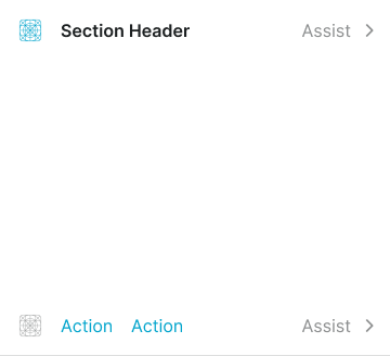
Section Header
Header elements that provide title, context, and navigational information for content sections. These components serve as the primary identification interface for section content, adapting their appearance and layout based on information hierarchy, spacing requirements, and contextual presentation to provide clear section identification and maintain consistent user experience across all section scenarios.
Size Variants
Dimensional configurations that control the section header scale and content presentation to accommodate various layout requirements and content importance levels. These variants maintain proportional relationships while adapting to different design contexts and space constraints.
Large
Expanded section header dimensions designed for prominent content sections requiring enhanced visual presence. Use for main page sections, featured content areas, primary section headers, or when maximum visibility and content hierarchy emphasis are required.
Medium
Balanced section header dimensions suitable for standard interface layouts and moderate content hierarchy. Use for most section implementations, responsive interfaces, or when maintaining optimal balance between header prominence and content space efficiency.
Small
Compact section header dimensions optimized for secondary content sections and space-constrained layouts. Use for nested sections, subsection headers, dense interfaces, or when multiple sections need to fit within limited space while maintaining clear identification.
Spacing Variants
Layout configurations that control the internal padding and visual separation of section header elements. These variants determine the visual density and spacing relationships to match different design contexts and content requirements.
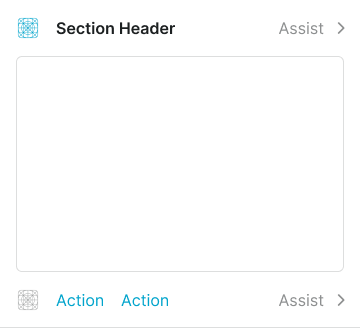
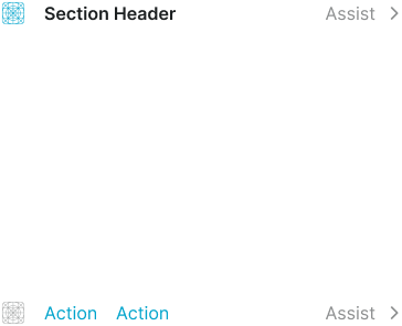
Regular
Standard spacing with balanced padding for optimal readability and clear visual separation. Use for most section header implementations requiring comfortable content separation, standard layouts, or when maintaining consistent visual rhythm with surrounding interface elements.
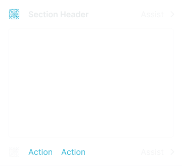
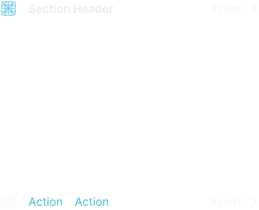
Flush
Minimal spacing with reduced padding for dense layouts and space-efficient content presentation. Use when maximizing content visibility, compact interfaces, or when header elements need minimal separation while maintaining functional readability and section identification.
Section Footer
Footer elements that provide action controls, navigation options, and supplementary functionality for content sections. These components serve as the primary action interface for section content, adapting their layout and button organization based on action importance, spacing requirements, and interaction patterns to provide clear action access and maintain consistent user experience across all section scenarios.
Type Variants
Layout configurations that determine the arrangement and organization of action elements within section footer interfaces. These variants control the button positioning and visual hierarchy to match different action patterns and space utilization requirements.
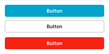
Right
Primary button positioning on the right side with standard action hierarchy. Use for form submissions, primary actions, standard workflows, or when following conventional action placement patterns with clear primary action emphasis.
Left
Primary button positioning on the left side for alternative action hierarchy. Use for alternative workflows, left-to-right action patterns, or when design context requires non-standard primary action placement while maintaining clear action identification.
Fill
Equal width button distribution across available footer space for balanced action presentation. Use for dual primary actions, balanced choices, comparative decisions, or when multiple actions require equal visual importance and accessibility.
Stack
Full-width button arrangement in vertical stack formation for comprehensive action display. Use for mobile layouts, multiple action options, sequential workflows, or when vertical space allows for enhanced action visibility and touch accessibility.
Action
Link-style button presentation with supplementary assist elements for subtle action interfaces. Use for secondary actions, helper functionality, optional features, or when providing action access without visual prominence or interface disruption.
Size Variants
Dimensional configurations that control the section footer scale and action element presentation to accommodate various layout requirements and interaction importance levels. These variants maintain proportional relationships while adapting to different design contexts and space constraints.
Large
Expanded section footer dimensions designed for prominent action sections requiring enhanced accessibility and visual presence. Use for primary action sections, comprehensive workflows, important decision points, or when maximum interaction area and action visibility are required.
Medium
Balanced section footer dimensions suitable for standard interface layouts and moderate action density. Use for most section footer implementations, responsive interfaces, or when maintaining optimal balance between action space and content efficiency.
Small
Compact section footer dimensions optimized for secondary action sections and space-constrained interfaces. Use for minimal action sets, dense layouts, supplementary controls, or when multiple action areas need to fit within limited space while maintaining clear accessibility.
Spacing Variants
Layout configurations that control the internal padding and visual separation of section footer elements. These variants determine the visual density and spacing relationships to match different design contexts and action requirements.
Regular
Standard spacing with balanced padding for optimal action accessibility and clear visual separation. Use for most section footer implementations requiring comfortable action separation, standard layouts, or when maintaining consistent visual rhythm with surrounding interface elements.
Flush
Minimal spacing with reduced padding for dense layouts and space-efficient action presentation. Use when maximizing content visibility, compact interfaces, or when footer elements need minimal separation while maintaining functional accessibility and action identification.
Section Block
Content container elements that provide structural organization and visual treatment for section content areas. These components serve as the primary content wrapper interface within sections, adapting their appearance and layout based on visual emphasis, content boundaries, and contextual presentation to provide clear content organization and maintain consistent user experience across all section block scenarios.
Type Variants
Visual presentation configurations that determine the styling approach and visual emphasis of section block content containers. These variants control the visual treatment and boundary definition to match different content importance levels and design context requirements.
Basic
Standard section block presentation with minimal visual treatment for clean content organization. Use for most section implementations, neutral content areas, standard layouts, or when providing clear content structure without additional visual emphasis or interface complexity.
Bordered
Enhanced section block presentation with border treatment for defined content boundaries. Use for content separation, grouped information, form sections, or when providing clear visual distinction between section content and surrounding interface elements.
Elevated
Premium section block presentation with shadow treatment for enhanced visual prominence. Use for featured content, important sections, card-like presentations, or when providing elevated visual hierarchy and depth perception within interface layouts.
Spacing Variants
Layout configurations that control the internal padding and visual separation of section block elements. These variants determine the visual density and spacing relationships to match different design contexts and content requirements.
Regular
Standard spacing with balanced padding for optimal content readability and clear visual separation. Use for most section block implementations requiring comfortable content separation, standard layouts, or when maintaining consistent visual rhythm with surrounding interface elements.
Flush
Minimal spacing with reduced padding for dense layouts and space-efficient content presentation. Use when maximizing content visibility, compact interfaces, or when block elements need minimal separation while maintaining functional readability and content organization.