section
Structural components that divide page content into thematically related areas, providing clear visual separation and content organization.
Technical specifications and measurements for section components that ensure consistent implementation and precise visual rendering across different content organization contexts and layout interface scenarios.
Legend:
- Brackets (
[]) denote a component variant placeholder. - Full emphasis indicates a value specific to that variant.
- Dimmed indicates a value unchanged from the default variant.
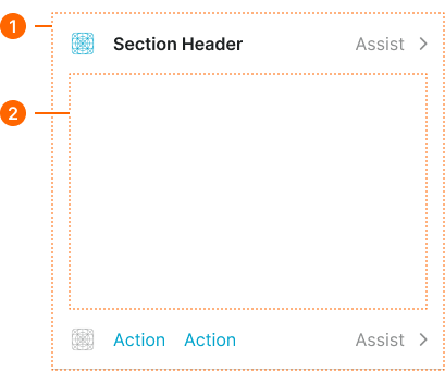
Section Header
Header elements that provide section identification with precise dimensional and spacing specifications for consistent content organization and optimal section recognition.
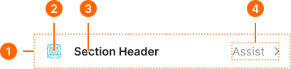
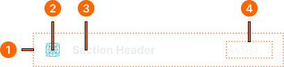
1
Section Header
- size:
- medium
- flush:
- false
- verticalPadding:
- space.context.small
- horizontalPadding:
- space.context.[size]
- itemSpacing:
- space.context.[size]
- borderColor:
- color.context.default.border-subtle
- borderWidthBottom:
- borderWidth.asset.separator
- size:
- medium
- flush:
- true
- verticalPadding:
- none
- horizontalPadding:
- none
- itemSpacing:
- space.context.[size]
- borderColor:
- color.context.default.border-subtle
- borderWidthBottom:
- borderWidth.asset.separator
- size:
- large
- flush:
- false
- verticalPadding:
- space.context.medium
- horizontalPadding:
- space.context.[size]
- itemSpacing:
- space.context.[size]
- borderColor:
- color.context.default.border-subtle
- borderWidthBottom:
- borderWidth.asset.separator
- size:
- small
- flush:
- false
- verticalPadding:
- space.context.xsmall
- horizontalPadding:
- space.context.[size]
- itemSpacing:
- space.context.[size]
- borderColor:
- color.context.default.border-subtle
- borderWidthBottom:
- borderWidth.asset.separator
2
Icon
- height:
- size.icon.glyph.[size]
- width:
- size.icon.glyph.[size]
- fill:
- color.section.icon-[size]
3
Title Text
- fill:
- color.section.fg-[size]
- typography:
- font.section.header-[size]
Section Footer
Footer elements that provide section functionality with precise dimensional and interaction specifications for consistent action organization and optimal user accessibility.
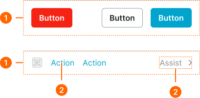
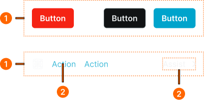
1
Section Footer
- size:
- medium
- flush:
- false
- verticalPadding:
- space.context.small
- horizontalPadding:
- space.context.[size]
- itemSpacing:
- space.context.[size]
- borderColor:
- color.context.default.border-subtle
- borderWidthTop:
- borderWidth.asset.separator
- size:
- medium
- flush:
- true
- verticalPadding:
- none
- horizontalPadding:
- none
- itemSpacing:
- space.context.[size]
- borderColor:
- color.context.default.border-subtle
- borderWidthTop:
- borderWidth.asset.separator
- size:
- large
- flush:
- false
- verticalPadding:
- space.context.medium
- horizontalPadding:
- space.context.[size]
- itemSpacing:
- space.context.[size]
- borderColor:
- color.context.default.border-subtle
- borderWidthTop:
- borderWidth.asset.separator
- size:
- small
- flush:
- false
- verticalPadding:
- space.context.xsmall
- horizontalPadding:
- space.context.[size]
- itemSpacing:
- space.context.[size]
- borderColor:
- color.context.default.border-subtle
- borderWidthTop:
- borderWidth.asset.separator
2
Action Text
- fill:
- color.context.default.link-main
- typography:
- font.text.[size].normal
Section Block
Block elements that provide section structure with precise dimensional and layout specifications for consistent content containers and optimal layout organization.
1
Section Block
- flush:
- false
- verticalPadding:
- space.context.medium
- horizontalPadding:
- space.context.medium
- itemSpacing:
- space.context.medium
- flush:
- true
- verticalPadding:
- none
- horizontalPadding:
- none
- itemSpacing:
- space.context.medium
2
Content Frame
- type:
- basic
- borderColor:
- none
- borderRadius:
- none
- borderWidth:
- none
- boxShadow:
- none
- type:
- bordered
- borderColor:
- color.context.default.border-subtle
- borderRadius:
- borderRadius.context.medium
- borderWidth:
- borderWidth.context.medium
- boxShadow:
- none
- type:
- elevated
- borderColor:
- none
- borderRadius:
- borderRadius.context.medium
- borderWidth:
- none
- boxShadow:
- shadow.section.main