section
Structural components that divide page content into thematically related areas, providing clear visual separation and content organization.
Configurable properties that control the appearance, behavior, and functionality of section components for content organization and structured layout interfaces.
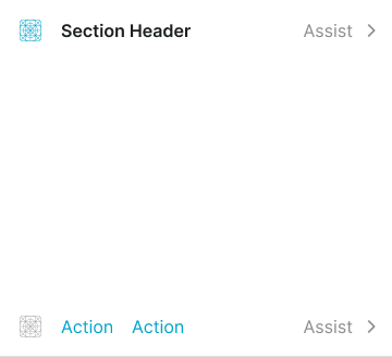
Section Header
Properties that define the visual state and content presentation of header elements that provide section identification and contextual information.


size variant
Controls the dimensional scale and content presentation of the section header to optimize usability across different screen sizes and content hierarchy requirements.
- large
- medium
- small
flush variant
Controls the spacing configuration of the section header, determining whether standard or minimal padding is applied for different layout density requirements.
- true
- false
has-icon boolean
Controls the visibility of an icon element that provides visual identification and contextual representation within the section header.
- true
- false
icon-instance instance-swap
- has-icon:
- true
Specifies which icon component to display when has-icon property is enabled.
- Icon Placeholder
has-assist boolean
Controls the visibility of supplementary elements that provide additional functionality and contextual information within the section header.
- true
- false
has-separator boolean
- flush:
- false
Controls the visibility of visual separator elements that provide clear boundaries and organization between the section header and content areas.
- true
- false
Section Footer
Properties that define the visual state and action organization of footer elements that provide section functionality and interactive controls.


type variant
Controls the layout arrangement and button organization of the section footer based on action patterns and space utilization requirements.
- right
- left
- fill
- stack
- action
size variant
Controls the dimensional scale and action element presentation of the section footer to optimize usability across different screen sizes and interaction requirements.
- large
- medium
- small
flush variant
Controls the spacing configuration of the section footer, determining whether standard or minimal padding is applied for different layout density requirements.
- true
- false
has-2nd-action boolean
Controls the visibility of a secondary action element that provides additional functionality and interaction options within the section footer.
- true
- false
has-3rd-action boolean
- type:
- right, left, fill, stack
Controls the visibility of a tertiary action element that provides supplementary functionality and extended interaction options within the section footer.
- true
- false
has-assist boolean
- type:
- action
Controls the visibility of supplementary elements that provide additional functionality and contextual information within the section footer.
- true
- false
has-separator boolean
- flush:
- false
Controls the visibility of visual separator elements that provide clear boundaries and organization between the section footer and content areas.
- true
- false
Section Block
Properties that define the visual state and content organization of block elements that provide section structure and layout containers.
type variant
Controls the content organization and layout structure of the section block based on content presentation and visual hierarchy requirements.
- basic
- bordered
- elevated
flush variant
Controls the spacing configuration of the section block, determining whether standard or minimal padding is applied for different layout density requirements.
- false
- true
has-header boolean
Controls the visibility of header elements that provide section identification and contextual information within the section block container.
- true
- false
has-footer boolean
Controls the visibility of footer elements that provide action functionality and interactive controls within the section block container.
- true
- false
has-separator boolean
- flush:
- false
Controls the visibility of visual separator elements that provide clear boundaries and separation between the section and page content or other sections.
- true
- false