mobile-nav-bottom
Bottom navigation bars for mobile interfaces, providing primary navigation options in thumb-friendly locations at the bottom of the screen.
Different configurations and states available for mobile navigation bottom components to accommodate various navigation requirements, platform conventions, and interaction patterns. These variants provide flexibility in appearance, content structure, and functionality while maintaining design consistency across mobile interface implementations.
Mobile Bottom Navigation
Container elements that provide foundational navigation structure and interface organization for mobile applications positioned at the bottom of the screen. These components serve as the primary navigation foundation for mobile experiences, adapting their appearance and behavioral patterns based on navigation type, content requirements, and platform-specific design conventions to provide accessible navigation access and maintain consistent user experience across all mobile bottom navigation scenarios.
Style Variants
Visual presentation configurations that determine the aesthetic treatment and platform alignment of mobile bottom navigation container elements. These variants control the visual styling approach to match different iOS design generations and platform-specific visual conventions.
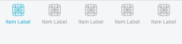
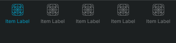
Basic
Standard mobile navigation presentation with conventional iOS styling for traditional interface aesthetics and iOS 18 design patterns. Use for standard iOS implementations, traditional mobile interfaces, or when maintaining established iOS design conventions with familiar visual treatment and platform consistency.
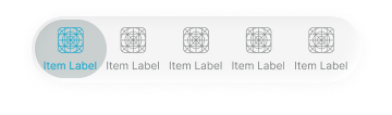
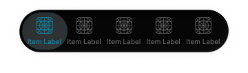
Glass
Enhanced mobile navigation presentation with translucent glass styling for modern interface aesthetics and iOS 26 design patterns. Use for contemporary iOS implementations, modern mobile interfaces, or when adopting current iOS design evolution with translucent visual effects and enhanced depth perception.
Type Variants
Structural configurations that determine the navigation type and content organization of mobile bottom navigation components. These variants control the interface functionality and interaction emphasis to match different mobile application contexts and navigation requirements.


Progress Info
Informational mobile navigation presentation with process-focused interface styling for status communication and contextual information display. Use for checkout processes, progress indication, onboarding flows, or when providing clear informational context about current user position or task state.
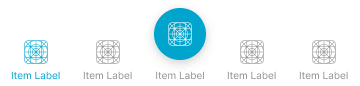
Nav Tabs
Interactive elements that provide tab-based navigation and section organization within mobile bottom navigation structures. These components serve as the primary section navigation interface for mobile applications, adapting their appearance and layout organization based on platform conventions, tab functionality, and content hierarchy to provide clear section access and maintain consistent user experience across all mobile tab navigation scenarios.
Type Variants
Layout configurations that determine the tab presentation and interaction approach of mobile bottom navigation tab elements. These variants control the visual hierarchy and functional emphasis to match different mobile design conventions and navigation requirements.


Standard
Standard tab navigation presentation with conventional tab interface styling for balanced section navigation and traditional mobile tab patterns. Use for most mobile tab implementations, standard section navigation, or when maintaining conventional mobile tab patterns with clear section organization.
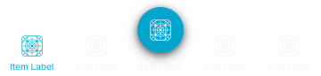
Floating Action
Enhanced tab navigation presentation with floating action button integration for emphasized primary action and iOS-style hero tab patterns. Use for primary action emphasis, featured functionality access, or when providing prominent action integration with clear functional hierarchy and improved accessibility.
Nav Action
Interactive elements that provide action-focused functionality and task completion controls within mobile bottom navigation structures. These components serve as the primary action interface for mobile applications, adapting their appearance and layout organization based on action type, button arrangement, and workflow requirements to provide clear functional access and maintain consistent user experience across all mobile action navigation scenarios.
Type Variants
Layout configurations that determine the action arrangement and interaction approach of mobile bottom navigation action elements. These variants control the button organization and visual hierarchy to match different workflow requirements and interface contexts.


Nav Progress
Interactive elements that provide progress indication and process status communication within mobile bottom navigation structures. These components serve as the primary progress interface for mobile applications, adapting their appearance and information organization based on process type, completion status, and workflow context to provide clear progress communication and maintain consistent user experience across all mobile progress navigation scenarios.
Type Variants
Content configurations that determine the progress presentation and information approach of mobile bottom navigation progress elements. These variants control the progress display and contextual information to match different workflow requirements and process contexts.


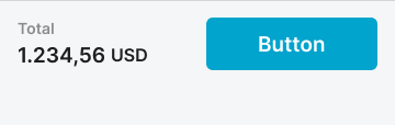
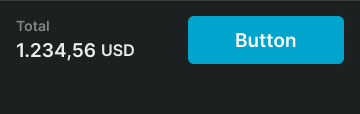
Purchase Summary
Transaction-focused progress presentation with pricing information and checkout functionality for e-commerce workflows and purchase completion processes. Use for shopping cart completion, payment processing, transaction finalization, or when providing comprehensive purchase information with clear transaction progress.


Step Progress
Process-focused progress presentation with step indication and workflow status for multi-step processes and guided task completion. Use for onboarding flows, form completion, setup processes, or when providing clear process navigation with step-by-step progress indication and workflow guidance.