mobile-nav-bottom
Bottom navigation bars for mobile interfaces, providing primary navigation options in thumb-friendly locations at the bottom of the screen.
Technical specifications and design system values that define the visual and structural properties of mobile navigation bottom components. These specifications ensure consistent implementation across design tools and development environments.
Legend:
- Brackets (
[]) denote a component variant placeholder. - Full emphasis indicates a value specific to that variant.
- Dimmed indicates a value unchanged from the default variant.
Mobile Bottom Navigation
Specifications for mobile navigation tab elements including measurements, colors, typography, and tab interaction styling attributes. These values define the tab presentation and section navigation properties for mobile bottom navigation tab implementations.
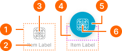
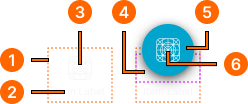
1
Tab item
- paddingTop:
- space.unit.6
- paddingBottom:
- space.unit.4
- itemSpacing:
- space.unit.2
2
Tab Text
- active:
- false
- fill:
- color.context.default.fg-subtle
- typography:
- font.text.2xsmall.normal
- active:
- true
- fill:
- color.context.primary.base-color
- typography:
- font.text.2xsmall.normal
3
Tab Icon
- active:
- false
- height:
- size.icon.glyph.large
- width:
- size.icon.glyph.large
- fill:
- color.context.default.fg-subtle
- active:
- true
- height:
- size.icon.glyph.large
- width:
- size.icon.glyph.large
- fill:
- color.context.primary.base-color
4
Floating Frame
Fixed height frame with overflowing content.
- height:
- size.unit.28
- paddingBottom:
- space.unit.8
5
Floating Button Frame
- active:
- false
- height:
- size.unit.52
- width:
- size.unit.52
- fill:
- color.context.primary.bg-idle
- borderRadius:
- borderRadius.context.round-52
- boxShadow:
- shadow.elevation.default.20
- active:
- true
- height:
- size.unit.52
- width:
- size.unit.52
- fill:
- color.context.primary.bg-press
- borderRadius:
- borderRadius.context.round-52
- boxShadow:
- shadow.elevation.default.10
6
Button Icon
- active:
- false
- height:
- size.icon.glyph.large
- width:
- size.icon.glyph.large
- fill:
- color.context.primary.fg-idle
- active:
- true
- height:
- size.icon.glyph.large
- width:
- size.icon.glyph.large
- fill:
- color.context.primary.fg-press
Nav Actions
Specifications for mobile navigation action elements including measurements, colors, and layout properties for action button containers.
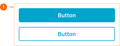
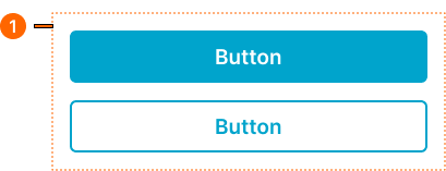
1
Actions - Basic
- verticalPadding:
- space.context.medium
- horizontalPadding:
- space.context.medium
- itemSpacing:
- space.context.medium
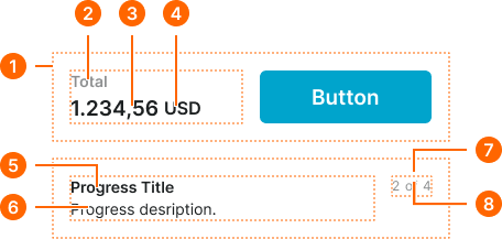
Nav Progress
Specifications for mobile navigation progress elements including measurements, colors, typography, and progress status properties for purchase summary and step progress implementations.
1
Progress - Basic
- verticalPadding:
- space.context.medium
- horizontalPadding:
- space.context.medium
- itemSpacing:
- space.context.medium
2
Label Text
- fill:
- color.context.default.fg-subtle
- typography:
- font.text.small.strong
3
Price Text
- fill:
- color.context.default.fg-subtle
- typography:
- font.text.large.strong
4
Currency Text
- fill:
- color.context.default.fg-subtle
- typography:
- font.text.medium.strong
5
Title Text
- fill:
- color.context.default.fg-main
- typography:
- font.text.small.strong
6
Description Text
- fill:
- color.context.default.fg-main
- typography:
- font.text.small.normal
7
Status Frame
- itemSpacing:
- space.base.4
8
Status Text
Separate text boxes for current, division and total texts.
- fill:
- color.context.default.fg-subtle
- typography:
- font.text.xsmall.normal