mobile-nav-bottom
Bottom navigation bars for mobile interfaces, providing primary navigation options in thumb-friendly locations at the bottom of the screen.
Configurable properties that control the appearance, behavior, and functionality of mobile navigation bottom components for mobile application interfaces and platform-specific navigation patterns.
Mobile Bottom Navigation
Properties that define the visual state and structural organization of mobile navigation container elements that provide bottom navigation for mobile applications.
type variant
Controls the navigation type and content organization, determining whether tabs, actions, or info styling is applied for different interface contexts.
- tabs
- actions
- process
glass variant
Controls the visual styling approach of the navigation container, determining whether basic or glass aesthetic treatment is applied for different iOS design generations.
- false
- true
has-nav-bar boolean
Controls the visibility of navigation bar content, determining whether tab, action, or progress elements are displayed.
- true
- false
has-home-bar boolean
Controls the visibility of the iOS home indicator bar, providing appropriate spacing for devices with home indicator requirements.
- true
- false
has-slot boolean
Controls the visibility of additional content slots, enabling extended functionality and supplementary content integration.
- type:
- actions, process
- true
- false
slot-instance instance-swap
- has-slot:
- true
Specifies which component to display within the content slot when slot visibility is enabled, providing flexible content customization options.
- Basic Placeholder
has-separator boolean
- glass:
- false
Controls the visibility of visual separation elements, providing clear distinction between navigation content and main interface areas.
- true
- false
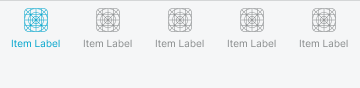
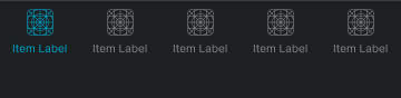
Nav Tabs
Properties that define the visual state and content organization of mobile navigation tab elements that provide section navigation and tab functionality.


type variant
Controls the tab presentation format and layout organization, determining whether standard or floating action styling is applied for different navigation requirements.
- standard
- floating-action
Nav Actions
Properties that define the visual state and functional organization of mobile navigation action elements that provide task completion and action functionality.


type variant
Controls the action arrangement and layout organization, determining whether stacked or side by side styling is applied for different workflow requirements.
- stacked
- side-by-side
has-2nd-action boolean
Controls the visibility and configuration of secondary action elements, enabling multi-action workflows and comprehensive task completion functionality.
- true
- false
Nav Progress
Properties that define the visual state and information organization of mobile navigation progress elements that provide process status and progress communication.


type variant
Controls the progress presentation format and information organization, determining whether purchase summary or step progress styling is applied for different process workflow requirements.
- purchase-summary
- step-progress