form-floating
Individual input elements that capture user data through different input methods and visual states with modern floating label styling.
Technical specifications and design system values that define the visual and structural properties of form input components. These specifications ensure consistent implementation across design tools and development environments.
Legend:
- Brackets (
[]) denote a component variant placeholder. - Full emphasis indicates a value specific to that variant.
- Dimmed indicates a value unchanged from the default variant.
Form Input
Specifications for individual input elements including measurements, colors, typography, and styling attributes. These values define the core appearance and behavior properties for each input variant.
1
Floating Form Input
- verticalPadding:
- space.form-input.medium-padding-y
- horizontalPadding:
- space.form-input.medium-padding-x
- itemSpacing:
- space.form-input.medium-gap
- fill:
- color.form-input.[state].bg-floating
- borderColor:
- color.form-input.[state].border
- borderRadiusTopLeft:
- borderRadius.form-input.floating-blunt
- borderRadiusTopRight:
- borderRadius.form-input.floating-blunt
- borderRadiusBottomRight:
- borderRadius.form-input.floating-sharp
- borderRadiusBottomLeft:
- borderRadius.form-input.floating-sharp
- borderWidthBottom:
- borderWidth.form-input.[active|inactive]
2
Icon Frame
- verticalPadding:
- space.unit.10
3
Icon
- height:
- size.form-input.medium-icon
- width:
- size.form-input.medium-icon
- fill:
- color.form-input.[state].fg-active
4
Content Frame
- active:
- true
- verticalPadding:
- space.unit.0
- active:
- false
- verticalPadding:
- space.unit.8
5
Input Text
- fill:
- color.form-input.idle.fg-[active|inactive]
- typography:
- font.form-input.floating-text
6
Label Text
- fill:
- color.form-input.[state].help
- typography:
- font.form-input.floating-label
7
Assist Frame
- verticalPadding:
- space.unit.8
- itemSpacing:
- space.unit.8
8
Assist Text
- fill:
- color.form-input.idle.help
- typography:
- font.assist.medium
9
Assist Icon
- height:
- size.form-input.medium-icon
- width:
- size.form-input.medium-icon
- fill:
- color.form-input.default.[state].help
10
Caret Frame
- verticalPadding:
- space.unit.10
11
Caret Icon
- height:
- size.form-input.medium-caret
- width:
- size.form-input.medium-caret
- fill:
- color.form-input.default.[state].caret
Form Field
Specifications for composite field elements including labels, help text, and form input combinations. These values define the structural and informational properties for each field variant.
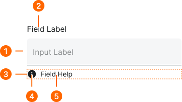
1
Floating Form Field
- itemSpacing:
- space.context.xsmall
2
Field Label Text
- fill:
- color.context.default.fg-main
- typography:
- font.text.medium.strong
3
Help Frame
- itemSpacing:
- space.context.xsmall
4
Help Icon
- height:
- size.icon.glyph.small
- width:
- size.icon.glyph.small
- fill:
- color.form-input.[state].help
5
Help Text
- fill:
- color.form-input.[state].help
- typography:
- font.text.small.normal