button-link
Link-styled interactive elements that combine button functionality with hyperlink visual presentation for consistent inline action and navigation triggers.
On this page
This documentation is a work in progress and may contain incomplete or outdated information. If you have any feedback or suggestions, please open an issue on GitHub.
Technical specifications and design system values that define the visual and structural properties of link button components. These specifications ensure consistent implementation across design tools and development environments.
Legend:
- Brackets (
[]) denote a component variant placeholder. - Full emphasis indicates a value specific to that variant.
- Dimmed indicates a value unchanged from the default variant.
Link Buttons
Specifications for button elements including measurements, colors, typography, and styling attributes. These values define the core appearance and behavior properties for each button variant.
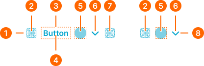
1
Link Button
- state:
- idle, disabled
- minHeight:
- size.button.[size]-main
- minWidth:
- size.button.[size]-main
- verticalPadding:
- space.button.[size]-padding-y
- horizontalPadding:
- space.button.[size]-padding-x
- itemSpacing:
- space.button.[size]-gap
- fill:
- color.context.[context].transparent-color
- borderRadius:
- borderRadius.button.[size]
- state:
- hover, press
- minHeight:
- size.button.[size]-main
- minWidth:
- size.button.[size]-main
- verticalPadding:
- space.button.[size]-padding-y
- horizontalPadding:
- space.button.[size]-padding-x
- itemSpacing:
- space.button.[size]-gap
- fill:
- color.context.[context].dim-slight
- borderRadius:
- borderRadius.button.[size]
2
Icon Start
- state:
- idle
- height:
- size.button.[size]-icon
- width:
- size.button.[size]-icon
- fill:
- color.context.[context].link-main
- state:
- hover
- height:
- size.button.[size]-icon
- width:
- size.button.[size]-icon
- fill:
- color.context.[context].link-hover
- state:
- press
- height:
- size.button.[size]-icon
- width:
- size.button.[size]-icon
- fill:
- color.context.[context].link-active
- state:
- press
- height:
- size.button.[size]-icon
- width:
- size.button.[size]-icon
- fill:
- color.context.[context].fg-slight
3
Label Frame
- horizontalPadding:
- space.button.[size]-nudge
4
Label Text
- state:
- idle
- fill:
- color.context.[context].link-main
- typography:
- font.button.[size]
- state:
- hover
- fill:
- color.context.[context].link-hover
- typography:
- font.button.[size]
- state:
- press
- fill:
- color.context.[context].link-active
- typography:
- font.button.[size]
- state:
- disabled
- fill:
- color.context.[context].fg-slight
- typography:
- font.button.[size]
5
Badge Frame
- state:
- idle, hover, press
- opacity:
- opacity.level.solid
- state:
- disabled
- opacity:
- opacity.context.fg-slight
6
Caret Icon
- state:
- idle
- height:
- size.button.[size]-caret
- width:
- size.button.[size]-caret
- fill:
- color.context.[context].link-main
- state:
- hover
- height:
- size.button.[size]-caret
- width:
- size.button.[size]-caret
- fill:
- color.context.[context].link-hover
- state:
- press
- height:
- size.button.[size]-caret
- width:
- size.button.[size]-caret
- fill:
- color.context.[context].link-active
- state:
- disabled
- height:
- size.button.[size]-caret
- width:
- size.button.[size]-caret
- fill:
- color.context.[context].fg-slight
7
Icon End
- state:
- idle
- height:
- size.button.[size]-icon
- width:
- size.button.[size]-icon
- fill:
- color.context.[context].link-main
- state:
- hover
- height:
- size.button.[size]-icon
- width:
- size.button.[size]-icon
- fill:
- color.context.[context].link-hover
- state:
- press
- height:
- size.button.[size]-icon
- width:
- size.button.[size]-icon
- fill:
- color.context.[context].link-active
- state:
- disabled
- height:
- size.button.[size]-icon
- width:
- size.button.[size]-icon
- fill:
- color.context.[context].fg-slight
8
Solid Icon-Button
- state:
- idle, disabled
- minHeight:
- size.button.[size]-main
- minWidth:
- size.button.[size]-main
- verticalPadding:
- space.button.[size]-padding-y
- horizontalPadding:
- space.button.[size]-padding-x
- itemSpacing:
- space.button.[size]-gap
- fill:
- color.context.[context].transparent-color
- borderRadius:
- borderRadius.button.[size]
- state:
- hover, press
- minHeight:
- size.button.[size]-main
- minWidth:
- size.button.[size]-main
- verticalPadding:
- space.button.[size]-padding-y
- horizontalPadding:
- space.button.[size]-padding-x
- itemSpacing:
- space.button.[size]-gap
- fill:
- color.context.[context].dim-slight
- borderRadius:
- borderRadius.button.[size]